

This daily chart is consistent with the buy climaxes on the weekly and monthly charts. It’s a reminder of how overbought the market is. While it can get much more overbought, it’s more likely to have at least a 3% correction before going much higher, asserts Al Brooks.
Monthly S&P500 Emini futures candlestick chart:
Emini buy climax before Trump’s tax cuts and FOMC rate hike
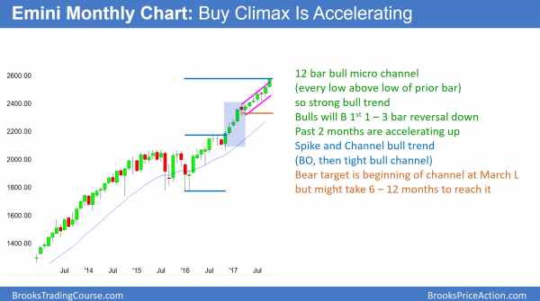
The monthly Emini chart has another strong bull bar with just a few days left in the month. The low of every bar has been above the low of the prior bar for 11 months on the monthly S&P500 Emini futures candlestick chart. This is a 12-month micro channel. While it is a sign of a strong bull trend, it is extremely climactic.
The monthly S&P500 Emini futures candlestick chart has a 12-bar bull micro channel. The longest bull micro channel in the S&P500 cash index in the past 50 years was 13 weeks. That was in 1995 and at the start of a huge bull trend. The current micro channel is 8 years into a bull trend. It is not likely to lead to a strong rally that will last for the next several years.
The 13-month bull micro channel in 1995 led to about a 5% pullback. The bull trend resumed and the stock market quadrupled over the next 5 years. The odds are that the current micro channel will end within the next few months. This is because markets rarely ever get more extreme than in the past. The pullback will probably be similar to the one in 1995. Since the current buy climax is late in bull trend, it might lead to a deeper pullback, and it could last a few bars.
However, the odds are that the bulls would buy even a 20% pullback that lasted 6 months. This is because they know that the 1st reversal down in a strong bull trend is usually minor. That means that there is a 70% chance that it will be either a bull flag or a bear leg in what will become a trading range. If it were to be a bear leg in a trading range, it would lead to a bull leg that would test the current all-time high. Consequently, a bull buying now or in a pullback could scale in and have a 70% chance of making at least a small profit.
Weekly S&P500 Emini futures candlestick chart:
Historic buy climax
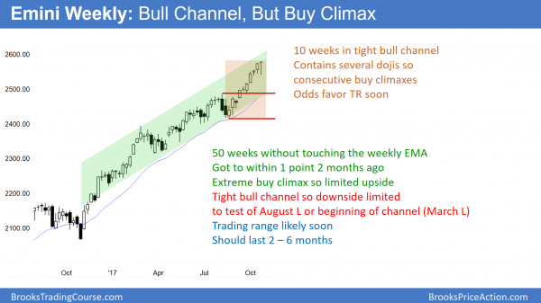
The weekly S&P500 Emini futures candlestick chart formed an outside up bar this week. However, it closed near the open and is therefore a neutral bar in a bull trend. It has not touched its 20-week exponential moving average in 50 weeks. It got to within a point in August, but did not touch. This has never happened in the 18-year history of the Emini. It is, therefore, unsustainable and climactic. Finally, every bull bar or series of bull bars is a climax and a breakout. Each breakout over the past couple of months has led to a doji. This is consecutive buy climaxes and usually leads to a trading range.
When the Emini weekly chart this week traded below the last week’s low, it triggered a sell signal. However, last week was a bull bar and therefore a weak sell signal bar. Furthermore, this week rallied back above last week’s high, erasing the sell signal. The bears continue to need consecutive big bear bars on the daily chart before traders believe that a correction is underway.
The weekly S&P500 Emini futures candlestick chart has never been this overbought in its 18-year history. This is using its EMA as a measure of the buy climax. The weekly chart stayed above the average for 48 weeks in 2003. This led to a 10-month trading range and a 10% correction. The minimum target for the pullback this time is probably 5% and 2 months. However, since this buy climax is the most extreme in history, there is maybe a 25% chance of a 20% correction lasting more than 6 months.
Even if this were to happen, the bulls would buy the selloff. This is because the weekly chart is in a tight bull channel. The odds are that any reversal down will be minor. This means that the best the bears can reasonably hope to get is a trading range. Bulls will buy the selloff, knowing that a bear leg in a trading range will lead to a bull leg in the range, and possibly a resumption of the bull trend.
Can markets be random and irrational?”
Because charts are a reflection of rational human behavior, they cannot go much beyond their historical norms. This is because that would be irrational. There are too many firms participating in the market for the chart to stay irrational much longer.
However, betting on a return to normalcy is always a low probability bet. There is an adage on Wall Street that highlights this concept: Markets can stay irrational for much longer than you can stay solvent in your bet against the trend.
When will it begin to pull back? Probably within the next few weeks. However, the market so often does surprising things that no one should be surprised if the buy climax continues for several more months.
Does the Emini ever have to touch any moving average? Yes and no. In theory, no, but in practice, yes. There are always going to be wars and disasters that create reversals that are big enough to return any overbought or oversold market to the Emini’s average prices. I discussed this in a comment after last week’s report, and in case you not see it, I am posting it again here:
Can a chart stay above its 20-bar average forever without accelerating up in a parabolic climax?
I agree that everything has to hit “average” at some point in the real world. This is because there is always eventually going to be a major news event that would create a selloff that was big enough to fall below the average. Therefore, I specifically chose the word “indefinitely” instead of “forever.” I want readers to understand that the chart can stay above an average price for much longer than what seems logical when one thinks about what an average is.
Get Trading Insights, MoneyShow’s free trading newsletter »
I have given this some thought over the years, but I have never spent time doing the math. However, from a mathematical perspective, I believe “forever” is correct. The 20 week exponential moving average is based on closes, and it uses almost exclusively those of the past 20 weeks. This week’s close replaces the close of 21 week ago.
The candlestick bars on the weekly chart show every price during every week. Can those bars stay above the 20-week average forever without accelerating upward in a parabola? Instead of a candle stick chart, use a line chart, which simply connects closes and is therefore a 1 bar moving average. The question is, can a 1 bar average stay above a 20-bar average without acceleration?
Let’s look at a bull trend that keeps going up at the exact same rate every week. Let’s say that every week closes 1 point above the close of the prior week. The rate of change (which is the slope of the line and also the velocity) is constant and therefore there is no acceleration. Both the 1 week and 20 week moving averages are increasing at 1 point per week. Both lines are straight and sloped up at exactly the same angle, and therefore parallel.
The 20-week average lags (is lower) because it is held down by prices that go back 20 weeks, and those prices are lower. A 1 bar average is based only on this week’s close. It therefore only “averages” this week, which is higher than each of the 19 prior closes. It therefore remains above the average of the past 20 bars. Although I might be missing something, this makes me conclude that a chart (candle stick or line), which is always a 1 bar average, can stay above its 20-bar average forever without accelerating.
Daily S&P500 Emini futures candlestick chart:
Summary
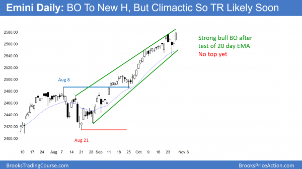
The daily S&P500 Emini futures candlestick chart triggered a sell signal by falling below Tuesday’s low. It was an inside bar after a breakout to a new high, and therefore a sell signal bar. However, the strong reversal up from the 20-day exponential moving average after triggering the sell signal makes sideways to up more likely.
The daily S&P500 Emini futures candlestick chart is in a strong bull trend. There was a 2-week wedge top after the early October strong breakout. That was a reasonable top. Yet, the bulls bought the bear breakout and the Emini rallied to a new high.
It then formed an ioi sell setup (inside bar-outside bar-inside bar) on Tuesday. When Wednesday traded below Tuesday’s low, the Emini triggered the sell signal. Because the 2nd half of the week reversed up strongly above Tuesday’s low, the Emini erased the sell signal.
The bears continue to need consecutive big bear bars to convince traders that they have taken control. Without that, any reversal down will probably lead to a bull flag or a trading range on the daily chart instead of a correction. The odds would continue to favor at least slightly higher prices.
Breakout test is a magnet
The August 21 low is a major higher low. The August 8 high was a strong reversal down and therefore also major. Therefore, the measured move target based on those prices is major as well. This is especially true because the September 25 low tested the August 8 high and reversed up strongly.
The Emini has been oscillating around the measured move target for 2 weeks. It is therefore clearly an important price. In addition, the September 25 low only dipped a little below the August 8 high, which is the breakout point. When a breakout test bar has a big tail, but it only dips a few ticks below support, there is an 80% chance that the Emini will test the breakout again before too long.
While the rally from the test has lasted over a month, the odds still are that there will be a reversal down to test that August 8 high again. That reversal probably will begin within a month. This is consistent with the buy climaxes on the weekly and monthly charts. Furthermore, the test would be about a 100 point and 5% correction. This is also consistent with the higher time frame minimum targets.
Longest streak without 3% correction in 90 years
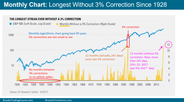
LPL Research published this chart recently, and I have added text to make it clear. The height of each yellow peak is the number of months since the last 3% correction. The current peak is tied with the 2015 spike for the tallest, with both streaks lasting 12 months, However, the current spike has more days than the 1995 streak, and it is still growing. It is therefore the longest time without a 3% correction since before the 1929 Stock Market Crash. There are many long stretches without yellow peaks. Therefore, there was not even a month between consecutive 3% corrections during those stretches.
This daily chart is consistent with the buy climaxes on the weekly and monthly charts. It is a reminder of just how overbought the stock market is. While it can get much more overbought, it is more likely to have at least a 3% correction before going much higher.
Minor seasonal bullish tendency
There is a high probability that the close of November 5 is above the close of October 26. Why? I don’t know, but 20 years ago, I used to test lots of seasonal tendencies, and this was one of the better ones. I have not checked it again in many years and it might not be reliable. I mention this only because it is entertaining to watch to see if it happens again. Please note that I never place trades based on small seasonal windows.


