

If the Senate plan is the final version, the stock market might rally if it fails to become law, writes Don Kaufman, co-founder of TheoTrade.
The stock market almost had a big selloff on Thursday as the Senate Republicans proposed a plan that delays the tax cut until 2019. In the mid-afternoon, it looked like we could be in for a bad day, but as usual investors bought the dip; the S&P 500 (SPX) was only down 0.38%. The worst performer was the Nasdaq which was down 0.58%. The high yield debt bonds fell again.
The iShares iBoxx High Yield Corporate Bond ETF (HYG) is now down 2.07% from its peak. This is its biggest selloff since February-March of this year. For a moment, the Dow Jones Industrials (DJI) was down 250 points, but it closed down only 101 points. I think this news is an excuse to selloff from very overbought levels.
It’s arguable the market has been overbought all year as the biggest correction has only been 2.8%. It has been a nice ride since the 2016 election.
The Senate plan differs from the president’s plan and the House plan which have tax cuts starting in 2018.
The other difference is the Senate plan adds back the deduction for medical expenses and does a full repeal of the state and local tax deductions. The House plan was passed out of the Ways and Means committee in a 24-16 vote. That plan could be voted on this week. Since the market likes that plan, it could help boost stocks temporarily.
Now the Republicans have moved their goal of getting the plan done from Thanksgiving to Christmas. There are major differences between the House and Senate bills which will need to be worked through. It has a windshield wiper effect on the market. That analogy means some days the market likes the reports of the plans and other days the market hates it as the negotiations go back and forth.
Currently the PredictIt market has the chances of both an individual tax cut and corporate tax cut passing by the end of the year at 20%.
Consumer health
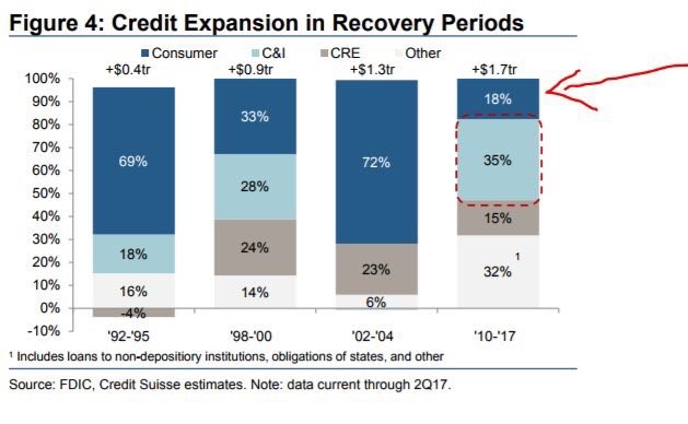
Let’s look at some charts which show the health of the consumer. The chart below shows a breakdown of credit expansion in recovery periods. The first thing worth mentioning is how much longer the current credit expansion is than the previous ones. As you can see, the others are 3-4 years and this one is 8 years.
The biggest difference from this recovery and the others is consumer credit as a percentage of the total debt taken out is only 18% which is the smallest amount out of any other period, possibly because of the lack of growth in mortgage debt.
This time the C&I lending has taken a larger share. The ‘Other’ category is also taking up a larger percentage than the other expansions.
I think that’s a result of student loan debt. If that’s the case, it would cancel out the point that consumer debt is low as millennial consumers are being dragged down by student loans.
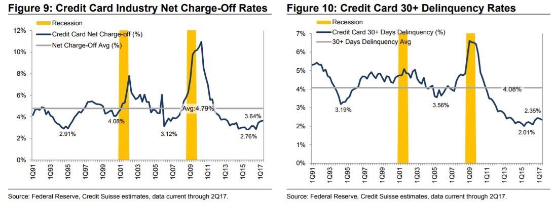
The charts below get manipulated by the bears because they look at them in rate of change terms. When numbers are very low, the rate of change can make a small move look bigger than it is. The chart on the left shows charge off rates for the credit card industry. The bottom of this cycle was lower than the few previous ones.
The current rate is still near what the cycles usually bottom at, so I think it’s too early to claim the consumer is weak. The chart on the right is even more optimistic. It shows the credit card 30+ delinquency rates. That bottomed way lower than the previous two cycles. It’s now still below the previous two troughs. When both metrics go above their long-term average, I will get concerned. Until then, everything is fine.
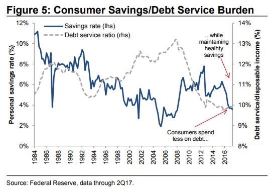
The chart below shows the battleground the bulls and the bears are debating. The bears point to the low savings rate, but the bulls show how the debt service ratio is so low.
As you can see, the debt service ratio is the lowest in decades and the savings rate is near the lows seen in the mid-2000s. I don’t understand why the chart shows consumers are maintaining a healthy savings rate when the rate is so low.
The only thing keeping the consumer in good shape is low interest rates. If rates rise, then the debt service ratio will increase and consumers will be hurt by their low savings.
On the other hand, if savings accounts offer higher rates, consumers might save more.
The other aspect of this situation is wage growth. If it accelerates in 2018 like I expect, then the consumer will be better able to cope with rising rates.
PPI improvement
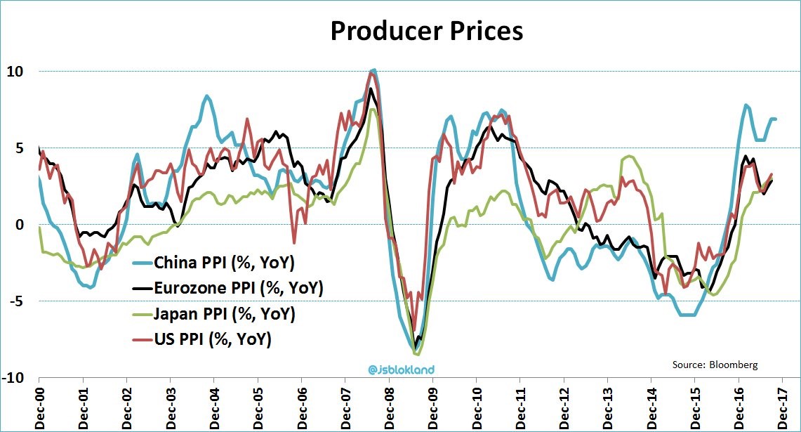
Speaking of higher rates, the year over year PPI growth appears to be accelerating in the past few quarters across the globe. China’s PPI was last reported at 6.9%. Part of this year-over-year increase is related to the base effect just like what happened in 2010-2011. There was a relapse afterwards. Hopefully, that doesn’t occur this time.
It’s interesting to see how China went from the laggard to the leader of the pack. This is a great representation of how China is driving the global economic recovery. The other countries and regions listed in this chart are all developed markets. If there were other emerging markets listed, we’d see similar results to what China is seeing. The notable exception is India which appears to be reeling from Prime Minister Modi’s demonetization effort which did nothing to stop tax fraud.
Conclusion
The Senate plan is bad news. It’s a tax cut that doesn’t cut taxes for millions and also increases the debt by $1.7 trillion over 10 years.
It’s very difficult to solve the problems with the tax code. Those problems are amped up by the fact that the Republicans only have 52 Senate seats.
A plan with a better chance of passing would be one worked out with Democrats. That won’t happen. The hope is the plan gets fixed by Christmas when it looks like it will be voted on. If the Senate plan is the final version, the stock market might rally if it fails to become law.


