

Relative performance (RP) measures how a stock is performing relative to a specific market or index. Momentum analysis of a stock’s RP is one of our favorite ways to measure a stock’s health, notes technical expert Mike Cintolo, editor of Cabot Growth Investor.
A stock that holds its value during a declining market often soars once the market turns higher. In a strong bull market, most stocks will rise, even the stocks of weak companies! But you should concentrate your efforts on the best companies with the strongest stocks, the market’s leaders. The way to find them is by analyzing RP lines.
Relative Performance Calculation
Specifically, Relative Performance is calculated by dividing the Friday closing price of a stock by the Friday close of an index. (We use the broad Wilshire 5000.) The weekly changes are then plotted on a line graph, using a log scale—this is called the RP line.
When an RP line is moving upward, the stock is outperforming the market. When it’s moving downward, the stock is underperforming the market. A flat RP line indicates the stock’s performance is equal to the market’s.
In general, we like to see a minimum of 13 weeks of outperformance (an uptrending RP line) before we consider buying a stock. Once this condition has been met, we conclude the stock has positive momentum. If a company has a compelling fundamental story and strong positive momentum, it’s a candidate for purchase.
What constitutes strong momentum? When a stock has a powerful RP line, its corrections will be brief, lasting just a week or two. The longer the Relative Performance correction, the weaker the situation. There’s nothing more positive than an RP line that’s hitting new highs!
In general we’ll consider selling a stock if it underperforms the market for eight weeks or longer. But there are other considerations. How deep (or shallow) has the correction been? Has the stock been declining on heavy trading volume (a big negative)? Is it holding up in an area of price support? RP analysis is extremely important, but it’s not done in a vacuum. There are other considerations.
Let’s look at a few examples.
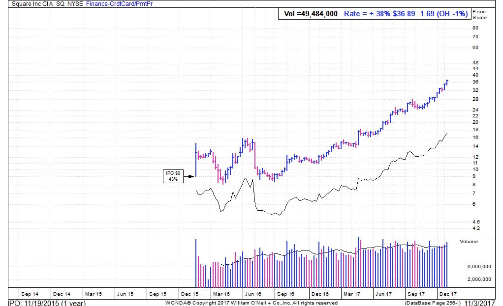
Relative Performance (RP) Analysis
Above, you can see a stock that’s been strongly outperforming the market for quite some time. In the last year, the stock has nearly doubled! And if you used RP analysis as the basis for buying and holding this stock, you would have profited handsomely, as there was no way you could have sold your position given the persistence of the advance.
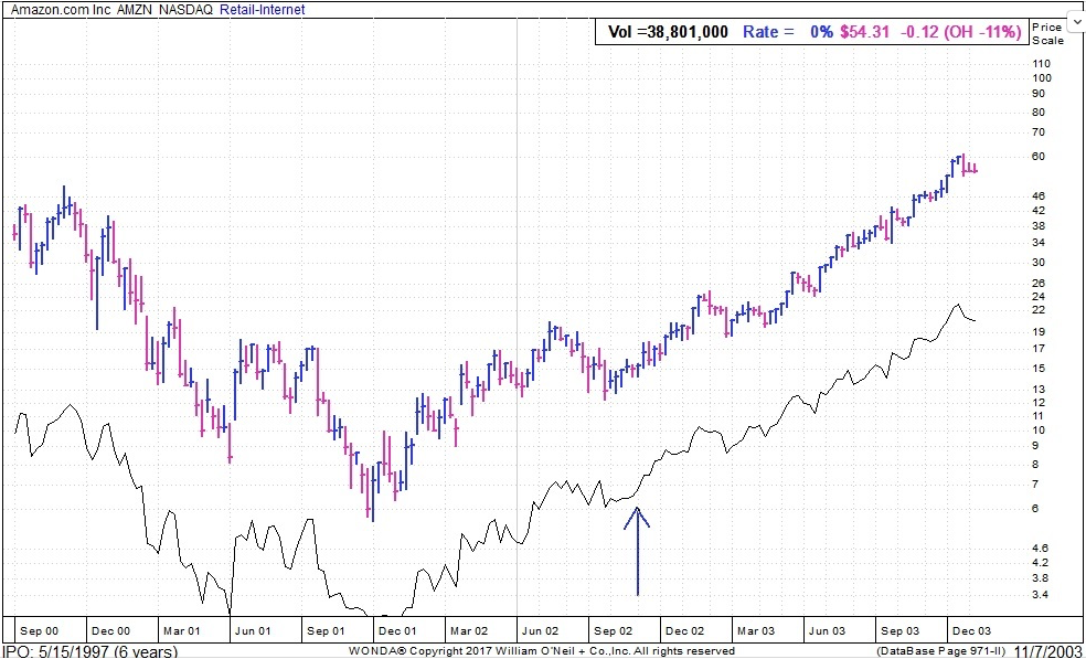
The chart above shows a positive situation that developed in one of today’s best growth stocks more than a decade ago. Amazon (AMZN) rallied nicely into May 2002 before it corrected for more than two months.
But here’s the key: As the stock began to bounce, the RP line reached new highs many weeks ahead of the price—a sign the stock’s sponsorship and momentum was strong. Sure enough, shares continued higher and went on to big gains in the year ahead.
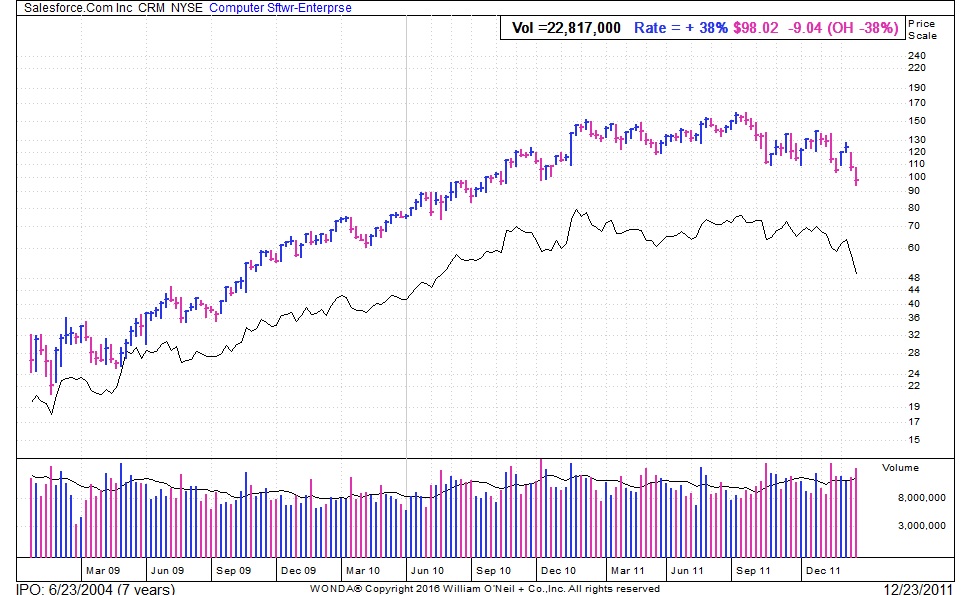
Now consider the above chart, which shows the opposite situation. After a long uptrend, the stock hit a new price and RP peaks in November 2010. All was well.
But after months of consolidation, the stock tried to hit new highs in July 2011 … but the RP line did not conform. A negative divergence! Sure enough, the stock itself faded from there and eventually fell more than 30%.
Interpreting Relative Performance lines is as much an art as it is a science. But to any serious investor, it’s worth the effort. It gives you the conviction to stay with a stock rather than selling for a quick profit. It helps you identify the strongest growth stocks in both weak and strong markets. And it gives you advance notice that a stock is weakening.


