

Many investors follow market correlations very closely. But, do they really understand what a correlation represents?
You see, markets are not linear in nature. While two different markets may be traveling in the same direction for a period of time, that doesn’t mean they are being driven by the same factors—either fundamentally or technically. Unless you understand each chart on its own, how will you ever know when a seeming correlation will break? And, if you assume that they will align indefinitely, how long does it take for you to cut your losses in determining that a seeming correlation has broken?
Remember, when you are following a correlation, all you are doing is assuming a relationship will continue indefinitely in a linear manner, despite the fact that markets are simply not linear in nature.
As an example, back in 2016, I began warning the members of Elliottwavetrader that there are many well followed correlations that are setting up to break down. And, I based this upon the underlying charts we were tracking across the markets.
Then in January of 2017, ZeroHedge published an article regarding break downs in market correlations wherein Morgan Stanley publicly noted that “we haven’t seen a shift this severe in over a decade.”
Yet, there are times where the underlying charts support correlations that many follow. Currently, I am tracking a seeming correlation that seems to support the underlying theory of most market participants. And, that is the correlation between the U.S. Dollar Index and the precious metals market. Or we should say, negative correlation.
First, I would like to begin with our long-term analysis on the U.S. Dollar Index (DXY). Back in the middle of 2011, the DXY was hitting levels as low as the 73 region as the Federal Reserve was throwing numerous iterations of Quantitative Easing (QE) at the market, which made everyone certain that the USD was going to crash.
However, despite all the expectations regarding what QE was going to do for the dollar, I began calling for a multi-year rally in the DXY with a target in the 103.50 region. For those counting, that is an expectation of a 41% rally. That is a huge move. But, with the Fed pushing QE, many viewed this as a laughable expectation.
Well, as we now know, the DXY rallied from that time until it struck a high of 103.82 five and a half years later.
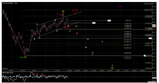
Yet, at this time, and based upon the current structure I have been tracking in the DXY, we seem to be setting up a decline phase, which can take the DXY back down towards the 84 region within the next few years.
Most specifically, back in early October, the DXY moved into the target region we identified to our members as completing a potential major topping structure. Since then, the DXY has provided us with a five-wave decline off the high struck in early October. When we see a five-wave decline off a target top, it most often signals a change of trend based upon our Elliott Wave analysis (see chart below). For this reason, we think that the U.S. Dollar has begun a major decline phase, which will likely take us into 2021.
Moreover, with the metals currently setting up for what can be a multi-year rally as well, this is one commonly held correlation belief that seems to be supported by the underlying charts we track.
While we will continue to track these charts in our ElliottWaveTrader.net service as we progress over the coming years, for now this is what these markets are telling us on their own, and not just based upon the commonly held belief in their correlations.
Avi Gilburt is a widely followed Elliott Wave analyst and founder of ElliottWaveTrader.net, a live trading room featuring his analysis on the S&P 500, precious metals, oil & USD, plus a team of analysts covering a range of other markets.


