

The bulls returned, and all eleven S&P sectors closed higher, states Bonnie Gortler of bonniegortler.com.
However, only one gained more than the SPDR S&P 500 ETF Trust (SPY), up 3.82%. Technology (XLK) and Energy (XLE) were the strongest sectors, while Consumer Discretionary (XLY) and Utilities (XLU) were up the least.
S&P SPDR Sector ETFs Performance Summary
12/03/21 - 12/10/21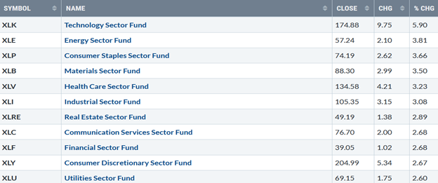
Source: Stockcharts.com
Figure 2: Bonnie's Mix OF ETFs To Monitor
Summary 12/03/21– 12/10/21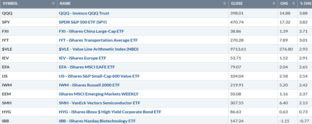
Source: Stockcharts.com
Investors were attracted to technology stocks last week, while biotechnology remained out of favor. The Santa Claus rally started. All major averages finished the week higher, and the Dow rose +4.02%, breaking its four-week losing streak. The S&P 500 (SPX) gained +3.82%, closing at a record high on Friday, and the Nasdaq (NDX) was up 3.61%.
The Russell 2000 Index (RUT) gained +2.43%, yet underperformed the major averages. The Value Line Arithmetic Index (a mix of approximately 1700 stocks) rebounded up +2.93%, implying the rally was wide-ranging. Weekly market breadth improved on both the NYSE and Nasdaq. The New York Stock Exchange Index had 2476 advances and 1064 declines. Nasdaq had 3212 advances and 1821 declines. There were 186 new highs and 244 new lows on the NYSE, and 219 new highs and 819 new lows on the Nasdaq. For this week’s rally to be sustainable, market breadth needs to continue to improve.
Figure 3: 10-Year US Treasury Yields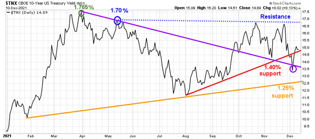
Source: Stockcharts.com
10-Year US Treasury Yields (TNX) rose, closing at 1.489% (Figure 3), staying between support and resistance. Support is 1.25%. Resistance is between 1.65% and 1.80%.
Figure 4: Daily New York Stock Exchange (NYSE) New Lows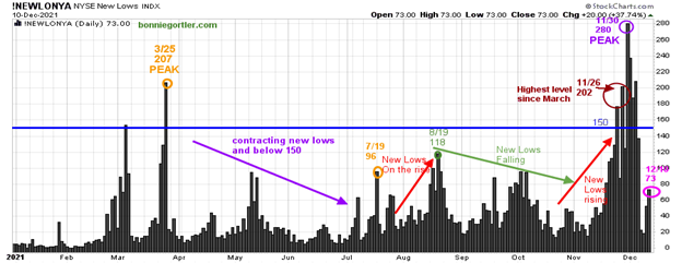
Source: Stockcharts.com
Watching new lows on the New York Stock Exchange is a simple technical tool that helps awareness about the immediate trend's direction.
Learn more in my book, Journey to Wealth. Here is an excerpt, "If the new lows are above 50, it is an alert or warning of possible market weakness or a change in market tone. Be aware, it’s a good idea to make sure you are happy and comfortable with your portfolio. It is best not to have more volatile investments than you can handle where you feel uncomfortable. If the selling continues, you could have some serious losses if the market falls further. When new lows are above 150, the market is negative, higher risk, selling is taking place. Sometimes it could be severe, and sometimes on a very nasty day, you can have 'panic selling,' and big wild swings (high volatility) to the downside may occur."
On 11/26 (brown circle), 202 stocks made new lows, the highest since March weakness followed before peaking on 11/30 (purple circle) at 280. New lows then contracted, falling below 150 (blue line), the high-risk zone implying less selling pressure.
New lows contracted, closing at 73 (pink circle) on 12/10, not in the lowest risk zone but a significant improvement. It will be a positive sign if new lows fall to between 25 and 50. On the other hand, a close above 150 would be negative, signaling more weakness; and high day-to-day volatility will occur in a usually seasonally strong, low volatility environment ending 2021.
Figure 5: Daily Nasdaq Advance-Decline Line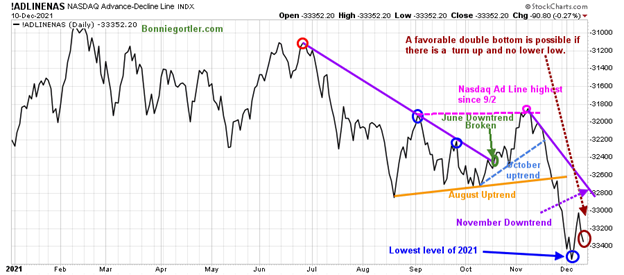
Source: Stockcharts.com
The first week of November, the AD-Line rose sharply to its highest level since 9/2 (pink circle), stalling at resistance and turned down, breaking the October uptrend (blue dotted line), an advanced warning a decline was forthcoming.
The August uptrend was broken (orange line) and continued to the lowest low of 2021 (blue circle). A higher low has formed (brown circle), potentially a favorable double bottom if there is a turn up now. Watch for a break of the November downtrend (purple line) to imply more gains.
Figure 6: Transportation Average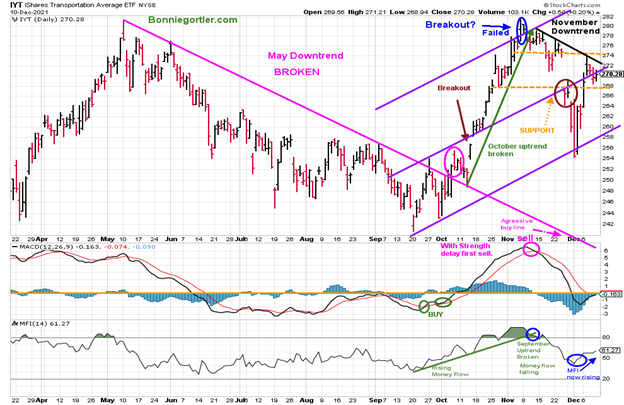
Source: Stockcharts.com
Transports rebounded after falling three weeks in a row up 3.01%, closing at 270.28. IYT penetrated first resistance at 267.50. If IYT breaks the downtrend, the next resistance is 274.00, followed by 280.00. MACD (middle chart) is on a sell, barely missing a buy. A rally in IYT appears to be underway, and MACD is likely to generate a buy this week.
Support is at 268.00 followed by 256.00, and a close below 256.00 would negate my positive outlook.
It’s a positive sign money flow (lower chart) turned up the previous week and continued to rise last week. If money flow continues to rise, look for a test of the old highs before the end of the year. On the other hand, if money flow weakens and IYT goes below the low at 256.20, IYT may fall fast. An aggressive buy is if IYT falls to 238.00.
Figure 7: Daily iShares Russell 2000 (IWM) Price (Top) and 12-26-9 MACD (Middle and Money Flow (Bottom)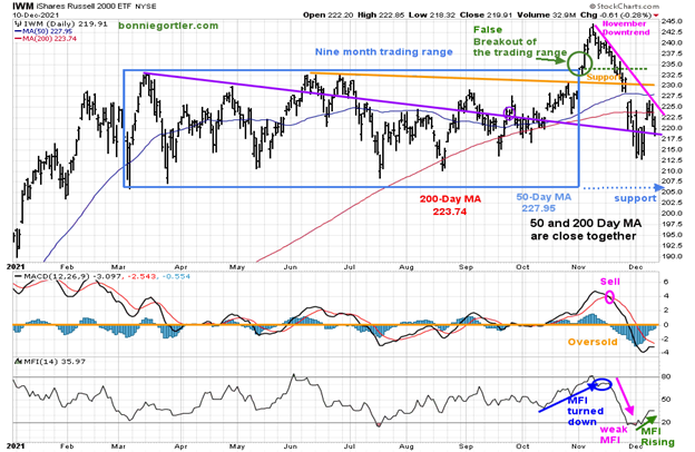
Source: Stockcharts.com
The top portion of the chart is the daily iShares Russell 2000 Index ETF (IWM), the benchmark for small-cap stocks, with a 50-day moving average (MA) (blue line) and 200-day moving average (MA), that traders watch and use to define trends.
A false breakout occurred in IWM after being in a nine-month trading range.
After falling four weeks in a row, IWM held 210.00 support and turned up, gaining +2.42% and closing at 219.91. The rally remains questionable, closing below its 50-and 200-day moving average, and it remains in a downtrend from November.
Support is 217.00, followed by 210.00, and 205.00. MACD (middle chart) remains on a sell, oversold, and below zero. A turn-up would create a favorable double bottom pattern.
Money Flow (lower chart) has stopped falling and is rising, a sign that investors are stepping into small caps in the short term. The intermediate-term remains in question. See Figures: eight, nine, and ten below.
Figure 8: Weekly iShares Russell 2000 (IWM) Price (Top) and 12-26-9 MACD (Bottom)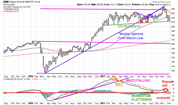
Source: Stockcharts.com
IWM fell sharply for four weeks after a failed breakout. On the plus side, key support of 210.00 (green line) remains. IWM reversed higher trading within the previous weeks' range (an inside week) up +2.42%. Resistance is at 230.00 followed by 240.00.
A weekly close below 210.00 would imply weakness with downside objectives to 195.00 followed by 180.00. A weekly close above 230.00 would indicate another rally towards the 11/8 high at 244.46 is possible.
MACD (lower chart) remains on a sell, falling, not yet oversold, and below zero (red horizontal line), showing weak momentum. Be patient and wait for daily and weekly IWM relative strength vs. the S&P 500 to improve.
Figure 9: Daily Relative Strength Ratio Russell 2000 (IWM)/S&P 500 (SPY)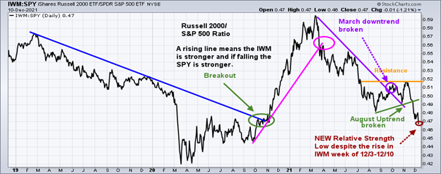
A rising line means the IWM is stronger; and if falling, the SPY is stronger. IWM has turned up and is now leading in relative strength.
IWM continues to underperform the S&P 500 (SPY) after failing to get through resistance and breaking the August uptrend making a new low last week (brown circle), despite the rise in IWM.
Figure 10: Weekly Relative Strength Ratio Russell 2000 (IWM)/S&P 500 (SPY)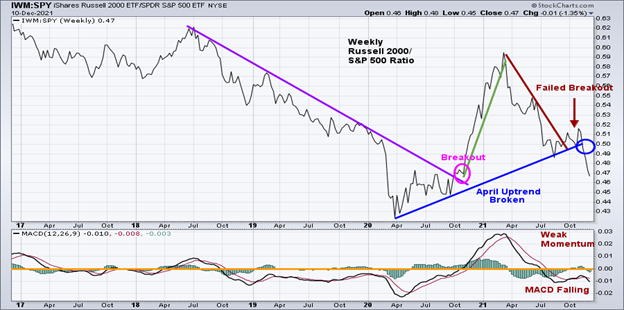
Source: Stockcharts.com
The IWM/SPY ratio on the weekly chart also failed, breaking the uptrend from April (blue circle). The daily and weekly ratio charts clearly show no signs yet of outperformance of IWM compared to the S&P 500 in the near term.
Figure 11: Daily Invesco QQQ Trust (QQQ) Price (Top), Money Flow Middle), and 12-26-9 MACD (Bottom)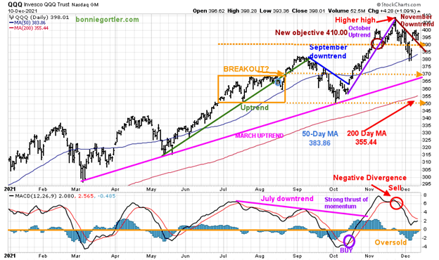
Source: Stockcharts.com
The chart shows the Daily Invesco QQQ (QQQ), an exchange-traded fund based on the Nasdaq 100 Index with its 50-day moving average and 200-day moving average. In June, QQQ was in a trading range (orange rectangle) and then broke out above 370.00 in August, which failed. A decline followed to 350.00 support in late September. After breaking the short-term downtrend 10/7 (blue line), QQQ continued to climb in November, close to its upside target of 410.00 on 11/22 with a high of 408.71 before reversing lower.
QQQ closed at 398.01, up +3.88%, led by Apple (AAPL) up +10.9% and Microsoft (MSFT) up +6.1% for the week. Both stocks combine for 23.05% of QQQ.
Figure 12: Invesco QQQ Trust (QQQ) Top Holdings 12/10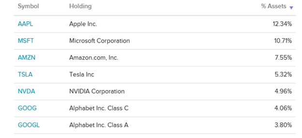
Source: ETFDB.com
QQQ broke the November downtrend and is only 2.6% from its high. However, many growth stocks remain under selling pressure, have fallen 20-50%, and are nowhere near their highs. The top holdings will significantly impact QQQ performance whether the rise continues or a decline begins.
Support is at 390.00, followed by 380.00, and 370.00. Resistance is 400.00.
The lower chart is MACD (12, 26, 9), a measure of momentum. MACD gave a timely buy and remained on a sell as it did not get oversold, below zero.
The March uptrend (top chart) remains intact (pink line). A close below 365.00 would shift the trend to down, make it harder to make money, and likely fuel more selling in Nasdaq. For now, the bulls remain in control.
Figure 13: Van Eck Semiconductors (SMH) Daily Price (Top), Money Flow (Middle), and 12-26-9 MACD (Bottom)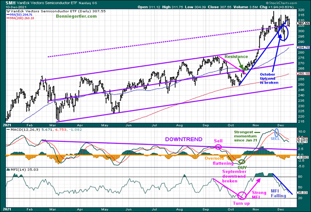
Source: Stockcharts.com
Semiconductors rose +2.13%, closing at 301.15; with support at 296.00, followed by 286.00.
MACD (middle chart) remains on a sell after very strong momentum despite the rise in SMH. As expected, MACD declined as SMH rose. More time is needed for MACD to reset and go below zero.
Money flow (lower chart) continues to fall in a downtrend (blue line). I recommend caution until money flow turns up and breaks the downtrend.
What to Watch for Short-Term Direction This Week?
Figure 14: New York Stock Exchange AD-Line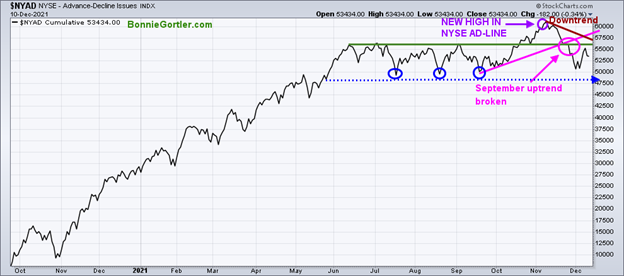
Source: Stockcharts.com
The November downtrend remains in effect. The lows made in July, August, and September are essential to hold (blue circles), or a more severe correction is likely.
Figure 15: I Shares Hi Yield Corporate (HYG) and 12-26-9 MACD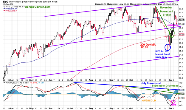
Source: Stockcharts.com
After peaking on 11/8/21, Hi-Yield Bonds (HYG) was under pressure, falling to their lowest level since May (blue circle). HYG closed higher for the second week in a row last week +0.73% after breaking the November downtrend (green line) and holding above 85.00 support. HYG closed just above resistance is at 86.63, and its positive Lord Abbett High Yield (LAHYX - chart not shown) also rose, breaking its downtrend and holding the June lows at 7.40.
MACD (bottom chart) generated a buy and gained momentum after penetrating the September and July downtrend. Continued strength in Hi Yield is favorable for US Equities. On the other hand, it would be negative if HYG closes below 85.00. and LAHYX falls below the June low at 7.40. Be alert to capital gains distributions in December, where HYG and LAHYX will drop in price.
Figure 16: CBOE Volatility Index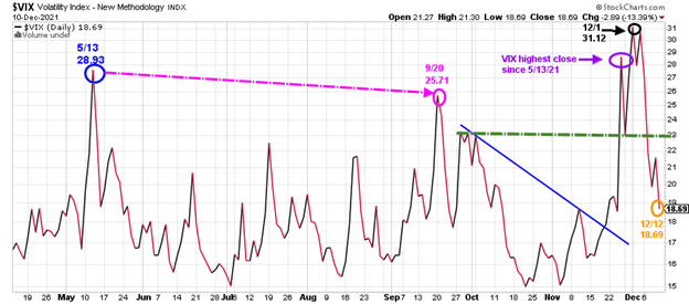
Source: Stockcharts.com
As long as VIX closes below 23.00, intraday volatility is likely to be contained.
Figure 17: ARKK Innovation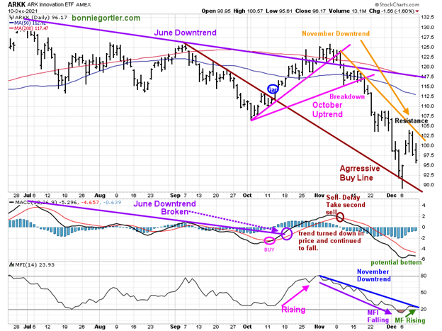
Source: Stockcharts.com
ARK Innovation ETF (ARKK), an actively managed ETF by Cathie Wood that seeks long-term growth.
ARKK broke its September short-term downtrend (brown line) in October and gapped up, followed by a failed rally. ARKK has sold off sharply since its peak at 125.86 on 12/04 to its low at 93.53, a decline of 24.10% MACD remains on a sell, but its positive MACD has stopped falling and is in a position to generate a buy.
Short-term resistance is 103.00, followed by 105.00, 108.00, and 117.00.
Money flow (lower chart) was trending down and is not rising. Watch money flow for a turn-up, and if it breaks the November downtrend, it implies a potential rally in beaten-down growth stocks.
A Lower-Risk Buying Opportunity is Developing.
Figure 18: Daily Relative Strength Ratio Consumer Staples (XLP) /S&P 500 (SPY)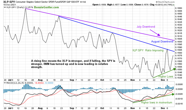
Source: Stockcharts.com
XLP, a defensive area, has been gaining strength compared to the S&P 500 since November, and on Friday 12/10, XLP made a new high last week. Notice the XLP: SPY ratio is making higher lows and now close to breaking the August downtrend.
Summing Up:
Tape action was better last week on improving market breadth for the short term. New lows decreased on the NYSE and Nasdaq as investors stepped in to buy. Short-term momentum and volume indicators have turned up. However, it's a mixed message for the intermediate-term trend of weakening momentum. Unless the rally continues to broaden now, it will be more challenging for a sustainable advance. The Federal Reserve meeting is on 12/15, and Quadruple witching is on 12/17. The bulls are back in control now, but more caution is needed if Russell 2000 (IWM) closes below support at 210.00 and QQQ closes below 390.00.
Remember to manage your risk, and your wealth will grow.
I would love to hear from you. If you have any questions or comments or would like to talk about the market, email me at Bonnie@Bonniegortler.com.
Disclaimer: Although the information is made with a sincere effort for accuracy, it is not guaranteed that the information provided is a statement of fact. Nor can we guarantee the results of following any of the recommendations made herein. Readers are encouraged to meet with their own advisors to consider the suitability of investments for their own particular situations and for determination of their own risk levels. Past performance does not guarantee any future results.


