

At the time, the S&P 500 (SPX) was 2,237 and was in one of the fastest declines of historical record, explains Buff Dormeier of Kingsview Partners.
The vast majority of Wall Street analysts were predicting doom and gloom, focusing on the pandemic and the looming economic shutdown. Meanwhile, I was focused on the S&P 500's “VPCI V Bottom capitulation signal,” and was among the first analysts at the time focused on what would become the rocket analogy of the stock market. Earlier this year the S&P 500 surpassed 4800, a 115% increase since the call on March 23, 2020.
With these same events in mind, this new series is entitled “Returning from Orbit”. The Federal Reserve’s rocket has since overshot its orbit causing increasing inflation while providing a speculative paradise for risk assets. Now how shall the Federal Reserve return the economy back to post-pandemic normalcy? While the launch is the most exhilarating part of the journey, the reentry is often the most dangerous. In returning a rocket back to earth, the first step is “de-orbit burn”, slowing the rocket down below its orbital speed. Once the rocket is slowed, gravity takes over and the spacecraft plunges back into the atmosphere.
CHART 1: FEDERAL RESERVE “ROCKET LAUNCH”
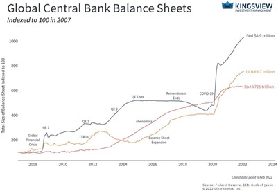
While the atmosphere slows the spacecraft further, it also creates heat which could destroy or damage the craft. Landing a rocket from space is not like landing an airplane. Landing from space needs to be just right. Yet, there are many variables to calculate such as potential craft damage during reentry, weather, drag and weight. Likewise, the economic re-entry may continue to be a treacherous journey as well.
In efforts to tame inflation and bring the markets back to normalcy, the Federal Reserve will soon begin a rapid reversal of the stimulus previously infused into the economy. The Fed has two primary tools to “slow down the rocket”. One of these tools is to raise rates while the other is balance sheet reductions. Some believe the Fed may use both. The last time they attempted this was the “Powell Pivot” in 2018. Those “pivot” actions did not turn out so well for the markets. Will the Fed be able to orchestrate a soft landing or will there be damage landing the “ship”? We will not wait to see but rather trust our leading indicators to dictate our market positioning.
Thus far we have referenced two dates in comparison to today—December 2018 and March 2020.
AII sentiment data shows the lowest number of bullish individual investors (only 19.2% bullish) since December 2018 and March 2020. Both prior times represented good times to enter the market. Also, Investor Intelligence, a measure of the sentiment of market advisors, is also at its lowest point since March 2020 (chart two below).
CHART 2: INVESTOR INTELLIGENCE
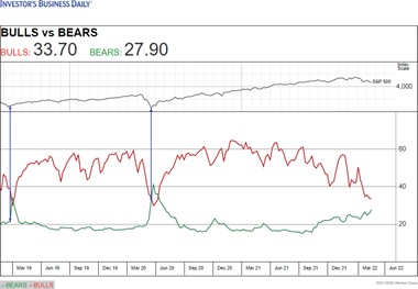
Although both sentiment indicators show a low number of bulls, neither sentiment indicator shows an extraordinarily high number of bears.
When there are a high number of bears, it may mean that investors have already sold out, a bullish indication. You can see in the graph below that the last two times bears have outnumbered bulls, it has represented a positive inflection point in the market.
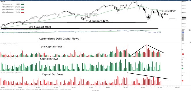
Although not completely there yet, this data seems to be suggesting that bad news may already be largely built into equity prices. Now that we know how advisors and individuals feel about the market, let us investigate together what the big money is actually doing. We can discover their actions by following the flows of capital. Chart three shows us the daily capital flows in and out of the market. Note that although the daily capital flows have turned negative during this correction, they have lightened during the second selloff compared to the first selloff.
CHART 3: DAILY CAPITAL DOLLAR FLOWS S&P 500 INDEX
Knowing now the short-term action of market participants, let us now look at the intermediate trends of capital. Referencing chart four below, you can see in the top panel the intermediate term trend of capital dollars (Capital Weighted Volume) in blue is ticking lower but remains above trend (orange line).
CHART 4: CAPITAL-WEIGHTED VOLUME
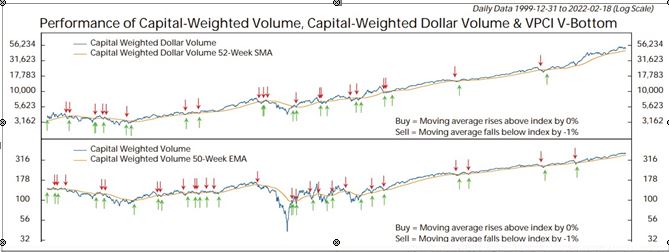
Likewise, referencing the second panel, the number of shares being purchased (Capital Weighted Volume) also remains above its intermediate term trend. Together, these two charts confirm that although the market is presently experiencing a correction, our analysis indicates we are still in a bull market from a volume analysis perspective.
In our last edition of Volume Analysis on January 24, 2022, we concluded by identifying 4,315 as a major S&P 500 support. Referencing chart three again, on January 24 through January 28, the S&P 500 tested this 4,315 support level daily. Each of these days, the S&P 500 temporarily broke 4,315 but then rallied to close above it. Moving forward, this buying action solidifies 4,315 as being an important level for the bulls to hold. The next support level is the recent intraday low of 4,225 and, if broken, look for 4,050 for additional support.
Overall, in our return from orbit, nailing the landing is a difficult proposition. Yet it is an exercise that must be successfully accomplished to keep the economy roaring while taming inflation. The expectation of possible Federal Reserve hawkish action is presently applying pressure to the financial markets.
Although I expect a lot of turbulence, sentiment and volume analysis suggest much of those negative impacts may already be priced into the market. That stated, the capital flows are nearing important trend levels which, if broken, could shift this correction into bear market territory. Until then, dips into support levels appear cautiously buyable, assuming risk management strategies are employed.
Learn more about Buff Dormeier here.


