

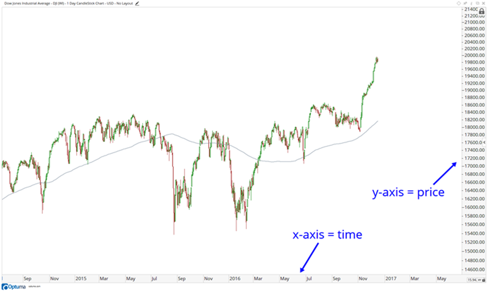
The first thing we want to do is determine what all the numbers and letters represent, states JC Parets of AllStarCharts.com.
As you can see here, the y-axis is the vertical data set on the right representing price. The x-axis is the horizontal data set on the bottom representing time. As the time goes by, the chart is plotted to the right of the previous period.
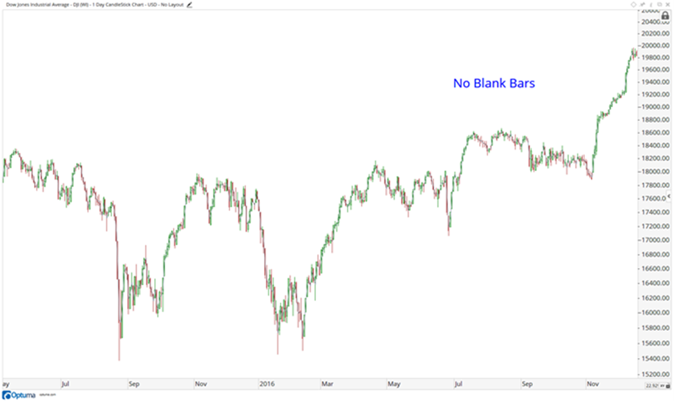
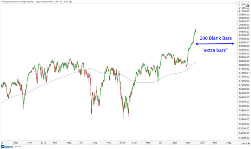
Notice how I leave room between price and the y-axis. This is done purposely to allow for a visible area to determine the direction of the next price movements. These are called “Blank Bars” or “Extra Bars”. Look at a chart without any extra bars:
Part Two next week will go into more detail.
Learn more about JC Parets at AllStarCharts.com.


