

Next, I’d like to discuss the differences between a semi-log chart and an arithmetic scale chart, states JC Parets of AllStarCharts.com.
When you are using an arithmetic scale chart, you are visualizing price in a linear format. This is traditional when looking at, say, time and temperature. Linear case, that we refer to as an arithmetic scale, represents absolute price changes. So, the vertical distance between $5 and $10, although a 100% move, appears the same on the chart as the vertical distance between $50 to $55, which only represents a 10% move.
Semi-log charts show the logarithmic scale on the y-axis. These are therefore sometimes referred to as “Percentage Charts”. The vertical distance between $5 and $10 is the same as $50 to $100 since both represent a 100% move in price.
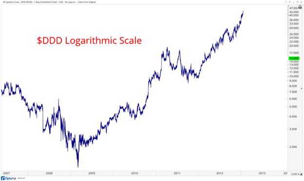
Logarithmic Chart
Here is a good example of 3D Systems (DDD) using a logarithmic scale. Look how the price changes closer to the bottom of the y-axis are much further apart than the price figures towards the top. This is because the logarithmic scale shows percentage changes
Arithmetic Chart
Here is the same exact chart as above but except using Arithmetic price scale. Below is the Arithmetic scale, or linear chart format.
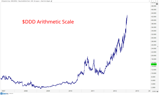
Notice how you barely even see the price changes in 2008-2009. How much better does this look on a logarithmic scale?
You can see what happened in 2008-2009. You see, the problem with the linear charts using an arithmetic scale is that they improperly exaggerate the top end of the axis but hide valuable information towards the lower end.
Learn more about JC Parets at AllStarCharts.com.


