

I prefer to use Logarithmic charts as the default. This is especially the case for long-term charts with a lot of data and for charts that have very wide swings in price from high to low, states JC Parets of AllStarCharts.com.
I had the opportunity to interview one of the founding fathers of the Market Technicians Association, Alan Shaw, about this very subject. I recommend watching this. He spent 46 years as an analyst on Wall Street, so he talks about some old school stuff.
He makes a great point during the interview that for day traders, log-scale charts are irrelevant. They’re trying to make points on a stock. But for any kind of intermediate or long-term perspective, logarithmic scale charts are not only incredibly valuable, but a necessity.
How else can we really get the real perspective on the direction of the primary trend?
Over the years, I’ve been lucky enough to become friends with some of the smartest technicians in the world. One time I reached out to them to hear their thoughts on the subject of Arithmetic vs Logarithmic scale charts.
Using Multiple Timeframes
We always want to incorporate multiple timeframes in our analysis. This is part of the top/down approach. First, we start with a longer-term view, formulate a thesis, and then work our way down to a shorter-term timeframe. The first thing you need to do is define your time horizon. Are you swing trader looking at 30-minute and 65-minute charts? Or are you a longer-term investor looking at weekly and monthly charts? I personally look out weeks and months at a time, so I use a daily time frame.
Therefore, I need to go one level higher to get my longer-term view, so I use weekly charts. If you are a day-trader, you can use daily charts to get a longer-term perspective on price levels. If you’re a longer-term investor looking at weekly charts, you can go further and look at monthly charts to get longer-term perspective. The whole idea is to use multiple timeframes, preferably no more than two or three.
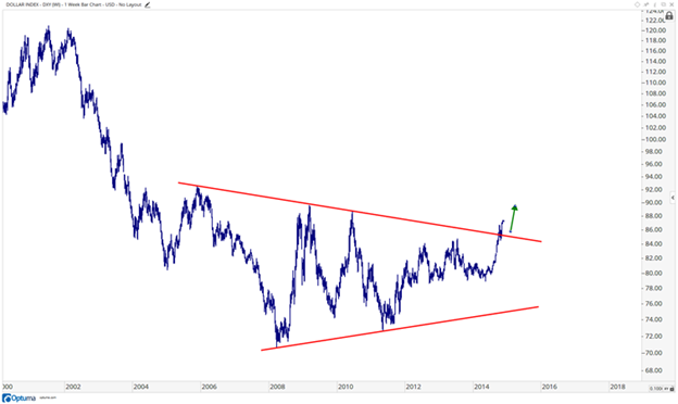
So here we’re looking at the US Dollar breaking out in 2014 above a downtrend from the 2005 highs. We look to this as a bullish development, and US Dollars (USDX) are coming out of a huge base.
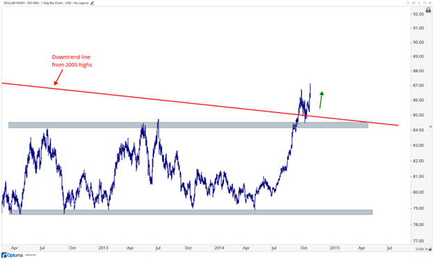
Then you work your way down to the daily timeframe and see the US Dollar not only breaking out above that downtrend line shown above, but coming out of a shorter-term range as well between 79 and 84. Both timeframes are showing bullish developments.
Incorporating multiple timeframes is a vital part of my process. I would encourage everyone to regularly take a step back and look at the markets you are focused on from a bigger picture perspective.
I asked my friend Brian Shannon at Alphatrends, who originally inspired me to consistently use multiple timeframes in my technical analysis, to send you a message about the subject. Here is what he had to say:
Multiple period analysis gives you an opportunity to “see inside” a larger trend to improve your timing, which means less risk and better profit potential.
Using a minimum of three time frames:
1. Identify the opportunity on a long-term chart (200-days or more) to identify the bigger trend.
2. Anticipate entry on the intermediate-term trend (30-50 days using 30- or 65-min period) to establish our risk/reward.
3. Participate (buy or sell short) on a shorter-term period (10-15 days using a 15-minute period or lower) to fine tune our entry.
Multiple period analysis can (and should) be used for any market participant, regardless of your time frame!
Brian explains this concept perfectly. He has a shorter-time horizon than I do, but the psychology is the same. We want to start from the top and work our way down. I like starting 10-20 years back, then working our way to what is happening the past couple of years, and finally to the past few quarters. This helps identify the direction of the primary trend and can put us in a position to trade in the direction of the long-term, intermediate-term, and short-term trends. Having all that wind behind us is a huge advantage. Without using multiple timeframes, it becomes impossible to do that.
Price-Only vs Dividend-Adjusted Charts
There is no easy answer in technical analysis. This is not science where two + three always equals five. Or force = mass x acceleration. I have always considered what we do as more of an art. Howard Lindzon calls it “Chart Art”. Others call it "Data Visualization". Whichever nomenclature you prefer, it doesn’t change the fact that you can ask ten technicians a question about a stock and get ten different answers.
In my experience, price is what pays. We remember what we paid for it, not how much money we’ve made or lost. It is not the total return we’re concerned about when it comes to supply and demand dynamics, it’s the absolute price. So, while a few people like to adjust their charts for dividends, I choose not to. I want to look for absolute levels of support and resistance, not distorted ones.
Learn more about JC Parets at AllStarCharts.com.


