

Moving averages are just a smoothing mechanism, states JC Parets of AllStarCharts.com.
I prefer to use a 200-period simple moving average. When I say “period”, I mean that when we are looking at a chart with daily timeframes, I use a 200-day moving average and when I look at weekly timeframes, I’m using a 200-week moving average. The formula is very easy. You’re adding up the closing prices for the previous 200 periods and then dividing that total by 200. Every time a new period ends, you take the new data point, add it to the equation, and eliminate the data from 200 periods ago. As time goes on, the smoothing mechanism “moves”, which I suppose is why they call it a moving average.
Moving Averages are not for Support and Resistance purposes. Almost consider it an invisible line. We only use it as a supplement price when identifying price trends.
Indicator Windows
I’ll use additional windows in my charts primarily for four reasons: Relative Strength Analysis, Momentum Readings, Correlations, and Breadth Analysis. If you have a custom indicator that you’ve built, this is where it would likely be plotted. With improvements in technology, I’m seeing more and more indicators plotted directly on the price scale itself. I’m personally not a fan of all that clutter. I would prefer a single indicator below, and if I need to see something else then I’ll just create another chart. Don’t be lazy!
Relative Strength
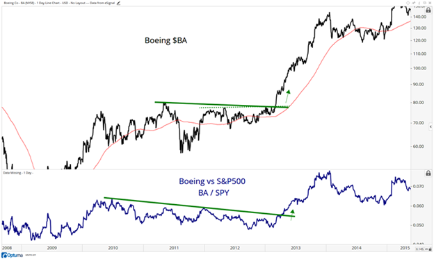
Here you can see a chart of Boeing breaking out in early 2013. Plotted in the window below the price window is the relative strength of Boeing (BA) vs the S&P 500 (SPX) also breaking out. We get powerful signals when both happen simultaneously.
Momentum
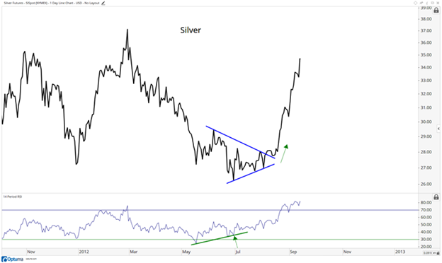
Here you can see Silver (SLV) in 2012 with momentum plotted in the window below. This is another window that you’ll often find in my charts. In this case, we’re looking at momentum putting in a bullish divergence at the late June lows. This was a warning of a change in trend and sure enough, a few months later, silver saw an epic rally into the Fall.
For momentum I use a Relative Strength Index, it’s an RSI. I prefer 14 Periods. When I say Relative Strength Index, I don’t mean Relative Strength which is one security relative to another. In the case of the RSI, we’re referring to a momentum oscillator. In reference to Periods, we use 14 weeks for weekly charts and 14 days for daily charts. The RSI moves from zero to 100, which means that it is an oscillator. We get much more into this in the Momentum Module.
Correlation Analysis
The third way that I use an additional window is for correlation analysis. When certain assets move together with others, you’ll often see one move before the other. This intermarket analysis really helps to understand how money is flowing. I use it consistently throughout my entire process.
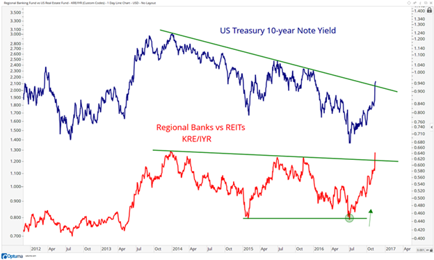
Here we’re looking at a chart of US Interest Rates at the top and then at the bottom is a ratio of US Regional Banks vs Real Estate Investment Trusts. As you can see, the two move very closely together. Regional Banks benefit from higher rates while REITs become a nice alternative to bonds if rates are falling. So the ratio between the two is a good indication of where the market thinks rates are going. You can see them breaking out simultaneously in early November of 2016
Breadth
Finally, breadth is another important aspect of the weight-of-the-evidence approach. With new highs in the indexes, we want to see an expansion of stocks participating to the upside making new highs as well. When fewer stocks are participating in the upside while the indexes make new highs, this divergence suggests the market breadth is thinning and fewer stocks are leading to the upside. This is the beginning of the end for market trends. Here are two examples of the Russell 3000 (RUT) in the Fall of 2015 and again in early 2016
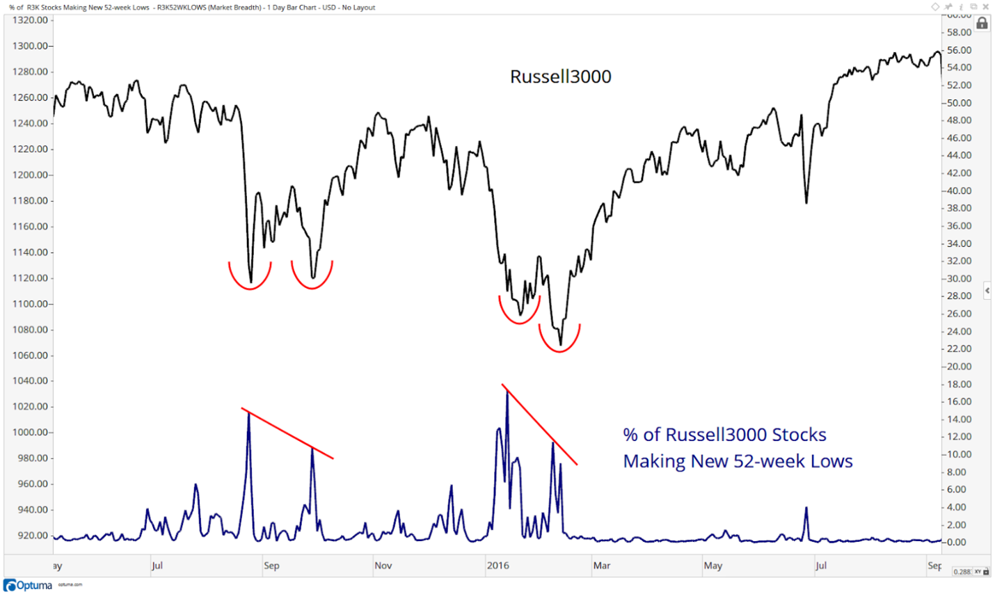
At the double bottom in August and September in 2015, you can see that on the September bottom, fewer stocks made new 52-week lows: Also in the February 2016 bottom, you can see how a fewer percentage of stocks in the index made new lows compared to January’s bottom. This improvement of breadth was a positive characteristic at a time of turbulence. Both of these set up terrific opportunities with well-calculated risk parameters.
I also like to compare the momentum of breadth. In other words, when prices make new lows and fewer stocks participate with downside momentum characteristics, that is a positive catalyst. Here is the S&P 1500 during the crash of 2008.
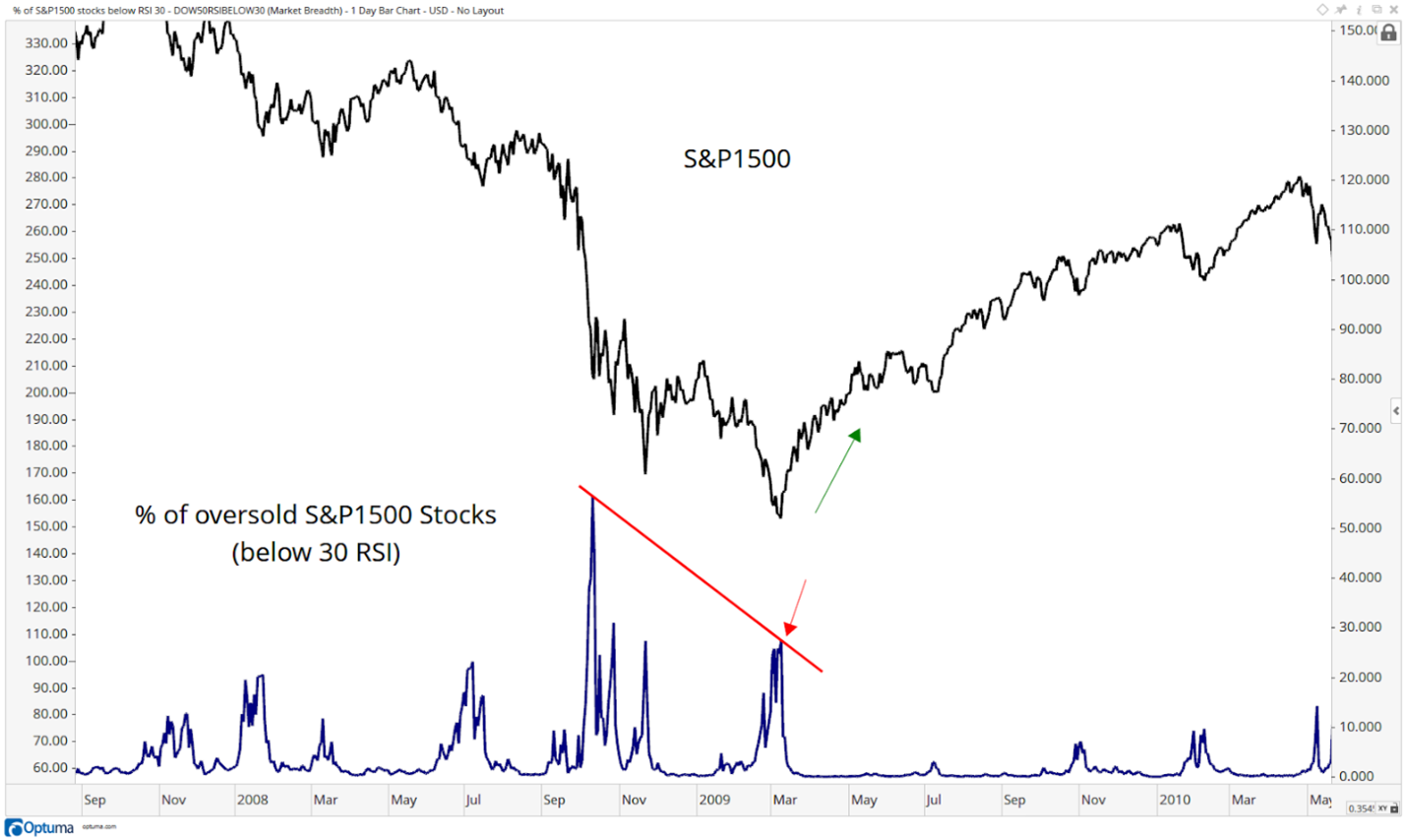
You can see that the real low was made in October. This was the bottom in the “market of stocks” when most stocks hit oversold conditions. The point is that we can use these charts to help visualize the changes in supply and demand dynamics.
Volume
So far, we’ve paid the most attention to the price. By now you may have noticed that I don’t use any volume on my charts. In some circles, this might be considered blasphemy. To that, I’ll say this: I think we can all agree that price is what pays. In fact, it is the only thing that pays. Therefore, by definition, volume is only a supplement to price itself. Again, we can all agree that there are many other supplements to price, like momentum, pattern recognition, sentiment, intermarket analysis, etc. But we don’t necessarily have to agree in which order of relevance these indicators should be put in, only that they are all a far second to price behavior itself.
I only use volume to check for liquidity. In my case, I deal with the most liquid markets in the world, stocks, ETFs, futures, and options, so I only need to worry about some ETFs and some options contracts. But for the most part, I’m good with respect to volume. I’m not managing $100 Billion dollars yet. I look forward to having that problem when I get there.
Also, on that note, I also think that volume can be seen elsewhere, not just in the stock. We often see huge trades going off in the options market that represents exponentially more in exposure, leverage, and risk. This isn’t seen in stocks. So, when Charles Dow wrote his tenets down in the Wall Street Journal in the 1880s, they didn’t have options contracts. The futures markets also weren’t what they are today, where you can leverage a fortune in S&P futures and hedge your portfolio or leverage it in one direction.
Clean Charts
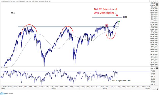
Finally, I want to be clear that we want to have our charts nice and clean. Have some respect for yourself and your work. My friend Howard Lindzon calls what we do “Chart Art”. We created a visual representation of supply and demand using the FTSE 100 (FTSE).
Let’s keep the focus on what we’re trying to accomplish here and not include extra distractions like too many moving averages or indicators.
This would be appropriate, for example:
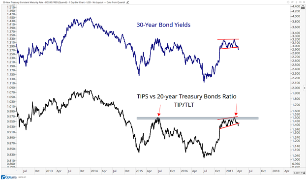
Or something like this where we’re comparing a couple of assets:
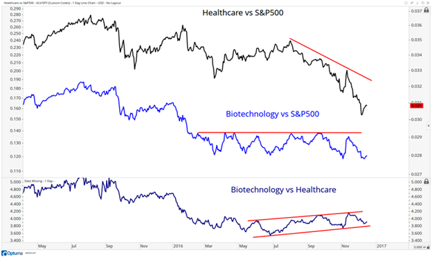
Here’s another one where we’re seeing the relative strength in Healthcare and Biotechnology, both against the S&P 500 and each other.
This is not the look we’re going for:
Or even something like this is way too much:
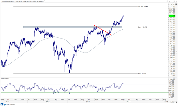
We’re looking for something like this. Much more reasonable:
Take pride in your work. Keep your charts clean!
For my charting software, over the years I’ve used Stockcharts.com, Bloomberg, Tradestation, and Thinkorswim. I have to say that Optuma is my favorite charting software by a long shot. Nothing even competes.
Learn more about JC Parets at AllStarCharts.com.


