
Welcome to your first “Chart of the Week” feature here in Trading Insights! I’m your MoneyShow Editor-in-Chief Mike Larson, and each week in your newsletter from here on out, I’ll share a chart that tells an important trading story.
It might give you insights into the outlook for a particular stock. It might illustrate what I’m seeing in a particular sector. It might take the form of a traditional stock chart that features a host of secondary momentum or trend indicators. Or like this week, it might be a chart showing the relative performance of different stocks or asset classes.
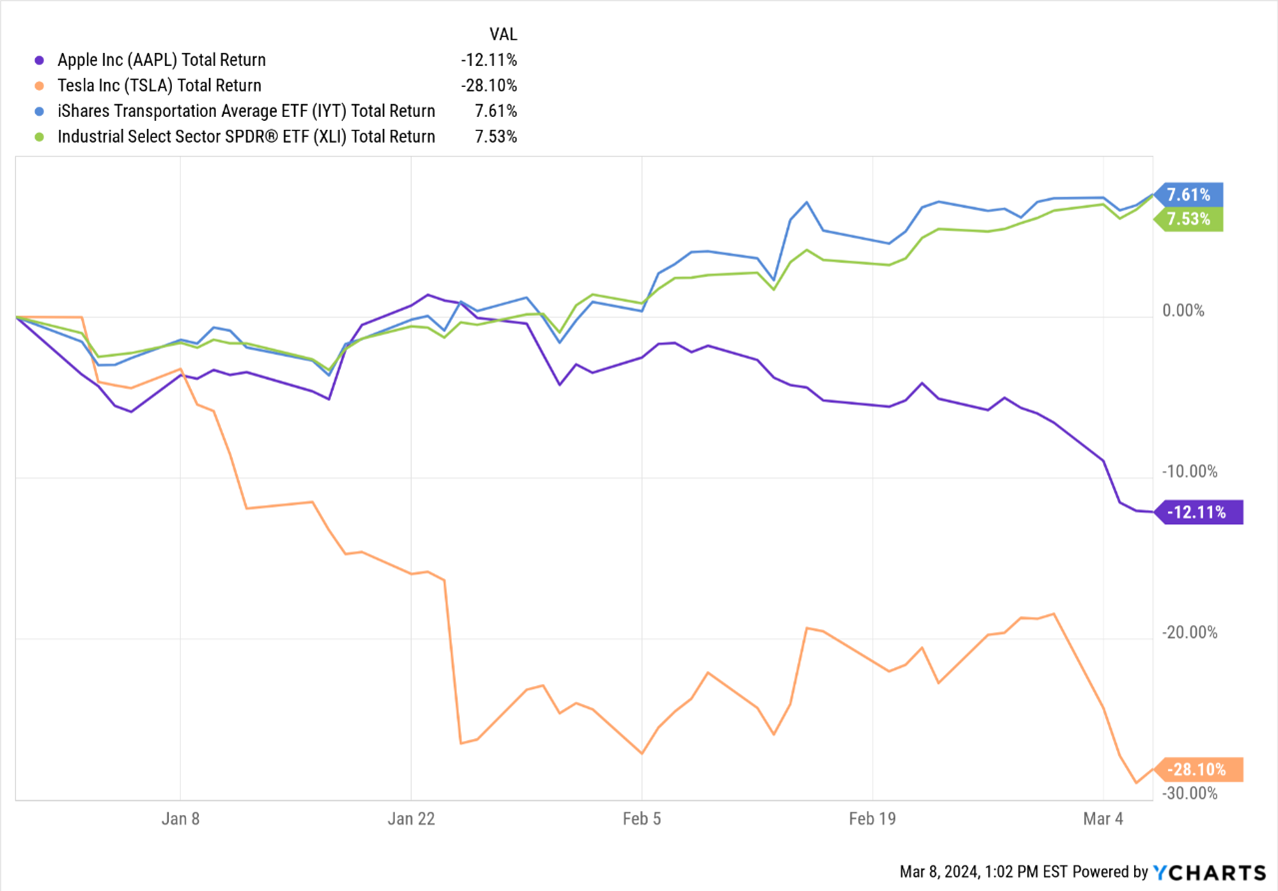
No matter the TYPE of chart, the PURPOSE will be the same: To illustrate an important trend – and show you how to capitalize on it. With that in mind, this one shows the year-to-date performance of Apple (AAPL), Tesla (TSLA), the Industrial Select Sector SPDR Fund (XLI), and the iShares Transportation Average ETF (IYT).
Source: YCharts
As you probably know, AAPL and TSLA are two of the “Magnificent Seven.” But they aren’t looking too magnificent these days – down around 12% and 28% YTD. The XLI and IYT, by contrast, are each UP more than 7%. This shows two things: 1) The trend of across-the-board, Mag 7 dominance is fading in 2024 AND 2) Other sectors and groups are taking the lead.
Industrials and transports are two examples. But I could have also shown the Financial Select Sector SPDR Fund (XLF), up 8%, or, say, the iShares Russell 2000 ETF (IWM), up almost 11%. Your best bet? Buy a ticket to “Rotation Nation” and start moving some money into NEW leaders for 2024 rather than just sticking with what used to work best.