
Price action can help traders in countless scenarios and James Stanley of DailyFX.com discusses the most basic premise that allows price action to work: supply and demand.
One of the most difficult aspects of learning to trade is finding which systems, strategies, or indicators might work best given your personal goals in the market. Surely, there are quite a few choices out there and there are numerous different ways of going about speculation in a market, making this ‘journey’ to find a personalized approach even more difficult.
Further exacerbating this issue is the topic of ‘lag,’ or the fact that any technical indicator that is used (or any strategy based around technical indicators) will be delayed in its responses. The reason for this is simple: To create an indicator, a series of past prices are used to compute its values which create a type of ‘averaging’ effect. This can be good in the fact that it can help to smooth out volatile events (after all, this is why people use moving averages in the first place), but it can be bad because this averaging effect (whether it’s with a moving average or RSI) introduces delays and lag to the trader.
This is where price action can help. Price action is the study of price and price alone in a market, with no indicators required. With price action, traders can look to grade trends and market conditions, enter and trigger positions, and manage the risk of their trading operations.
In this article, we’re going to examine the most basic premise that allows price action to work: Supply and Demand. Over the next seven follow-up articles, we’re going to dig deeper into price action with both analysis and strategy pieces.
The Most Basic Relationship in Markets: Supply and Demand
One of the best aspects of price action is that it offers traders a clean depiction of supply and demand at any one point in a market. As mentioned above, the lag introduced by indicators can create dissonance in a number of ways, least of which is allowing this ‘averaging’ effect to obscure the relevancy of near-term price movements.
Here’s an example: Imagine that we go into a Non-Farm Payrolls (NFP) report and the USDJPY has been stuck in a tight trading range for the past five months. So moving averages on the daily, and the weekly chart are both moving flat to reflect this lack of vertical movement on the chart. But when NFP is released, we receive a ‘blow out’ figure that far eclipses even the most bullish analyst expectations.
Once NFP is released and prices spike, do we still take into account the relevancy of the moving average values? Because surely the periods used in the calculation of that moving average before the NFP print are quite a bit less relevant than the periods since, given that there is now new information that can create additional supply or demand (and thereby create additional price movements).
Supply and demand is at the core of price action.
If there is more demand than supply—prices will go up. This isn’t just FX or financial markets or commodities: This is all-around us in the world we live in.
Those Rolling Stone Tickets? Ya, they’re sold out at the box office so you have to pay exorbitant prices on Stubhub. (Demand has outstripped supply so prices go up as sellers can command a premium)
And Rolling Stones ticket prices can be charted just like this hourly chart on USDJPY:
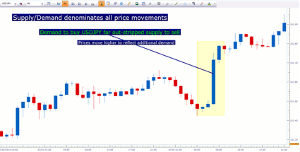
Created with Marketscope/Trading Station II; prepared by James
Stanley
Click to Enlarge
Next Page: Relating Supply and Demand to Trend Identification
|pagebreak|Relating Supply and Demand to Trend Identification
But
it takes a lot more than just one instance of higher prices to denote a trend,
right? Otherwise, we’re seeing an anomaly that may be irrelevant to our goals of
analyzing a market. So we have to look at each of these price movements with
relative scope.
For a trend to take place, we need progressively higher (or lower) prices to continue for a prolonged period of time. Once we zoom out on the chart to see what this price spike means relative to previous price movements, we can get a significantly better view of what’s taking place in that market:
Higher-highs and higher-lows highlight up-trend in the US Dollar 15-minute chart
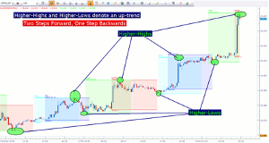
Created with Marketscope/Trading Station II; prepared by James
Stanley
Click to Enlarge
In the chart above, we take a look at an up-trend and as you can see, the market made progressively higher-highs and lower-lows over a prolonged period of time. We can reverse this relationship to investigate down-trends:
Lower-lows and lower-highs accent down-trend in AUDUSD
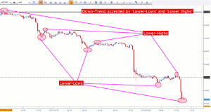
Created with Marketscope/Trading Station II; prepared by James
Stanley
Click to Enlarge
As you can see from the above charts, trend identification with price action is relatively simple, and maybe more importantly than that, it makes sense. Indicators can have a tendency to obscure the trend given the lag or disconnect involved, making them somewhat esoteric for many trader’s purposes.
But a bigger question must be asked; and this is applicable to not just price action but Technical Analysis in general: Which time frame is best for grading the trend?
As an example—if you look back to the second chart in this article, the US Dollar 15-minute chart, you’ll notice that the uptrend seems fairly robust. Higher-highs and higher-lows show prices tearing away on the 15-minute chart, but if you backed out to the weekly chart, you’ll notice a significantly different picture:
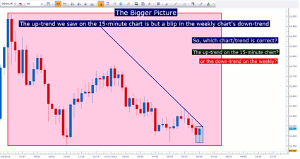
Created with Marketscope/Trading Station II; prepared by James
Stanley
Click to Enlarge
This is the conundrum of time frames, and brings up the old saying ‘if you want to find a trend, just change the time frame.’
But which of these is the correct trend? And more importantly, which ones should traders follow? Think about these questions in scope of your personal approach, because there isn’t one ‘right’ answer here.
The best answer is based on you, and your approach, and your desired holding-time for trades.
Traders can look to utilize two time frames in an effort to both ‘see the bigger picture’ while focusing on a shorter-term chart that can allow entry possibilities in scope of the bigger-picture trends or moves.
There’s somewhat of a sweet-spot here: If your time frames are too far apart, then price action may feel disconnected between the trend and entry charts; if they’re too close together than you’ll lose some of the benefit of the analysis.
We propose that traders should look for a ratio between 1:4 and 1:6 between time frames, as shown in the table below.

Taken from The Time Frames of Trading
Click to Enlarge
This would mean that if you’re looking to enter trades on the hourly chart, you can use the 4-hour chart to see the bigger picture trend. If you’re using the daily chart to enter positions, you can look to the weekly for trend analysis.
Before employing any of the mentioned methods, traders should first test on a demo account. The demo account is free; features live prices, and can be a phenomenal testing ground for new strategies and methods.
By James Stanley, Trading Instructor, DailyFX.com