
It is crucial to properly analyze an automated trading system before buying, and especially before trading with it. Here are two critical performance measures that should be part of any evaluation process.
There are tons of useful features for traders of all types in the latest version of TradeStation 9, particularly for those who are serious about system development and deployment. The performance graphs tab within the TradeStation Strategy Performance Report contains no less than eight different performance charts for any given system, each of which gives a unique insight into the inner workings of the system.
See video: Make Automated Trading Work for You
Here’s a comparison of the equity curve and the average profit by month performance graphs. Let’s see if there are meaningful differences in these visual displays of system output and how we might interpret such differences.
The detailed equity curve chart may not always be the prettiest thing to look at, but it can at least help you come to terms with the realities of trading a system:
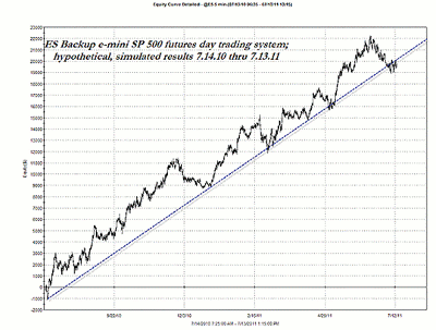
Click to Enlarge
The image above is the detailed equity curve line for this particular e-mini S&P futures daytrading system, covering a full year of backtested, hypothetical performance across 311 trades. Overall, it looks pretty good, despite a couple of meaningful drawdown periods along the way.
This particular graph reveals all of the true nature of any given system, especially because it depicts the maximum intra-trade drawdown prior to final trade closeout. This is, by the way, one of the most vital charts available in the TradeStation performance summary, and will help keep you focused on the harsh realities of trade system performance.
NEXT: Another Telling Method for Analyzing Performance Data
|pagebreak|Now we migrate to the next graph (below), which simply depicts the performance of the same exact system over the same exact time series (a full 12 months), but which instead uses monthly histogram bars to display the data:
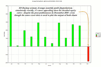
Click to Enlarge
This monthly system performance histogram uses the exact same data and time window as the previous chart, but its visual output would seem to be far more appealing to the average trader. Using both graphs would be far preferable to relying on either one alone.
Note how much more visually appealing this graph is, especially because of the string of 11 unbroken green (profitable) monthly histogram bars. The one for December is a real drag, but overall, any trader looking for a decent system would likely still be more than a little interested to learn more about this particular e-mini system.
The big idea here is this: Get all of the information you can before deciding to go ahead and trade, lease, subscribe to, or even buy a trading system.
Imagine having only looked at the lovely histogram graph for this system without having witnessed the occasional ugliness of the more informative and detailed equity curve graph as well.
Take plenty of time and go through as much performance summary data as is humanly possible in order to help set yourself up with a winning, reliable trading system. A little extra time spent up front could help eliminate some nasty surprises later on down the road.
By Don Pendergast of Linear Trading Systems, LLC


