
The current market picture is not the sign of strength we would like to see during a strong, sustained bull market, writes Corey Rosenbloom of AfraidToTrade.com, and below he examines several sector charts.
While we may have heard headlines discussing the outperformance of “defensive” sectors, let’s take a brief moment to view the updated sector rotation charts and pinpoint where the money is flowing in terms of broad sector performance.
Let’s start with a line chart and then move to finer details:
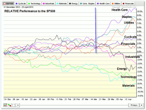
Click to Enlarge
We’re seeing StockCharts data (PerfChart) with the nine major AMEX Sector SPDR ETFs (XLK for technology, XLE for energy, etc) on a line graph starting with the percentage comparison at the beginning of 2013 (and ending on April 24).
The chart shows relative performance to the SP500, not absolute performance, by which we can compare which sectors are “outperforming” or “underperforming” the others relative to the performance of the SP500.
Take for example the Health Care ETF (XLV), which has outperformed the SP500 year to date by 11%.
As we’ll see shortly, the SP 500 has increased roughly 10% this year while the XLV ETF increased 21% (making the relative performance metric 11%).
It’s true what they say—defensive sectors have clearly outperformed their offensive or “risk-on” counterparts year to date.
The two other defensive sectors—consumer staples (XLP) and utilities (XLU)—have outperformed the SP500 by 8.5% and 7.0% respectively.
There are only two additional sectors that have outperformed the 10% SP500 increase this year and the relative strength comes from cyclicals (consumer discretionary—XLY) and financials (XLF).
All other “risk-on” or offensive sectors—while positive for the year—underperformed the SP500, which we can see clearly in the bar chart below:
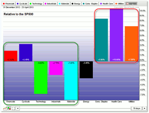
Click to Enlarge
The bar chart above shows the same data, only we summarize the year-to-date performance with a bar graph instead of a line graph.
The green box represents the offensive sector group (financials, cyclicals, technology, industrials, and materials) while the red box highlights the relative-strength winners—staples, health care, and utilities.
Finally, we can view the absolute performance of all sectors and the SP500 as a reference:
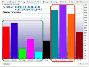
Click to Enlarge
Sector rotation strategies build on the logic that some sectors are stronger than others at key points in the market and economic cycle while some are weaker and these trends can be identified using performance charts like these (along with following price trends on charts).
By assessing ongoing performance and trends in sector behavior, we can increase odds of a winning swing trade or investment or else use hedging logic (playing strong stocks in strong sectors against weak stocks in weak sectors).
The current picture is not the sign of strength we would like to see during a strong, sustained bull market. Instead, it reflects widespread caution and defensive postures within the stock market allocation portion of portfolios.
If investors are worried about the economy or stock market performance in the future, they can decide to rotate money out of the stock market (and perhaps into the bond market or into a cash equivalent) or else remain invested (or allocated), yet do so in defensive names, which typically have higher dividends and experience less volatility than higher-beta stocks (like technology).
By Corey Rosenbloom, CMT, Trader and Blogger, AfraidToTrade.com


