
The Mass Index measures the narrowing and widening of the range between the high and low prices, it doesn’t tell the direction of the trend change, but since questions were raised last week, MoneyShow’s Tom Aspray goes into further detail about the signals from this indicator.
In last Friday’s Week Ahead column, I featured a weekly chart of the Dow Industrials with the Mass Index that raised some questions.
I wrote about this technical indicator in Power Your Portfolio with the Mass Index. As I noted then, it “first appeared in the June ‘92 Technical Analysis of Stocks & Commodities article The Mass Index, by Donald Dorsey.” As he said in the article, "Range oscillation, not often covered by students of technical analysis, delves into repetitive market patterns during which the daily trading range narrows and widens. Examining this pattern, Donald Dorsey explains, allows the technician to forecast market reversals that other indicators may miss.” Dorsey uses range oscillators in his Mass Index.
It measures the narrowing and widening of the range between the high and low prices, it does not tell you the direction of the trend change. For the direction of the intermediate trend I use two indicators that I have used since the 1980s, the on-balance-volume and the NYSE A/D Line.
The long-term chart I shared last week clearly reflected the powerful rally in the Dow Industrials, or SPDR Dow Jones Industrial (DIA), over the past three years. Therefore, some apparently assumed that the trend change was from up to down, but the other intermediate-term indicators do point to the upside as I provided some upside targets for the major market tracking ETFs last week.
Let’s take a closer look at the signals from the Mass Index.
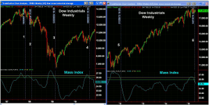
Click to Enlarge
Chart Analysis: The left hand side of the chart covers the period from 2007 through August of 2010.
- A trend change signal occurs when the Mass Index first moves above the yellow line at 27 and then drops below the green line at 26.5.
- The Mass Index moved above the yellow line on August 3 and the first trend change signal occurred on October 26, 2007 (line 1) when it dropped back below the green line.
- This occurred just two weeks after the bull market high on October 12.
- A second trend change came on February 8, 2008 (line 2) and by then the NYSE A/D line had already topped out.
- The next signal came on February 20, 2009 (line 3) as the Mass Index moved above the yellow line the previous October. The Dow Industrials made their low on March 6, 2009.
- The weekly NYSE A/D line completed its bottom formation in April.
- The Dow Industrials topped out in April 2010 and then on August 20 (line 4) a new trend change signal was generated.
The Mass Index did not again move above the yellow line again until August 2011 as the stock market was dropping sharply over the debt crisis.
- It did not generate a trend change signal until January 20, 2012 (line 5).
- This signal stayed in effect until April 10, 2015.
- The Mass Index moved above 27 (yellow line) on February 6, 2015 setting the stage for a new trend signal.
- Given the recent new high in the NYSE A/D line, the most recent trend change signal is likely to mean another move to the upside.
- This, of course, could change in the next few months as it would take at least that long for the A/D line to complete a top.
What it Means: It could take until later this year to fully assess the value of this most recent signal from the Mass Index. But if the major averages do stage a more significant upside breakout in the coming weeks, it will clearly favor the bullish scenario.
The market’s strength Thursday—if followed by a strong weekly close—will be positive.
This indicator does also work on stocks and Apple, Inc. (AAPL)—which was recently recommended—also generated a Mass Index trend change signal on April 10, 2015.
How to Profit: No new recommendation.


