
One of the many ways we have illustrated this bizarre and extended environment is our chart featuring a 5% “regression” line dating back well over a century, explains Alan Newman, a long term market timing specialist and editor of CrossCurrents.
Why 5%? If stocks are truly all about the quest for value, the objective must be to invest for the long term. Believe it or not, the average annual gain for stocks over every single rolling ten year period is only 5.24%. Close enough.
Our chart (see below) shows the Dow Industrials under the 5% line 72.5% of the time back to 1897! The regression line now stands at 18,143, down 48.3% from the recent close.
Despite our line at 5% annually a bit lower than the 5.24% average, we expect the Dow will eventually return to the line and likely sooner, rather than later.
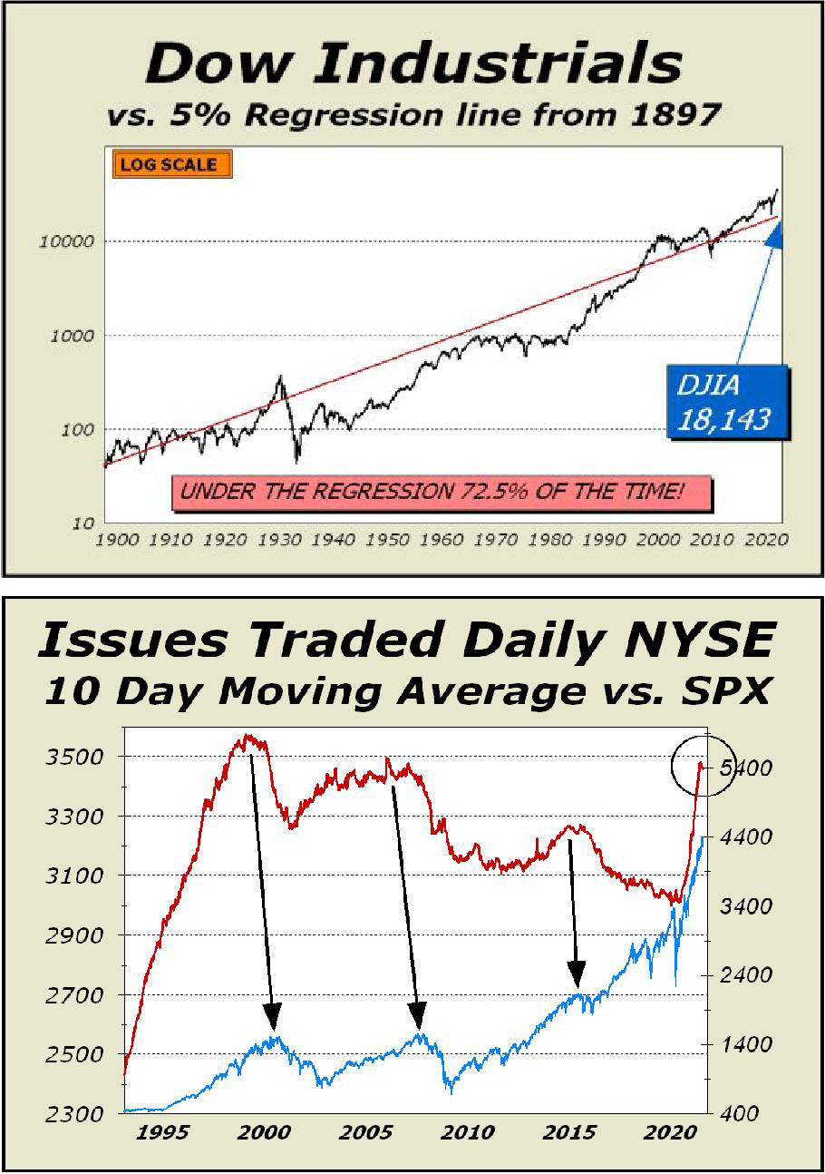
Moreover, we expect the Dow to penetrate the line as it did most recently in late November 2011. Despite the Dow trading well above the regression line consistently since the mid-to-late 1990s, there is no new paradigm that will afford stocks a permanently elevated average annualized gain higher than history has show is the norm.
How can we say that? Easy. In the same period, the two resoundingly savage bear markets of 2000-2002 and 2008- 2009 each cut prices in half.
The S&P 500 peak in 2000 was not exceeded until October 2007, a rather punishing wait for perma bulls. We wrote this; “And that’s not the bad news. The 2000 and 2007 manic peaks were not exceeded on a regular basis until March 11, 2013. You read that right. If you bought the S&P at the height of the tech mania, you were underwater for almost every day for the next 13 years!"
Garden variety bear markets — those down perhaps 20% to 35% — wind up just being a modest, albeit painful, exercise in patience. A simple Google search shows the average bear market lasts less than ten months, significantly less than the last two bears.
The same search for bull markets shows an average length of 2.7 years, also significantly less than the last two bulls. The 2020 sell off lasted only 33 days, so far from a normal duration that we hesitate to call it a true bear market.
It was so sudden and short that most professionals were caught like the proverbial Deer in the headlights, unable to comprehend the matter at hand. There were only three weeks in which advisory sentiment tallied more bears than bulls and by the first such tally, prices had already crashed to levels previously seen 39 months earlier.
Think about this; at the end of the 39 months, the Dow Industrials were no higher than at the start, yet there were a total of only four weeks in which more bears were tallied than bulls. Four weeks out of 172 tallies!
Wall Street has so inundated the public and professionals alike that no one dares dispute the common “wisdom” that stocks always go up in the long term. Everyone seems to be a believer, yet the aphorism is hopelessly inaccurate.
Our choice of aphorisms is “the Devil is in the details,” and that goes a lot further in nailing down fact. The 13 year waiting period from the 2000 peak to 2013 is just one example. The Dow’s September 1929 high was not exceeded until November 1954, a 25 year hiatus.
The all-time record holder is Japan’s Nikkei 225 Index, which peaked at 38,957 on December 29, 1989 and closed Friday at 27,548, still down 29.3% closing in on 32 years later.
With valuations at historically extreme levels, either the worst or second worst in history, the only rational conclusion is that stocks have already priced in their potential for at least the decade ahead.
While we cannot guarantee the market's latest high will hold and a bear market will immediately ensure, we are quite confident that the S&P 500, the Nasdaq Composite and the Dow Industrials will all be lower ten years from today. At bottom center, it takes sustained investor interest to sustain a bull market.
As prices rise, we see more initial public offerings take place. As well, even long ignored issues come to life and trade. The rising tide of issues traded are a hallmark of a bull market. Clearly, peaks in interest are closely aligned with peaks in price.
Margin debt rose 2.4% in June to another record high of $882.1 billion, the 16th consecutive month of new record highs. Similar expansions in the use of leverage in 2000 and 2007 were followed by two of the worst bear markets in history, both down 50%.
The red line on our net liquidity chart below measures the absolute level of cash for mutual funds minus margin debt. We recently added the green line, which includes net wealth (dollar capitalization) created in Bitcoin. Bitcoin wealth represents a possible source of cash to buy stocks or more importantly, the confidence speculators required to leverage.
We believe the chart is a valid concept and it scares the hell out of us. Wild optimism killed stocks at the 2000 peak. Record leverage killed stocks in 2008. We now have both.
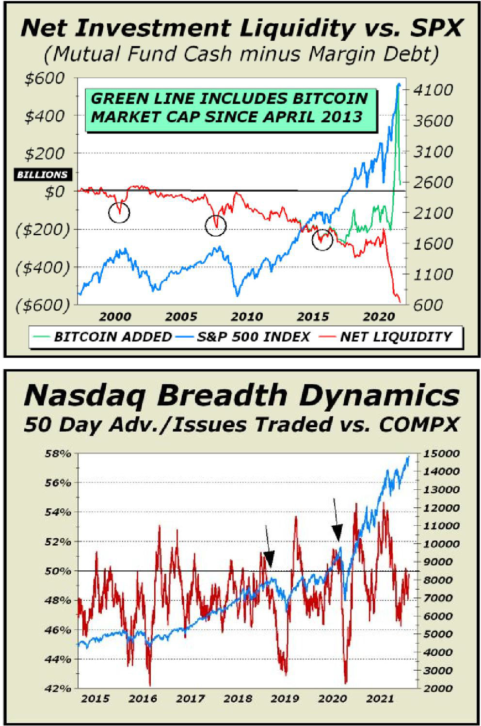
Our second chart (above) attempts to identify trend changes for the intermediate term, which we arbitrarily place at 50 trading days. We look for divergences primarily but changes in the market’s character are usually easy to spot. The black arrows point to price peaks and look where our red line is at the peak — already on the way down.
That is a significant change in character. Despite a rally continuation, breadth did not follow through. Most recently, it appears the bull is having a lot of difficulty in pushing stocks to advance on a daily basis. Typically, when the red line is rising, you can expect prices will continue to rise.
We’re clearly missing that particular confirmation of the bull trend and are sufficiently concerned to identify the present situation as similar to the two previous highlighted peaks.
More proof of the mania arrives this week with the IPO of Robinhood stock, with roughly one-third sold to their account holders. Nearly half of all new brokerage accounts in the U.S. between 2016 and now were opened by Robinhood. Neophytes driving prices we suppose and maybe using margin for effect?
The valuation of $35 billion for the company is based on the valuation of TD Ameritrade (AMTD) selling at 26 times revenues only months before the tech mania peak. AMTD peaked at roughly $63 per share in April 1999 and never saw that price again. It last traded in September 2020 at $40 after being gobbled up by Charles Schwab. Some things never change.


