
There are many different types of indicators and chart patterns on which market technicians focus when making trading decisions, and many ways to interpret them. That is why technical analysis is truly an art. The key is to be able to recognize these patterns and implement a trading strategy based on what you think the charts are telling you will happen next. You must have a good understanding of the basic patterns before you can develop a strategy to give you a potential edge. When you combine a couple of these different methods, you really unlock the power of technical analysis.
The Trend Line
You probably know the classic adage ”The trend is your friend.” There are dangers to fighting the trend. It leaves you with headaches and sleepless nights, wondering why you went against it. Sometimes the trend isn’t all that easy to identify, but it can help to look at charts over several time frames.
The trend line is one of the most basic charting tools. These are lines drawn across successively higher bottoms in bullish markets (moving up from lower left to top right), or successively lower tops in bearish markets (moving down from upper left to bottom right). A bullish trend is indicated by a series of higher highs and higher lows, and a bearish trend by lower highs and lower lows. Look for three good tests of support or resistance. Breaking through a trend line is an important signal that a trend is coming to an end.
You can see the trend in a very basic chart of the euro futures contract below. In this case, I am looking at a daily continuous chart. The key to determining whether this is in fact a solid bullish trend is to look for three tests of support. To the far right of the chart, we see a possible shift in the long-term trend. The market declines to a key support point, then bounces without much follow through—trading in an up-down-up-down pattern. To signal a shift in trend, you want to look for two days of lower closes, with the second low below the previous day’s low. We can see in this euro chart how the market broke through the trend line in December 2009.
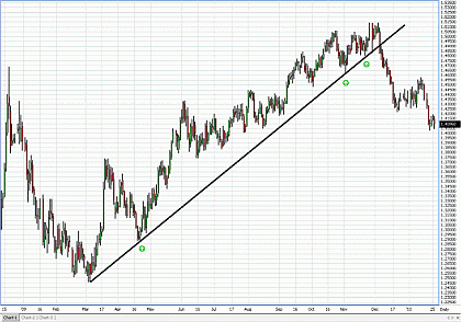
Click to Enlarge
Retracements
A retracement is a significant price adjustment of an existing trend. Traders commonly focus on Fibonacci retracements, and the three main levels are 38%, 50%, and 62% of a prior move. I’m not going to get into all the complexities of Fibonacci analysis—just know what these levels are, and what price points coincide with them in the market you are trading. They are key levels that act as a gravitational pull.
A two-day close through one retracement level can signal that the market’s next move could likely be to the next retracement level. When a market closes below the 38% retracement for two days, we’ll often see a quick move down to the 50% level because so many professional traders are watching and trading based on these levels. Participants may also try to defend these levels for as long as possible to minimize their losses on positions.
Looking at the euro again, I will add the Fibonacci retracements to the chart. You can see the move up from low at about 1.2460 in March 2009 to the high at about 1.51476 in November. As the market fell from that high in mid-December, participants seemed to defend the 38% retracement level, which held as support as the market traded in a consolidation pattern for a while. As a trader, you would want to watch for a two-day close below the 38% retracement level (which comes in around 1.41209). If this occurs, the market is likely to struggle and could head down to the 50% retracement level near 1.38038.
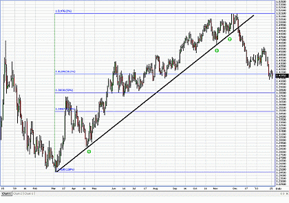
Click to Enlarge
NEXT: Moving Averages, Trading Ranges, and More
|pagebreak|Moving Average Crossover
A moving average is the average value of a market’s price over a defined time period, and can mark important support and resistance levels in the market. The basic concept is to be long when the market is trading above the moving average, and short when below. The most common moving averages are the 50-, 100- and 200-day, although traders use other numbers. You can use whatever you are comfortable with to gain a unique edge.
The moving average crossover is a trend identification tool that compares different moving averages. It provides a trading signal when momentum shifts directions. When a shorter moving average crosses a longer one, the trend is seen as up. When a shorter moving average crosses below a longer one, the trend is seen as down.
Moving averages do give a delayed signal, because they are computed using historical data. Using end-of-day data is more useful for some traders, because there can be an intraday crossover that could give a less reliable signal.
In the euro chart, we did see the 50-day moving average cross the 100-day recently as the market broke down, and it seems as if a test of the 200-day moving average is around the corner. If the market trades under the 200-day for a few sessions, it reinforces a bearish shift we were seeing with our other indicators.
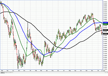
Click to Enlarge
Trading Range Breakout
A trading range breakout is a break outside of a congestion zone that contained price fluctuations for some time. I’m showing daily chart patterns that illustrate longer-term trends, but you can shorten the time horizon to a 60-minute, 15-minute or even a five-minute chart for very active, short-term trading strategies.
The types of breakouts you might see visible in chart patterns include pennants, flags, and triangles. The basic strategy is to buy or sell a two-day breakout to one side with a stop on the other side. (For a shorter-term strategy, focus on two bars instead of days.)
We can see an interesting breakout pattern in several markets in the summer of 2009. In the euro futures, we see the pennant start to narrow—it looked like do or die for the market. This type of pattern tends to move in the direction it had gone before.
We also see a flag formation to the far right of the screen. We have the pole coming down, a flag going sideways, and generally what happens is that the market will continue moving in the direction prior to the flag (the pole). The general rule is to look for a move of 50% of the pole. That would bring the market back to the 50% Fibonacci retracement level.
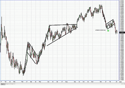
Click to Enlarge
Double Top and Double Bottom
A double top resembles the letter “M” and is marked by a resistance point that the market hits and then falls from, then rises back to the same resistance point or close to it, and falls again. A double bottom is the opposite of the pattern, resembling the letter “W.” Often, double tops and double bottoms lead to head-and-shoulders patterns. The head-and-shoulders top is represented by three prominent peaks, and at the bottom, there are three prominent lows.
The head-and-shoulders pattern is rarely in perfect symmetry. The first time the market makes the move, it retraces back, and the second time it tries to retest it, it’s typically not as high or low as the first peak or bottom. What tends to occur is that market participants will pile in the market on the first move. When the market reverses, half of the people take positions off and tend not to pile back in when the market reverses again. We can see these patterns in the euro chart below.
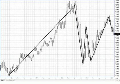
Click to Enlarge
Of course, it’s very easy to see patterns in hindsight. But it’s exciting to see them develop and anticipate how to trade them. Consider it a five-step process. Draw your trend line, then look at your retracements and moving average signals. Look also for chart patterns that indicate possible breakouts and for double tops and b double bottoms.
This is just a brief overview of the five basic chart types. There are many more complicated patterns you can learn about and perhaps incorporate into your trading. And of course, each individual will interpret what he/she sees on the chart in a unique way.
By Phil Streible of Lind-Waldock
Phil Streible is a Senior Market Strategist at Lind-Waldock. He can be reached at 800-803-8037 or via e-mail at pstreible@lind-waldock.com.


