
Most traders use charts as part of their methodology to determine when to enter or exit trades, but if you’re not careful, you can get fooled by the differing perspectives they display, says Brian Lund of BCLund.com.
We think of charts as being very objective, built on price and volume, technical data that is not open to interpretation. But no matter how much we try to convince ourselves of that, we have to understand and acknowledge that charts are ultimately a visual media, and as with everything that we use our eyes to analyze, there are ways that our perceptions can be altered.
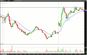
Take for example this five-minute chart of Cree Inc. (CREE) from last week.
Click to Enlarge
In a “post-opportunity” analysis it looks like a very clear set up, one that we surely would have taken if seen in real-time.
The Action
CREE gaps ups, pulls back slightly, and then rockets up to a resistance area. Price pulls back in and forms a nice green hammer right off the 20-period exponential moving average (ema) and above the opening range high (based on the first 15 minutes that the market is open). That hammer provides a good risk/reward entry with a reasonable target of the morning pivot high.
Different Perspective
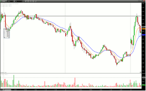
But let’s look at that same chart at the moment that the green hammer formed and with a little bit more back data.
Click to Enlarge
Now the trade doesn’t seem so obvious. The pullback seems steeper and there is no clear reason to assume it would make it to the morning pivot high.
Another Example
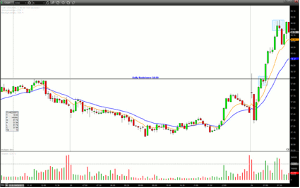
Let’s look at another example, also from last week, in Coach, Inc. (COH).
Click to Enlarge
Market Recap
COH gaps up and gets rejected at a daily resistance level. Price pulls back, but then reverses and makes a strong run back to that same resistance level, pausing to print a tight inside bar, before breaking out and running to new highs.
Once again, after the opportunity that tight inside bar looks like a no-brainer, creating an optimal risk/reward entry that of course all of us would have taken if caught in real-time.
Different View
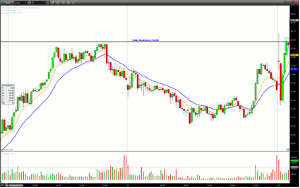
Now let’s look at the same chart but at the time of possible entry.
Click to Enlarge
That chart doesn’t look so obvious. Price is extended from the 9-ema and 20-ema and it appears as if the daily resistance has stopped its progress for a second time, creating a potential intraday double top.
Develop Objective Criteria
These examples show how important it is to review charts not only from an end- of-day viewpoint, but from one that is contemporaneous to the time of the potential trade. It also illustrates how important it is to have objective criteria to get you in and out of positions so that you don’t get fooled by the differing perspectives charts can show depending on the time and amount of data being used.
By Brian Lund of BCLund.com


