
The current bull market just keeps confounding the bears at every turn, and here, David Moenning of StateoftheMarkets.com offers his take on what can keep the party going on for a little while longer.
This just in... We interrupt your regularly scheduled review of the big-picture market environment models with...some good news. Yes, fans, the bulls appear to have rediscovered their mojo.
What a difference a few days makes in this business, right? Just about a week ago, traders were freaking out in response to David Tepper's suggestion that hedge funds shouldn't have the pedal to the metal at this time. Just like that, two days of hard-earned gains were reversed, the momentum stocks were back in the tank, and it looked like the bears were about to win the day.
But a funny thing happened on the way to the market debacle. It just didn't happen. Russia didn't annex Ukraine. The ECB started talking nice about improving Europe's economy. And the data in the US continued to come in above expectations.
On that note, the final GDP growth rate for Q1 is likely to come in below zero. But, the good news is that you can blame that on the weather. And the general consensus seems to be that Q2's growth rate for the economy might have a 4-handle on it. As such, investors are starting to realize that growth in the US might not be dead after all. And the bottom line is that with improving economic expectations comes higher stock prices—especially when expectations are low.
So, yes, Virginia, this is what a bull market looks like (see the chart below).
S&P 500 Weekly

Click to Enlarge
Based on the weekly chart of the S&P 500, you couldn't be blamed for wondering what all the fuss has been about lately.
While we have spent a fair amount of time looking at the same charts day in and day out lately (the S&P 500, NASDAQ, and micro-caps), the action over the past few days has been very important. So, before we get back to our review of the market environment models, let's run through the charts one more time and see what we can see. Because, as they say, a picture can indeed be worth a thousand words.
S&P 500 Daily
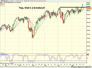
Click to Enlarge
After Friday, the key question was whether or not the S&P 500 had actually broken out of the recent resistance zone. Yes, the index did close at an all-time high, but you needed a magnifying glass to see it on a chart. And given that a little something called follow-through has been exceptionally tough to come by this year, well, a lot of folks had their doubts about Friday's rally.
NEXT PAGE: What About Tech & Micro-Caps?
|pagebreak|However, with Tuesday's gain tacked on, it is fairly clear that the S&P 500 has broken out to the upside. Therefore, the bulls will now be looking to defend their turf during the next bout of selling. The bottom line is that as long as the S&P 500 stays above 1900, the bulls can continue to claim possession of the ball.
NASDAQ Daily
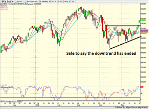
Click to Enlarge
Some will argue that the chart of the NASDAQ isn't nearly as compelling. Those seeing the glass as half empty will contend that the tech-heavy index is a long way from confirming the S&P's new high and as such, represents a technical divergence.
In the opposing dugout, those adorned in rose-colored Revos argue that the NASDAQ doesn't have to "confirm" anything at this stage. No, the idea here is that the downtrend that had been in place for about two months appears to have ended.
Yes, the NASDAQ has resistance overhead to deal with. Yes, this could certainly be problematic at some point—perhaps soon. But the key is that stocks appear to be trending higher at the moment. And since just about everybody on the planet was expecting the bears to be large and in charge right about now, well, the fact that there are uptrends to be found on many charts is certainly a positive development.
Next, let's check in on the micro-caps, which is where the real damage occurred during the mo-mo meltdown.
iShares Micro-Cap ETF (IWC) Daily
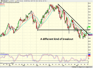
Click to Enlarge
To be sure, the chart of the iShares Micro-Cap ETF (IWC) is ugly. But remember, as we've been saying, history has shown that if stocks involved with a momentum meltdown are able to stabilize, then the overall market needn't have to experience a serious decline.
The thinking is fairly straightforward here. Up until the biotech, internet, and social media darlings started to tank in earnest, the stock market was in pretty good shape. But when the leaders get hit—and get hit hard—a "mo-mo meltdown" can weigh on investor sentiment. And oftentimes, the meltdown causes investors to lose faith in the overall market, which, in turn, produces more selling and a decent-sized correction.
However, as we've pointed out recently, IF the overall market can survive the meltdown and IF the mo-mo names don't drag down the rest of the market with them, the market has shown several times in the past that much to the chagrin of the bears, it can avoid calamity.
So, IF the S&P can remain above 1900 for a while, IF the NASDAQ can stay above 4150, and IF the low in the IWC can hold up, then the bulls might be able to begin yet another leg higher in what continues to be a most impressive bull market run.
By David Moenning of StateoftheMarkets.com


