
Bob Lang of ExplosiveOptions.net offers some general market analysis and goes to the index charts and markets in search of trends and patterns—not just for the benefit of options traders—but for the benefit of all traders.
As we move into the last quarter of 2014, it is time to do some market analysis. Let's take a deep dive-look at the index charts and markets and see if we can discover some reliable patterns or new trends (I'm looking at you, volatility) that may shape the coming action.
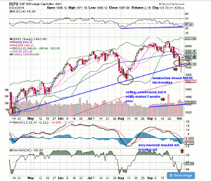
SPX 500 Daily Chart
This past week we saw price either touch or cross over the uptrend line, a line that has been in place since earlier this year. This move indicates that a higher low may be in place.
Last Friday's action was a good start for a reversal, but make no mistake, we are still in the middle of corrective action (previous corrections have been short in duration). The market is oversold on several metrics that I follow and it can certainly bounce in the interim, but unless 1985 is re-captured and exceeded, a bearish condition may persist.
Let's also not forget that earnings season is right around the corner.
Click to Enlarge
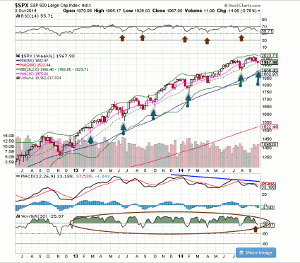
SPX 500 Weekly Chart
This chart looks great. Its newest candle pattern is similar to five prior hammers (marked) that launched the market to the next level. Additionally, the %R shows an excellent bull retest (red arrow) for the next time frame.
Click to Enlarge
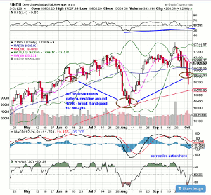
Dow Industrials Daily Chart
All of the indices have different overall patterns, but the theme is the same: They are in correction territory. This doesn't mean it's the end of the bull market; rather, it could just be a breather before another run ensues. Different patterns are everywhere—death crosses, hindenberg omens, moving average breaks—but on the Industrials, I see a potential inverse head/shoulders (it's a bit sloppy, but it fits the pattern) with the neckline around 17,200.
Click to Enlarge
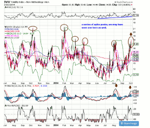
VIX Daily Chart
There is a great pattern to follow here, marked by spike peaks. My good friend Larry McMillan at Option Strategist has noted this strong and very powerful pattern repeatedly. The problem is, they correct so quickly. Note the circled peaks and the few days it takes to get momentum back down. You really need to be ready for the VIX's next move, or you'll miss out.
Click to Enlarge
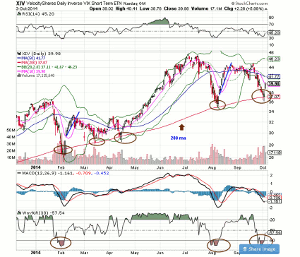
XIV Daily Chart
Last week, I hosted a webinar with Jay Wolberg of Trading Volatility, and we talked about the XIV (inverse VIX short-term ETN) and how it signals great buying and selling opportunities. Jay emphasized that the 200-day MA was a great spot where price reversals have occurred with consistency (circled). While the range is large (relatively speaking), it seems that Friday's move up is a good start.
Click to Enlarge
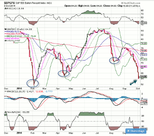
SPX Bullish % Index Daily Chart
This chart represents a breadth indicator based on the number of stocks on Point & Figure buy signals within an index. The Bullish Percent Index (BPI) is a straightforward indicator with clearly defined signals. Here we can see that the numbers have moved sharply lower, but no need to worry. Three previous lows have spawned a strong rally in the markets.
Click to Enlarge
By Bob Lang of ExplosiveOptions.net


