

Austin Galt, at TheVoodooAnalyst.com, takes a technical look at the monthly and weekly charts of the Dow expressed in gold to see what indicators are currently leaning towards as the better investment.
As far as I'm concerned, the only way to answer the question of which is the better investment between gold and the Dow Jones Industrial Index is to analyze the chart of the Dow expressed in gold. So, let's do just that using the monthly and weekly charts of the Dow:Gold ratio.
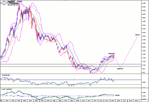
Dow:Gold Monthly Chart
Part 1
Click
to Enlarge
We can see the massive downtrend that was in place since the 1999 high of 43.92 until price bottomed in 2011 at 5.70. That is a solid gold smashing.
Price has been rising steadily for the last four years and has made a higher high after cracking above previous swing high levels which are denoted by the two horizontal lines. Now, all that is needed is for price to come back down and put in a higher low. Then the bull trend can really let loose.
Old tops often act as support in future and I expect price to now head down and test the support from the previous swing highs. I actually think price will nudge a bit below as it gives that support a thorough test.
The 2011 low was accompanied by a quadruple bullish divergence so it was no surprise to see a significant rise in price. However, the recent high at 15.56 was accompanied by a quadruple bearish divergence so perhaps the multi-year leg up is now in need of a break and a significant correction is set to occur.
The MACD indicator is bearish.
The Bollinger Bands show price bouncing back up just above the lower band with price now a touch above the middle band. It is not uncommon to see some toing and froing between the bands during trend changes.
The PSAR indicator has a bearish bias with the dots above price.
Now, this chart of mine only has relevant data going back to the mid 70s but using data from a much longer time period shows a massive megaphone top pattern. I find these patterns are generally nonsense and are given too much publicity by those with suspect knowledge of the technicals predicting doom and gloom. Price heading up now and cracking to new highs would invalidate the megaphone pattern and that is my expectation.
Let's move on to the weekly chart.
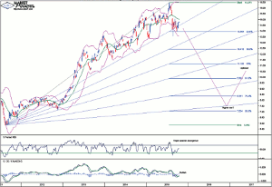
Dow:Gold Weekly Chart
Part 1
Click
to Enlarge
The RSI showed a triple bearish divergence at the recent price high.
The MACD indicator is currently bullish but it doesn't look overly convincing coming on the back of a solid move down.
The Bollinger Bands show price finding support at the lower band and now being around the middle band. If a significant correction is indeed about to take place then I would expect to see price move back to the lower band and hug it as the downtrend takes hold.
I have added Fibonacci retracement levels of this initial move up. The first correction in a new bull trend often makes a deep retracement and I am targeting the 76.4% level of 8.35 as the minimum with the 88.6% level of 7.05 also a chance. Perhaps somewhere in between.
I have drawn a Fibonacci Fan and I am targeting the low to be around support from the 88.6% angle which looks set to be in between of the aforementioned retracement levels in late 2016 and early 2017.
So, let's come back to the question of which is the better investment....gold or the Dow? My analysis leads me to believe that, over the next year or so, gold will be a better investment. However, over the longer-term, the Dow should prove to be a much better investment by far.
By Austin Galt at TheVoodooAnalyst.com


