

How the yield curve can suggest the next recession, the amazing volatility of bitcoin, and three risks to consider in 2018, according to Don Kaufman, co-founder of TheoTrade.
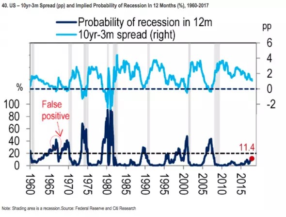
The yield curve is a timepiece that tells us how long the economy has until the next recession. The chart below shows the yield curve using the 3-month bill as the short end. As you can see, the curve has been flattening in 2017 which implies a recession is getting closer. The bottom chart does a better job of clarifying what the yield curve is saying about the odds of the next recession occurring in the coming 12 months.
As you can see, there is now an 11.4% chance of a recession in the next year.
Once the odds cross 20%, it has predicted a recession accurately in all but one case since 1960.
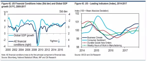
Some economists and investors are perplexed by the flattening of the yield curve because the economy is doing so well. As you can see from the chart, the financial conditions index and global GDP growth are both accelerating.
If you look at that chart and the yield curve above, you can see it flattened when growth slowed and steepened when growth improved. The current flattening, while growth is strong, is unusual for this cycle. However, it’s not unusual on a historical basis.
As you can see, growth was steady from 2004-2007, yet the yield curve flattened quickly. The yield curve is a forecasting tool that nailed the last recession. It’s entirely possible for the chances of a recession to increase as growth accelerates.
We’re talking about a recession in 2-3 years. The economic strength in 2017 is irrelevant to that period. The cause of the recession isn’t as obvious as it will be right before it occurs.
Personally, I don’t think we will be able to see the catalyst early because I don’t think this recession will be as bad as the last one. There’s not much that can compete with the largest asset the consumer has collapsing in value.
To continue the point about how healthy the economy is, the chart shows the leading indicators are all firing on all cylinders. Generally, economic growth doesn’t last for years when the business cycle is almost over, so great reports don’t rule out a recession in a few years.
This is the second longest expansion since WWII. Compared to 14 advanced economies since 1980, this is the 14th longest expansion out of 46 expansions those economies had in the past 37 years.
As you can see, the U.S. has had short expansions compared to the others.
Bitcoin speculation grows
In the last article I wrote, bitcoin (BTC) was at $16,500 and the market cap of all the coins was $450 billion.
Now the price of bitcoin has fallen to $15,000 and the market cap of the coins has fallen to $413 billion. I don’t necessarily think that’s the top; I’m just showing how volatile the coins have become.
The reason I’m discussing bitcoin again is because the Coinbase app has become the top free app in the App Store. Coinbase has surpassed Facebook which has over 1 billion users even though it only has 13.3 million users.
That’s an amazing stat which shows how active the downloads have been in the past few weeks. Finance apps never make it to the top 10 apps list. Usually, social games are at the top of the charts for a few weeks before falling back down to earth.
Some people think of bitcoin speculation as a game. If you’re putting less than 1% of your net worth into bitcoin, it can be a like a game. The key is to avoid the FOMO taking control; don’t go all in. That will crush some speculators.

A complete list of the risks in 2018
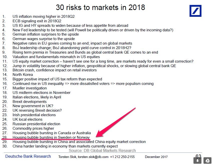
The title of this sub-head is slightly tongue in cheek because there is no way to have a complete list of the risks.
Some risks are surprises which were unforeseen a few months prior by most investors and analysts. However, this list is still valuable because it gives you a baseline to figure out what can go wrong.
Just coming up with the list is the first step.
The second step is figuring out if each risk will happen.
The third step is timing the events.
The fourth is picking the right strategy to make the most money on the bet.
As you can see, the first risk is inflation moving higher in Q2. That’s one of the risks I’ve highlighted previously.
I’m not sure what the second point means by exit. If it means ending the stimulus, I don’t see that as a risk because the ECB already announced the stimulus would end in Q4 2018. If the term exit means the ECB starting to unwind the balance sheet, that would be a big risk to the market. However, I don’t see why the ECB would announce the unwind before the program ended. It has mentioned maintaining a large balance sheet previously. I would think a potential unwind wouldn’t start until 2020.
The third risk factor is unclear because it doesn’t say what would cause a decline in the appetite for high yield debt from abroad. The ECB stopping its bond buying could cause less demand from investors searching for yield because Europe doesn’t offer it. In the last taper earlier this year, there wasn’t an effect on the demand for high yield. However, the taper at the start of 2018 is larger. I will discuss the rest of the list in future articles.
Conclusion
It is great to have a concrete number that shows the chance of a recession in the next 12 months. The prediction of 11.4% might not sound like much, but almost every time it has gotten to 20%, a recession happened soon after.
The bears came up with many explanations for why a recession would occur without an inverted yield curve.
Now we’re seeing bulls come up with reasons why there won’t be a recession when the yield curve inverts. I still trust the yield curve.
One final point is that it’s not inevitable that we have an inversion in 2018.


