

Stock index sectors diverge amid mixed signals, reports Marvin Appel.
Stocks have risen steadily since in the first two week of August, bringing the S&P 500 SPDR (SPY) within striking distance of its Feb. 19 record close of 338.34. Friday the SPY has paused with a 0.2% pullback while 10-year Treasury note yields have jumped to 0.72%.
I was hard pressed to explain why stocks have been so strong in the face of the economic fallout of the Coronavirus pandemic, which even optimists expect to take well over a year for the country recover from. The Federal Reserve Bank of New York reports data that offer some rationale for the stock market’s recovery. The chart below shows its Weekly Economic Index recovering steadily since hitting its low on April 25.
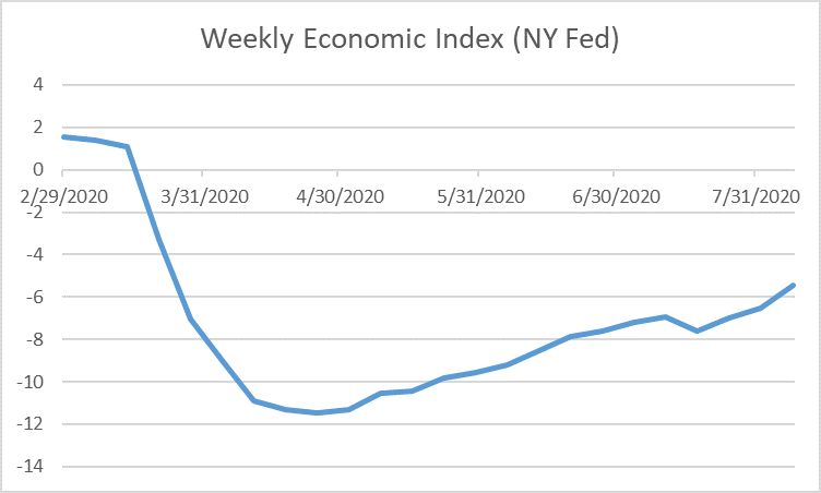
Weekly Economic Index
This indicator estimates the 52-week change in GDP based on ten daily and weekly data, potentially giving a more timely reading on the economy than the quarterly GDP report.
(https://www.newyorkfed.org/research/policy/weekly-economic-index#/interactive)
This index projects the most recent 12-month change in GDP inferred from weekly data such as unemployment insurance claims, Federal taxes withheld, electricity output, steel production and railroad traffic. Last week’s unemployment claims came in better than expected at less than one million, the lowest in five months. Despite an economic hiccup in the July 18 data point, this weekly index shows a steady recovery, not the stagnation that I have frequently seen mentioned in a number of news outlets. This week’s reading is -5.47, meaning that even after the recovery we have seen from the low of -11.48%, GDP is still estimated to be 5.47% below where it was a year ago. This 5.47% is a bigger drop than the 4% contraction the country suffered at the depths of the financial crisis in 2008-2009.
The indicators that make up the Fed’s weekly index are reminiscent of the Dow Theory, which looks for both the Dow Jones Industrial Average and the Dow Jones Transportation Average to be in agreement when a strong market trend exists. The chart below shows that both the Industrials and Transports are in uptrends, which according to the Dow Theory means that the economy is growing and the climate is good for stocks.
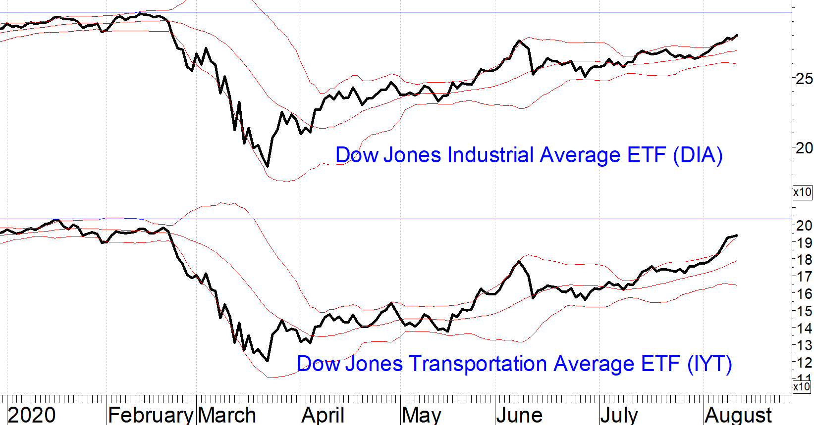
However, unlike the S&P 500 Index, both of these averages remain well below their prior highs. Both are short-term overbought as assessed by their climbing the upper Bollinger bands, so it would not be surprising to see stocks pause around current levels.
The economic recovery is stoking inflation fears. We reported on rising inflation expectations in our July 16, 2020 issue. In the past four weeks, inflation expectations have risen further. The TIP/IEF ratio in the chart below shows the continued, steady outperformance of Treasury Inflation-Protected Securities (TIP) compared to nominal Treasuries (IEF). The 10-year inflation rate that would make the total returns of TIPS and notes equal is up to 1.67%, up from a low of 0.5% in March but below the 2% level we saw for much of 2017-2018 and which is the Federal Reserve’s inflation target.
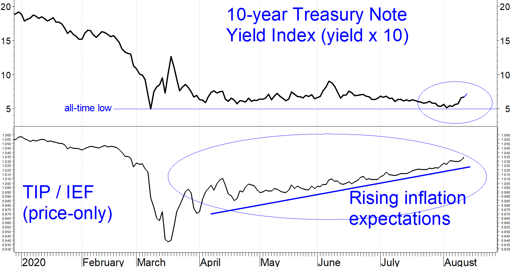
The chart also shows a bump in 10-year Treasury note yields from 0.51% on Aug. 4 to 0.72% Friday (circled). Normally, rising Treasury yields are a good economic omen and a mixed blessing for high yield corporate bond funds. The reason why rising Treasury yields are not necessarily bad for junk bonds is that the economic conditions that boost Treasury yields (faster growth, rising prices) also make junk bond borrowers less likely to default.
I worry about negative yields because that would deprive investors of any safe-haven for their money, so any bump from current levels is good news. Of course, it is too early to say that the recent rise in 10-year Treasury note yields is the start of a major new trend. We saw a similar bump in June and a much larger one in March, both of which turned out to be temporary.
There is, unfortunately, a second more sinister explanation for why Treasury yields could rise. Perhaps the federal government’s insatiable appetite for debt is finally catching up with it. The federal budget deficit has already hit $2.8 trillion for fiscal 2020 (Oct. 1,2019 to Sept. 30, 2020) and another
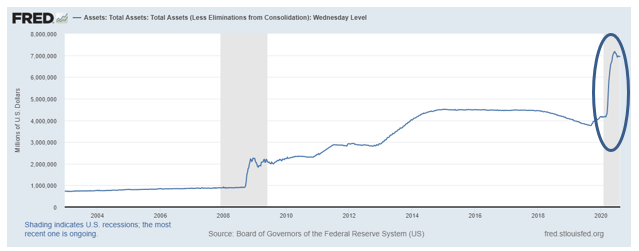
stimulus package of between $1 and $3 trillion is being worked out in Washington. So far the Federal Reserve has monetized almost all of this debt by expanding its balance sheet from $4.2 trillion at the start of March to $6.9 trillion at the end of July.
The problem for investors is that if the federal government’s borrowing becomes the primary driver for rising interest rates, there won’t be compensating economic growth to mitigate the risks.
Implications
There is both good and bad news in these developments. The ongoing slow but steady economic recovery is good news. The halt to the march towards negative long term interest rates is also good news. However, it is worrisome that inflation expectations now are about the same as they were at the start of 2020 even though GDP is significantly lower and unemployment remains above 10%.
In this environment staying nimble will be important as the markets’ valuations are not generously rewarding risks, making stocks and corporate bonds particularly vulnerable to a correction if there are any disappointments. We are staying the course with our clients’ accounts:
- Maintaining moderate equity exposure for as long as our equity timing model remains on a hold. (If it switches from “hold” to “buy”, which almost happened this week, then we will add SPY exposure. Consumer Staples, XLP, looks attractive as well.)
- Maintaining high yield and floating rate corporate bond exposure for as long as our models remain on buy signals.
- Keeping duration on investment-grade bonds short.
- We will not be chasing the technology sector rally. Since July 9, the market advance has broadened.


