
A good trader or investor should always be on the lookout for warning signs of a correction, so MoneyShow's Tom Aspray offers a technical review to illustrate how formations in the weekly and daily A/D lines can warn in advance of market corrections.
In the last trading lesson, Tell Tale Signs of a Correction, I explained how combining the analysis of the weekly and daily A/D lines can warn you in advance of sharp, double digit corrections.
At the time of the original article, I pointed out that there were no signs of such a significant correction but pointed out that a good trader or investor should always be on the lookout for the warning signs. Since then, most of the major averages have made further new all time highs.
Now, the warning signs differ from correction to correction and 6-10% can often be more difficult to spot in advance. In this continuation of the original article, I would like to review some recent examples of three corrections that have occurred in the past ten years.
Click to Enlarge
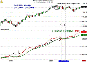
The first period I would like to discuss is the first correction that occurred after the bottom in the stock market was confirmed in 2003. The weekly A/D line broke out to new highs in April 2003 (point 1) after moving above its WMA several weeks earlier.
The A/D line came down to test its WMA in August as the S&P 500 had consolidated for six weeks. The A/D line led prices higher out of the consolidation period and formed a series of higher high and higher lows.
The week ending March 12, 2004, the S&P 500 dropped sharply and triggered a low close doji sell signal (see circle). The pullback was brief as the S&P 500 quickly rebounded to challenge its highs.
The weekly A/D line made a new high on this rally even though prices did not. Just three weeks later, the A/D dropped below the support at line b, and its WMA on April 23. Only a month later, the A/D line had moved back above its WMA (line 2). This was a sign of accumulation as more stocks were advancing then declining and just a few stocks were dragging the index lower. The correction low was not made until early August.
Click to Enlarge
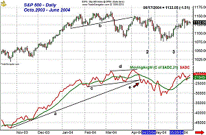
As with most indicators, you must look at multiple time frames, and with the A/D analysis, it can definitely give you an edge. I have met and heard many traders who miss the mark by concentrating on just one time frame. By November 2003, the daily NYSE Advance/Decline line was above its rising WMA. The pullback in the A/D line around Thanksgiving allowed one to define a new uptrend, line a.
By the end of November, the A/D line was in a strong uptrend, which lasted until the end of January 2004. When the A/D line is rising this strongly (the acceleration mode), one can be fully committed to the stock market and take more aggressive long positions.
In the latter part of February, it was clear that the A/D line had lost some of its momentum as the higher highs and higher lows were not as pronounced. This puts you on notice to look for additional signs of weakness. When the A/D line starts a new downtrend, it is time to trim your portfolio and become much more defensive.
The S&P 500 dropped below two month support in March, line b, which was a sign of weakness. This decline lasted thirteen days and dropped the S&P 6.7% from high to low. The A/D line held up very well on this decline as it did not drop below the February lows. In early April, the A/D line made a new high, line d. The S&P 500 just rallied back to former support, now resistance at line b.
Just five days after the high (point e), the A/D line broke down as it violated
the support from the February lows, line c, as well as the long-term uptrend
(line a). As indicated by the vertical line 2, the weekly A/D line dropped below
its WMA on the next rally as the S&P 500 made it back to 1146, which was
just below the previous high of 1150.
NEXT PAGE: What Can You Make of This?
|pagebreak|This provided a good selling opportunity as the weekly and daily A/D lines were now below their WMAs. The daily A/D line stayed below its WMA for most of the next five weeks, though it did pop back above it for two days in early May. The WMA of the A/D line was declining sharply at the time, so one could be confident that a bottom was not yet in place. This entire correction lasted 181 days from high to low as the S&P 500 dropped 8.1%
By the time the weekly A/D line had moved back above its WMA on May 28 (line
3), the daily A/D line had already moved above its downtrend and its WMA was
clearly rising, confirming the correction was clearly over.
Click to Enlarge
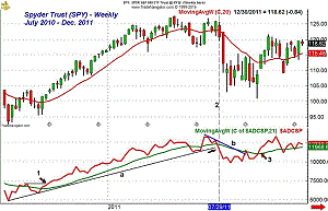
The sharpest correction in the current bull market occurred in 2011 as the selling was exacerbated by the debt ceiling crisis and the downgrade of US debt. The stock market had turned higher in September of 2010 as the weekly S&P 500 A/D line had started a new uptrend by moving above the previous highs (point 1).
The weekly A/D line stayed well above its rising WMA until June 2011 as the Spyder Trust (SPY) rose from $102 to a high of $127 in May 2011. The S&P 500 A/D line dropped below its WMA in early June and stayed below it for five weeks. In late June and early July, the market rose sharply taking the SPY just a point shy of its previous peak.
Two weeks later, the SPY
closed at a slightly new rally high but the A/D line formed lower highs, line
b. On Friday, July 29, the A/D line dropped below its long-term uptrend and
its WMA (line 2). The following week, the SPY
opened above $122 but closed the week just above $112, a drop of 7.1% for the
week. The weekly A/D line stayed below its WMA until early October, point 3.
Click to Enlarge
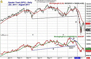
The daily chart of the SPY and the S&P 500 A/D were also very strong from early December through the latter part of February when it started to move sideways.
The A/D line showed signs of topping out in early March as its WMA had started to roll over. From high to low, the SPY lost about 7% and correction retraced just over 50% of the rally from the December lows.
By the end of March, the A/D line was again making a new high and it rallied up to another new high on May 10. By early June, the AD line was below its WMA and was in a short-term downtrend (see arrow). The correction lasted a couple of more weeks, and from the May highs, the SPY lost almost 8%.
The sideways pattern of the A/D line in May and in February-March warned that the market was becoming vulnerable. Though the decline dropped the SPY by 7% and 8% respectively, it was not severe enough to damage the market leading stocks or to hit reasonable stops. When you see this sort of pattern, it is time to be defensive and possibly hedge part of your portfolio. Sometimes you will only get a 3-5% correction, so traders need to watch the action closely.
The daily A/D line completed its correction on June 27 as it moved back above its WMA. The sharp eight day rally took the SPY up to $126.79, which was below the high from May 1. The A/D line also made a new high, but both then reversed to the downside. The SPY dropped below its 20-day EMA before bouncing once more as both prices and the A/D line formed lower highs, line b.
On July 27, the A/D line dropped below its WMA and two days later, on Friday, the weekly A/D line also dropped below its WMA (line 2). In the following seven days, the SPY dropped from its close on July 29 of $120.84 to a low of $103.03.
On October 4, the SPY
made its final low of $100.91 in early trading before closing the day higher.
Five days later, the daily A/D indicators confirmed that a bottom was in place
as I wrote at the time in Be
Bold, Be Fearless.Buy the Dip.
NEXT PAGE: What Else Were the Markets Nervous About?
|pagebreak|
Click to Enlarge
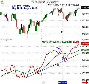
From the 2011 lows, the weekly NYSE Advance/Decline began a clear new uptrend, line a. It stayed above its WMA from the start of January until May 11 when it dropped back below its WMA. At the time, the markets were also nervous about the euro debt crisis and what countries might be forced to leave the EuroZone.
The weekly A/D line made a new high the last week of April before reversing
two weeks later and dropping below its WMA on May 11 (line 2). Just six weeks
later, on June 22, the A/D line was back above its WMA as the 9.9% decline lasted
just 59 days. The weekly A/D line did form a short-term bullish divergence (see
circle) at the June lows.
Click to Enlarge
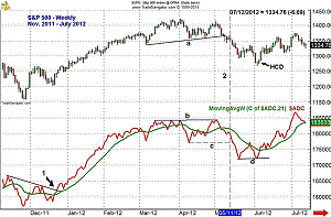
The daily NYSE Advance/Decline completed its corrective pattern on December 21, 2011, as it broke through its downtrend (point 1). Until the end of February, the A/D line was in the very bullish "acceleration mode" I discussed earlier. The sharp drop in early March was the first sign the rally might be slowing.
On the next rally, both prices and the A/D line made just slightly higher highs, line b. At the April 10 lows, the A/D line was below March lows but a new downtrend had not begun since it had made a new high in between. The S&P 500 held its lows putting the focus on the support at line a.
The important A/D line support at line c was also established. The six day rally from the April lows peaked on May 1 as most of the major averages made impressive new highs, but closed somewhat weak. Five days after the highs, the S&P 500 broke support at line a.
On May 11, the A/D line was in a short-term downtrend and just two days later the April lows (line c) were also broken. The decline lasted another fifteen days as the S&P 500 formed a doji on June 4, and the next day, a HCD buy signal was triggered.
The A/D line did not make a new low in early June, line d, forming a bullish divergence. The bearish sentiment was quite high at the time and in the June 6 column, Rally Potential That Bears Don't Expect, I also pointed out the bullish divergences in the McClellan oscillator. The rally from the June lows lasted another sixteen weeks as the S&P gained 16.4% from low to high.
I hope these further discussions of how the formations in the weekly and daily A/D lines can warn you in advance of significant market corrections. In advance of the larger corrections, you will often see the formation of significant divergences between the weekly A/D line and prices. These divergences will generally be confirmed by similar divergences in the daily A/D line analysis. Therefore, you have plenty of time to adjust your portfolio and develop a strategy to trade the short side of the market.
Before a smaller 6-10% correction, you may not see any divergences in the weekly
A/D line, just a sharp drop back below its WMA. This will then be confirmed
by the breaking key support by the daily A/D line. In some cases, you will not
get confirmation until you have already dropped 2-3% below the high. Typically,
the correction will often last several weeks, giving one ample time to adjust
his strategy.
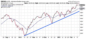
Click to Enlarge
The advance/decline lines can be monitored for free at stockcharts.com and I am sure their paid members have the ability to save many of the charts they like for further review. This daily chart of the NYSE Advance/Decline line shows the current strong uptrend from the October 2014 lows as well as the new highs that it has made in early 2015.


