
This simple process can be used to accurately analyze the broad markets and does not require the trader to shift their entire focus away from individual stock trades.
If you have been trading at all, you are aware of the importance of watching the broad markets for influence on your individual stocks. Those of you who know Online Trading Academy know that we always have a chart of the S&P 500 or Nasdaq to view in addition to our stock chart in the class.
On average, 50%-60% of a stock's movement will be directly related to the movement and trend of the broad market, and 30%-40% of the stock's movement will be influenced by the sector of that stock. That leaves only 10% of influence from the company itself.
I am sure you have noticed that the stocks moving with the market trend often move faster and farther than those trying to move against it.
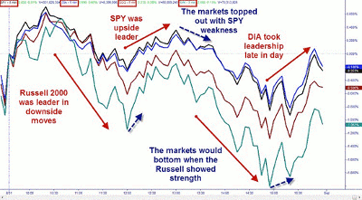
The other choice we must make is which market we should be following, be it the S&P 500, the Nasdaq, Dow Jones Industrial Average (DJIA), or Russell 2000? That comes down to which of those indexes is leading in the current trend.
Most traders would suffer from information overload from trying to watch the charts of those four indexes, as well as their individual stocks. I have found a solution for keeping an eye on the markets while still focusing on your stock trade.
TradeStation software allows me to chart the four indexes in one chart. This is something I have used extensively in the Extended Learning Track (XLT) programs to identify market trend and potential confirmation at supply and demand levels. I use the "percent change" feature to compare all four indexes and easily identify the leader in the dominant trend.
I like to use the overall market index ETFs SPDR Trust (SPY), PowerShares QQQ Trust (QQQ), SPDR Diamonds Trust (DIA), and iShares Russell 2000 Index Fund (IWM) to represent all of the indexes. You could easily substitute the indexes themselves or even the futures contracts. Since the futures are listed on different exchanges, you will have to adjust your chart to local time instead of "exchange" time for them to overlay. You can see the finished chart below.
Click to Enlarge
NEXT: See How to Create This Chart in 4 Easy Steps
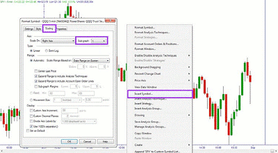
|pagebreak|To create the chart, I start with a chart of the S&P 500. If you right click on the chart, you can select "Insert Symbol" and then add the next ETF to your chart. You need to make sure you have the "Prompt for Format" box checked when you add the symbol. You will need to go to the Scaling Tab and change the Sub-graph setting to 1.
Click to Enlarge
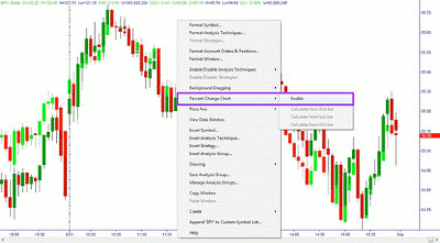
Once you have the second symbol on the chart, you will right click again and select "Percent Change Chart" and select "Enable."
Click to Enlarge
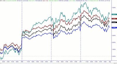
You can then add the additional ETFs one at a time in the same manner. You can change the style and color of the lines when you add them if you keep the "Prompt for Format" box checked. Once all four are added, your chart will look like this.
Click to Enlarge
Finally, you must choose a starting point for the comparison. On intraday charts, I use the open. I right click on the chart at the line that represents the beginning of the day. Under the "Percent Change Chart" menu, I select "Calculate from This Bar." That will start the price comparisons at zero from the open of the day.
If I am using a daily chart or want to compare a longer move, I will start the chart from a major top or bottom and see when the trend is weakening from the leading index changing direction.
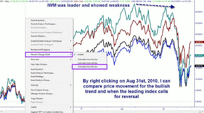
Click to Enlarge
By Brandon Wendell, instructor, Online Trading Academy


