

So far, this market is nothing we haven't seen before, writes Fil Zucchi on Minyanville, and five charts tell the story very succinctly.
Considering the avalanche of interest rates and equity market-related commentary I have seen over the weekend, I won’t beat those horses to death…again. Instead I will be exceedingly brief in my comments and will let a few charts explain all that I have to say. So here we go.
In this article, which I have linked multiple times in many of my other writings, you can read all about the notion that the current bull market in equities is being driven by the corporate bond market.
- Hiccups in the corporate bond market are usually preceded by a worsening in the credit derivatives space, particularly credit derivatives tied to large financial institutions, and then followed by a rise in investment-grade and high-yield spreads.
- When the corporate credit market worsens, stocks suffer, but the absolute level of corporate spreads is not nearly as important as the trend of those spreads.
- When it comes to Treasury yields, particularly on the long end, over the last five and 10 years, higher rates have correlated positively with stock prices.
And here are the charts that tell the story.
The first chart shows that since the end of the crisis in 2009, whenever credit default swaps rise, equities come under pressure; whenever CDS spreads ease, stocks rise. Those positive and negative periods are boxed in green and red respectively. The white CDS line consists of a simple index of credit default swaps on major US financial institutions, which I created.
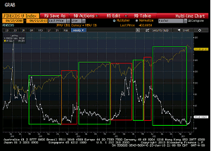
Click to Enlarge
The second chart shows high-yield spreads and the S&P 500 (SPX). The red vertical bars highlight every instance in the last five years when high-yield rates reached current levels, approximately 660bps. Taken in chronological order, the SPX traded at 1318, 1345, 1402, 1440, and 1405, respectively. Except for the last occurrence, you can see that despite revisiting the same spread multiple times, the SPX has had no trouble marking progressively higher highs. However, the direction of high-yield rates is relevant to whether stocks are in an uptrend or downtrend of their own.
Everyone with a charting package has an opinion on where the SPX should trade based upon high-yield spreads. So I may as well offer my own completely subjective approach. Let's say that high-yield spreads retrace 38.2% of their drop from the of October 2011 highs; a 38.2% retracement of the SPX move from the October 2011 lows to the recent highs would seem eminently reasonable. That would push the SPX down to about 1450.
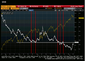
Click to Enlarge
The next two charts debunk the notion that rising 10-year Treasury rates have coincided with stock market drops. Over the last ten years, the correlation between 10-year Treasury yields and the SPX is a positive .273. The second chart zooms in on the last five years, and you can see from the red and green colored boxes that that correlation is even tighter.
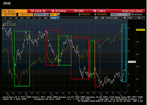
Click to Enlarge
Click to Enlarge
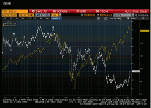
The last chart is a weekly chart of the Barclays US Corporate High-Yield index going back five years, with DeMark counts. First of all, you can see that in the broader scheme of things, the 160 bps rise in yields in the last seven weeks is relatively modest. By reference, during the summer 2011 scare, yields rose 300 bps, and even though stocks dropped 20%, it certainly did not mark the end of the bull market that began in 2009.
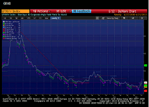
Click to Enlarge
Second, the weekly active TD sell setup is still only on count 5. If it were to complete, and/or if the TDST level up line on the monthly chart (735bps) were to be broken on a qualified basis, then and only then would it be time to consider if this pullback in yields is something more than what we have seen repeatedly over the last five years.
Until then, I will stick to my view that a 10%, 15%, or 20% correction in stocks is not only possible, but has a fair chance of happening. In the long run, however, the juggernaut of corporate-bond-driven equity buybacks that has been in place since 2009 (and from 2003 to 2008 before that) remains the dog that wags the financial markets’ tail.
By Fil Zucchi, Contributor, Minyanville


