Proven technical indicators are flashing extreme overbought signals for popular “safe havens” like the Swiss franc, meaning buyers seeking shelter from the current selloff could wind up in even more danger.
You have probably read it many times the last couple of days: People are rushing into safe havens such as gold and the SPDR Gold Trust (GLD), the Swiss franc (USD/CHF) and CurrencyShares Swiss Franc Trust (FXF), and the Japanese yen (USD/JPY) and CurrencyShares Japanese Yen Trust (FXY).
When the mass is doing something, we pay attention. We get cautious. We know that if you follow the mass, you will burn your hands. Therefore, we’ve analyzed those so-called “safe havens” in this article.
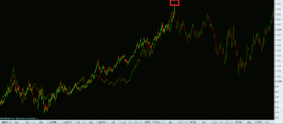
Below you will find a chart of the Swiss franc index. We can see that it is going nearly vertically in the last couple of days. The Relative Strength Index (RSI) is extremely oversold, and the Moving Average Convergence Divergence (MACD) is sky high.
See video: The “Big 4” Market Indicators
This is going to end very, very badly. If this parabola bursts, expect similar moves as were seen in silver in the beginning of May, and in any bubble when it eventually bursts.
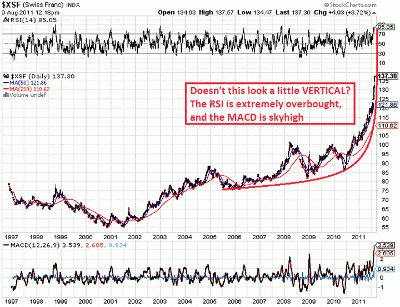
Click to Enlarge
NEXT: See More Ominous Price Action in Swiss Franc
|pagebreak|The following chart shows the USD/CHF since 1975. We can see that price is now 11.03% below the 50-day exponential moving average (EMA), as the Price Oscillator (PPO50) indicator shows us.
Only in September 1978 was it lower. That was the only time. You know what happened afterwards? Price rose from 1.45 to over 2.90 over the next seven years.
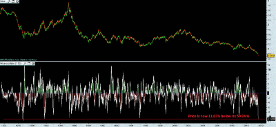
Click to Enlarge
The following chart also shows the USD/CHF exchange rate, but now with the 100-day EMA and PPO100, which shows us that price is now 14.59% below its 100-day EMA. Again, the only time this happened was in September 1978.
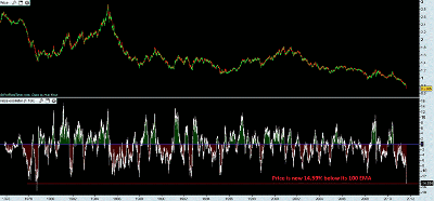
Click to Enlarge
The following chart also shows the USD/CHF exchange rate, but now with the 200-day MA and PPO200, which shows us that price is now 19.48% below its 200-day EMA. This happened only twice before (in February 1978 and in September 1978).
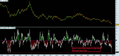
Click to Enlarge
The Swiss franc is extremely overbought based on the charts above, meaning this so-called “safe haven” is becoming a dangerous safe haven, in my opinion. We could make similar charts for the Japanese yen as well.
Last but not least, please have a look at the following chart, which compares the price action of gold (GLD) from early 2008 until today with the price action of gold from early 2006 until early 2008. Do you see the similarities?
Click to Enlarge
If the Swiss franc bubble bursts, keep an eye on gold, because the two are highly correlated.
By Willem Weytjens of ProfiTimes.com