
The best process requires defying conventional wisdom, because the key levels normal technical analysis would point you toward are often the opposite of the right buy points.
One thing I have paid close attention to in my many years of writing articles is making sure I did not spend much time writing about concepts and strategies that everyone else writes and talks about. If I did, there would be no point in reading the article.
To accomplish this, however, means suggesting ideas, concepts, and strategies that sometimes fly in the face of conventional wisdom. What I have found over the years is that simply questioning anything conventional often exposes a flaw…and most importantly, opens the door of opportunity you never would have found had you not questioned the conventional thought or idea.
In this piece, let’s take a look at the way conventional technical analysis teaches everyone to identify key support and resistance levels for the purposes of timing the market’s turning points, in advance.
Technical analysis books tell us when looking for key support (demand) and resistance (supply) levels, we should look for areas on the chart that have plenty of trading activity and heavy volume. They strongly suggest we should look for support and resistance levels that have many candles in the area and above-average volume.
This type of level on a chart does look attractive to the eye, but is this the best answer when attempting to identify key support (demand) and resistance (supply) levels? Does this logic lead us to the best and most consistent turns and moves in the market? To begin to answer this question, let’s think the simple logic through for a moment and then come back to conventional thought.
To make a long story short, markets turn at price levels where supply and demand is "most" out-of-balance. In other words, the more out-of-balance supply and demand is at a price level, the stronger and quicker the turn in price.
So how do we identify these big levels of imbalance on a chart? When you think the simple logic through, I think you will find that conventional technical analysis has it wrong, and the real answer is actually the opposite.
We just concluded that the most significant turns in price will happen at price levels where supply and demand are most out-of-balance. Think about it: at price levels where supply and demand are most out-of-balance, will you see a lot of trading activity or very little trading activity?
If you said very little, you are correct. This is because of the big supply and demand imbalance. At that same price level, you have the potential for the most activity, but the reason you don’t get much trading activity is because all that potential is on one side of the market, the buy (demand) or sell (supply) side.
So, what does this picture look like on a price chart? It’s not many candles on a screen, like conventional technical analysis suggests. It’s actually very few. Furthermore, this picture is not typically going to include above-average volume, it’s going to be very low volume most of the time.
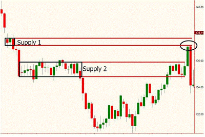
The example below shows exactly what I am suggesting in this piece. Let’s begin with supply level 2. This is a level with many candles in it that appears to be very attractive because it’s such a big level with many candles in it. Price also falls sharply from that area, suggesting it’s a strong supply level. Conventional technical analysis loves levels like this for turning points.
Next, notice that when price revisits this level over to the right, it doesn’t turn and fall from the level like we would expect. Instead, it bases sideways for a bit and then breaks up through it. How can this happen if this is such a great supply (resistance) level?
Well, whether this is a great level or not depends on your point of view. In the Extended Learning Track (XLT) program, we would never expect prices to fall from this level. In fact, our rules have us ignoring a level like this. To us, this is not a supply level at all. The reason is because price spent too much time there, which means supply and demand are not likely that out-of-balance.
Again, if the supply and demand equation was that out of balance at supply level 2, would price be able to spend so much time at that level?
Shortly after that breakout and failure of supply level 2, price reaches supply level 1. Most people would ignore this level because it only has a few candles in it; it’s hardly even noticeable. They would also ignore it because conventional technical analysis conditions people to ignore these levels (which is good for us).
Ask yourself why price could only spend such a short amount of time at that level. The answer is because supply and demand were out-of-balance in a very big way. If supply and demand were not so out-of-balance at that level 1, price would have spent more time at level 1.
Given that price spent so little time at that level, we conclude that there is a big imbalance and sell short when price retraces back up to that supply level (circled area on chart).
Click to Enlarge
When you do sell short at supply level 1, like I promote so often in the articles, you’re selling to a buyer who thinks this market is worth buying at that price level. Maybe that buyer read the trading books and ignored that supply level because the books say it’s not a key level due to such little activity.
As you can now hopefully understand, that lack of activity is what makes it such a strong supply level. Read an example of trading these supply levels here.
Sam Seiden is an instructor with Online Trading Academy.


