
Through a series of simple steps MoneyShow’s Tom Aspray teaches you how a weekly review of your 401k holdings can help you allocate your nest egg in the best performing funds
Most of my regular readers are active investors or traders, but many also have a retirement plan such as a 401k. Over the years I have found that even astute investors do not spend as much time or effort allocating their assets in their 401k plans. This, I think, is a missed opportunity.
I use some of the same techniques that I use on stocks or ETFs to determine how my 401k should be invested. This is something that anyone can do without the use of sophisticated or specialized analysis programs.
The goal of this article is to demonstrate that just a weekly or bi-weekly review of your 401k, using free Web sites, can dramatically improve your results. At the end of the article, I will give you a series of nine steps that you can follow on your own to increase the odds that your 401k will be invested in the market leading funds.
Click to Enlarge
In this discussion, I will focus on some of the Fidelity funds that are available in my own 401k. The same process can, of course, be applied to other 401K providers as the data on most of their funds is also available.
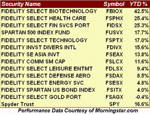
I have included 13 different funds, as well as the Spyder Trust (SPY), which is a widely followed proxy for the S&P 500. There are 26 funds, including a money market, in my plan. These funds are ranked in order of performance with the Fidelity Select Biotechnology (FBIOX) leading the list, up 42.5% so far in 2012.
The table reflects a wide range of performance as the difference between the 42.5% gain in the Fidelity Select Biotechnology (FBIOX) and the 4.8% gain in Fidelity Select Energy (FSESX) is 37.7%! The Fidelity Spartan US Bond Index (FSITX) has gained just 4%, but if you were in the Spyder Trust (SPY) you would have made over 12% more.
Admittedly this has been a great year for stocks, so in other years the spread may not be as large. It is not a bad idea to have some of your portfolio, say 5% in a benchmark like the Spartan 500 Index Fund (FUSVX) or Spyder Trust (SPY). But if you had a heavier weighting in the Fidelity Select Financial Services (FIDSX) or Fidelity Select Health Care (FSPHX) you would have done over 8% better than SPY.
The performance data on the table is from Morningstar, which is one of my favorite sites for fund data. By just using the quote function you can get a wealth of data as this link to the quote page for Fidelity Select Biotechnology (FBIOX) illustrates.
NEXT PAGE: FBIOX and the S&P 500
|pagebreak|In addition to a chart that compares FBIOX to health care and the MSCI World Index, it also provides the performance for a number of different time periods, as well as how the fund performed relative to other similar funds or benchmarks.
For FBIOX it shows that a $10,000 investment at the start of the year is now worth $14, 483. If you look at the five-year time period, the $10,000 has grown to just over $17,000, so clearly timing is important.
The site will also provide you with the largest holdings and what percentage they make up of the entire portfolio. This information can be found on many sites and another one I like is FT.com.
Click to Enlarge
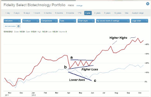
This chart from FT.com compares FBIOX to the S&P 500 from October 2011 to the present and was created easily using their interactive chart feature. The key to finding and investing in the right sectors is to find those funds that are doing better than a benchmark like the S&P 500.
This chart shows how, by using simple trend lines, it was possible to determine that biotech was leading the S&P 500 last spring. FBIOX (in red) was stronger than the S&P 500 in the first quarter as it made higher highs in March.
Both FBIOX and the S&P 500 corrected from March highs, but after a low in April, FBIOX started to form higher highs, line b. In contrast, the S&P 500 made lower lows, line c.
This was a sign that FBIOX was outperforming the S&P 500, and therefore had positive relative performance. The relative performance is a tool that I use in my daily column recommendations and it can be useful in any time frame.
In early June, FBIOX moved above its previous highs (line a) confirming that it was a market leader, while the S&P 500 did not surpass its corresponding high until August. Last month FBIOX made another new high, but as of this date the S&P 500 has not.
Regular readers of my sector analysis columns understand that periods of sector leadership do not often last an entire year. In a recent trading lesson, I reviewed the sectors that I liked the best last May, which included health care and biotech. Both are still acting strong even though they are overextended.

Click to Enlarge
One of the best sites I have found that allows you to do relative or comparative performance analysis is Stockcharts.com. (In the interests of full disclosure, it is partially owned by two old friends John Murphy and Greg Morris). On their site go to the create a chart box (see above), select Gallery View, and put in the symbol of your fund (FBIOX). This will generate both a daily and weekly chart of FBIOX.
NEXT PAGE: Weekly Comparison Chart of FBIOX to the S&P 500
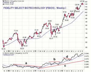
|pagebreak|I will focus on the weekly chart, which in the default setting also includes a ratio of FBIOX to the S&P 500 on the bottom along with a 20-period EMA of the ratio. This is analogous to my relative performance or RS Analysis.
In April of 2011, the downtrend in the ratio, line a, was broken signaling that FBIOX was starting to outperform the S&P 500.
Click to Enlarge
The sharp drop in the summer of 2011 took the ratio below its EMA as it developed a five-month trading range, line b. The ratio then again broke out to the upside in December 2011 as the resistance at line b, was surpassed. This was a new positive signal for the fund.
The ratio dropped back to test the rising EMA in April and May, but the break through the resistance at line d, confirmed it was leading the market higher. The ratio is in a long-term uptrend, line c, and a drop below the August lows would be the first sign that the fund was losing some of its leadership.
Click to Enlarge
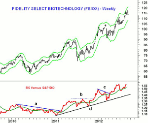
For comparison purposes I have provided the relative performance or RS Analysis chart of FBIOX that you are more familiar with from my daily column. The same resistance levels on the RS line are also noted. The signals coincide quite closely though the RS line has not yet made a new high. I have added the starc band analysis to the chart, which can also be closely approximated using Keltner channels on stockcharts.com with an input of 6, 2.0, and 14.
From the chart you will note that in many cases when the fund was above the weekly starc+ band, it was a good time to sell while drops below the starc- band (like last spring) provided good buying opportunities.
NEXT PAGE: What About Energy & Emerging Markets?
|pagebreak|Of course the signals are not always as clear as they were with FBIOX. The Fidelity Select Health Care (FSPHX) has shown strong relative performance for most of the year while the Fidelity Select Financial Services (FIDSX) moved above its relative performance resistance early in the year, but has since traded in a narrow range. Both are up over 25%.
Click to Enlarge
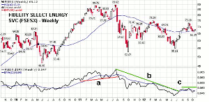
What about some of the laggards? The Fidelity Select Energy Services (FSESX) is up just 4.8% so far this year. The chart shows that this fund has just tested its flat 40-week MA and has key resistance at $73.18, which was the recent high.
The ratio helped identify the strong performance of FSENX from the lows in the fall of 2010 through the highs is the summer of 2011. The ratio then broke important support, line a, in August 2011 and subsequently FSESX lost almost 30%.
From the 2011 highs, the ratio (or RS Analysis) has been in a well defined downtrend, line b, that was just broken in July as the ratio line also moved above its EMA. The EMA was violated on the drop from the mid-September highs (line c), which is now a key level of resistance.
A move above this level will suggest that FSESX has become a leader. As I noted last week, some of the more targeted energy ETFs do show positive relative performance and new long positions were recommended.
Click to Enlarge
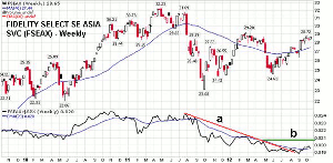
Another fund that I have been watching is the Fidelity Select SE Asia (FSEAX) as while it is up over 13% it has been lagging the SPY this year. This is a quite volatile fund as it was up over 55% in 2007 and down 52% in 2008.
The ratio analysis indicates that FSEAX had been underperforming the S&P 500, line a, since the early fall of 2011. This downtrend was broken in late July and in September the ratio did moved above its WMA which was an encouraging sign.
The ability of the ratio to move above the August high is also positive and a weekly close above the 0.020 level would be consistent with a new uptrend. The more important resistance is at line b, which if overcome should definitely complete a major bottom.
NEXT PAGE: Gold Funds & Nine Steps to Follow
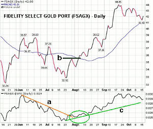
|pagebreak|Readers may have been surprised that the Fidelity Select Gold Portfolio (FSAGX) was up only 0.4% so far this year especially with the recent sharp rise in gold prices. This fund of gold mining stocks has a 13% weighting in Goldcorp, Inc. (GG) and 11% in Barrick Gold Corporation (ABX). The gold mining stocks often diverge from gold prices.
Click to Enlarge
The weekly ratio made its low in July, which coincided with the seasonal low for gold prices.
The daily chart shows a well established downtrend in the ratio, line a, that was broken in late July. The bottom formation on the daily charts was completed in August (see circle) as the swing high on the price chart (line b) was overcome. The ratio has been in a solid uptrend, line c, for the past two months.
While the yearly performance is still negative, FSAGX is up over 22% in the past three months and over 12% in the past month. This reinforces the importance of looking at your funds on a regular basis. The weekly analysis (not shown) does suggest that a bottom is now in place.
But what happens in a bear market? Typically different sectors and funds will top out at different times, therefore funds would be sold and more cash would move into a money market, as few would be giving new positive signals. Often those funds that are stronger than the S&P 500 when the market bottoms become the new leaders. A heavy weighting in gold funds during the last bear market would have done a good job of cushioning your portfolio.
So what steps do you need to take in order to drive your own 401k?
- Assemble a list of funds that you currently have in your 401k, as well as those funds that have lagged the S&P 500.
- Check the prices of each fund either weekly or bi-weekly and keep a written list and journal of your analysis.
- Look for funds that have either increased or decreased significantly (3-5%) in the past three reviews. Be sure to verify that there were not any distributions.
- Use ratio analysis to rate each fund as to how they are performing versus the S&P 500. Once you find a fund that appears to be bottoming versus the S&P 500, establish a small position, maybe 2-3%. Once a fund is clearly outperforming the S&P 500, buy more of the fund until you reach 10-15% of your portfolio.
- Look for pullbacks in those funds that have been outperforming the S&P 500 for additional buying opportunities.
- Always keep some cash in a money market fund, at least 5-15%, so you will have some available capital to move into a new fund.
- Each time you examine your funds review your journal as it will allow you to spot changes as well as determine how well you are sticking with your schedule.
This process, I think, will make a significant difference in the performance of your 401k, but it will take regular disciplined effort for it to be effective. A haphazard approach is not likely to be as successful as you are likely to miss some significant market developments.


