

The seasonal low point for natural gas is expected soon, and though no mainstream ETF has fared worse than UNG, favorable long entries—and big traps for short players—could lie ahead.
Running through the list of 52 exchange traded funds (ETFs) that I track through a comparative relative strength exploration reveals that once again, the United States Natural Gas Fund (UNG) ranks right at the absolute last-place position of all of them.
This isn’t all that surprising, given that UNG is off by more than 96% (yes, that’s right) since the natural gas/crude oil mania blowoff top printed in early-July 2008. UNG’s share price has been beaten senseless all the way down, with only a few tradable upswings here and there.
See also: A “Trap” for Energy ETF Traders
I’ve begun to take a closer look at this ETF lately, especially with a widely anticipated seasonal low pattern ready to be put to the test again. Seasonal charts reveal that natural gas futures tend to make some sort of a seasonal low sometime during the February/March time period, frequently offering attractive futures and options trading set-ups in the years when the pattern actually plays out.
See also: The 4 Key Seasonal Trends for 2012
Equities traders can now be afforded similar opportunities by trading UNG according to the same patterns, relieving them of the stress and risk of trading futures contracts while also allowing for greater control over their risk as they increase position sizes.
Think of it this way: if you are trading one natural gas futures contract and decided to add another one, your risk is now doubled. But what if you had only wanted to increase your position size by 10% or 20%? With futures contracts, you’re “outta luck” (unless you trade mini futures contracts, but again, it’s the same scaling size problem, only in a more manageable size), but if you are long 200 shares of UNG and want to increase your position by 20% (40 shares), you can do that very easily.
You have way more flexibility in this regard when trading stocks or ETFs as compared to futures contracts, and if you are a new trader, may I suggest that you learn to make money on a regular basis with commodity-linked ETFs before entering the shark-infested waters of the commodity futures markets.
If you can’t make consistent money with small, manageable risks as you trade ETFs like UNG, the United States Oil Fund (USO), the SPDR Gold Trust (GLD), and the iShares Silver Trust (SLV), then you are probably going to be eaten alive by the deep-pocketed pros who trawl the metals and energy futures markets.
That’s just a word to the wise, and it might save you enough money to buy a new car, a year of college tuition, and so on.
Here are the worst-performing, commonly-traded ETFs based on their recent calendar quarter relative strength versus the S&P:
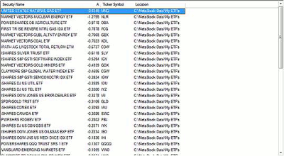
Click to Enlarge
NEXT: UNG Chart Shows Exhaustion Gap and Upside Possibilities
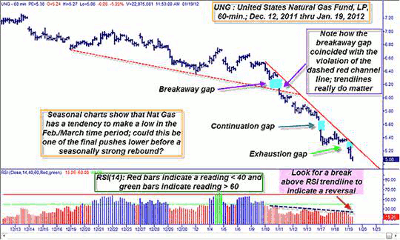
|pagebreak|Now let’s take a look at the 60-minute chart of UNG, which is offering us lots of technically tasty goodies:
You’ll note that the break of the lower channel line also coincided with the first of the three gaps lower on this 60-minute chart, and then from there, the floodgates really let loose, causing UNG to plunge all the way to $5.06 (as I write this, anyway) and causing two more gaps on the ride south.
Click to Enlarge
It’s fairly easy to recognize the series of gaps as the classic breakaway/continuation/exhaustion style, and there is also a good chance that UNG may soon find some temporary footing, at least in this hourly time frame.
Plotted at the bottom of the chart is a 60-minute relative strength index (RSI)(14); the times when the histogram is at 40 or below is highlighted in red (most of its recent trading history); and the times when it’s been at 60 or above is highlighted in green (very few recently).
Some technicians and traders hold the belief that an RSI(14) reading below 40 constitutes the definition of a down-trending market and that the exact opposite is true of an RSI(14) greater than 60.
These are good guidelines to use, and they are certainly proving their worth on this particular chart. Also note the solid red downtrend line on the UNG chart and the blue dashed trend line on the RSI histogram itself.
If you witness twin confirmed breaks of each of them, the probabilities of a tradable reversal (or perhaps a good time to start buying back your short positions in a hurry) are greatly increased, especially with tons of traders now using seasonal charts to trade key energy commodities.
All in all, it looks as if UNG is in the midst of a near-term “wash-and-rinse” operation, one designed to draw ignorant traders into new short positions while the big-money interests are ready to cover their shorts en masse.
This would drive UNG up in price enough to trigger the buy-to-cover stop losses of the newer shorts and possibly give this market the first significant bounce higher in a long, long time. Who knows if it will play out this way, but that last gap sure looks like an exhaustion gap.
Follow UNG along on your own 60-minute and daily charts and get ready for some wild price action in either direction!
By Don Pendergast, trader and systems developer, Linear Trading Systems


