

Willem Weytjens of Profitimes.com compares Apple’s rise to the rise of other bubble-like areas of the market in the past 30 years.
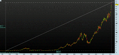
Apple (AAPL) is doing great these days. In January, the company reported that profits for the holiday quarter more than doubled.
The stock price shot up 8% on the news, and rallied all the way to over $526 per share in the days that followed.
On July 10, 1997, the stock was trading as low as $3.16. From $3.16 to $526+ is an increase of 16,554.75% in 15 years’ time. The chart is starting to look like a bubble in the making, as price is starting to go parabolic.
Click to Enlarge
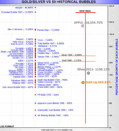
When we take a look at past bubbles, we can see that Apple has now reached the top three of all bubbles. Only eDigital and the Poseidon bubble did even better, with returns of 45,400% and 34,900% respectively…
Click to Enlarge
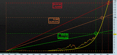
Could Apple go even higher? Sure! Imagine it would rise to $1,000 per share. It would then have gained 31,545.57%, which would be close to the Poseidon Bubble. In order to beat the eDigital Bubble, AAPL would almost have to triple, to over $1,437.80.
Click to Enlarge
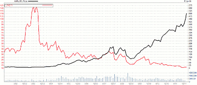
Is it possible? Yes…AAPL is trading at historically low price-to-forward earnings levels, as can be seen in the chart below.
If instead AAPL traded at a price-to-earnings ratio of, let’s say 30, and we assume profits would remain flat over the next two years, then Apple would be trading close to the $1,437.80 level.
|pagebreak|In addition to the low price-to-earnings valuation, AAPL has a war-chest of $97.6 billion (of which $64 billion is offshore), which it could use to make acquisitions, pay dividends, buyback shares, buy patents, and so on. So Apple has a lot of possibilities to grow even further.
Click to Enlarge
To put things in perspective: During the tech bubble, Cisco (CSCO) was trading at an insane 150 times forward earnings:
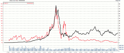
Click to Enlarge
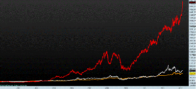
Apple’s gains dwarf those of gold and silver, even though those two assets also had a very impressive run since the beginning of the 21st century:
Click to Enlarge
Gold was up 663.87% from its low in 1999 to its high in 2011, while silver was up 1,130.12% from its low in 2001 to its high in 2011.
When we compare gold to silver, we can see that silver also went parabolic in April 2011 and has come down sharply since.
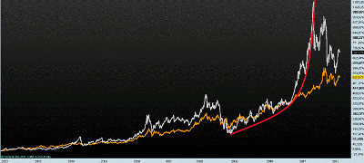
Click to Enlarge
Just some perspective for AAPL traders and investors who are long Apple stock.
Willem Weytjens can be found at Profitimes.com.


