

With the US stock market acting like the Energizer Bunny, Moby Waller of BigTrends.com takes a comparative look at global stock markets to see which ones are outperforming the US, with some interesting results.
It's been another strong year for the US markets in 2013, thus far, (as we had forecasted after the first few weeks of the year). But many international single country ETFs are lagging, and are even actually down on the year. Only one big country name is outperforming the S&P 500 (SPX) (SPY)…Japan (EWJ).
Take a look at the relative performance data below:
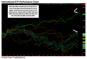
Click to Enlarge
While iShares Japan Index (EWJ) and the SPYders are up double digits this year, 10 major single country ETFs that have option trading and average volume over 100k per day are actually in negative territory on the year:
iShares Canada Index (EWC)
iShares Italy Index (EWI)
iShares Chile Market (ECH)
WisdomTree India Earnings (EPI)
iShares China Index (FXI)
MarketVectors Russia (RSX)
iShares South Africa Index (EZA)
iShares South Korea Index (EWY)
iShares Peru Index (EPU)
Global X Colombia (GXG)
Notice the wide global diversification of these names, not confined to one geographic area or heavily reliant on just commodities, for example. This indicates the general money flow going into the blue chips of the US and Japan, this year in particular—perhaps in search of dividend yield and relative safety.
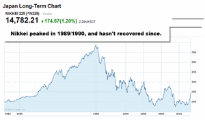
Japan is a fascinating stock market and economy, pretty much unique in the world. It reached a bubble euphoria stage in the late 1980s, which peaked when the Nikkei reached over 35k in 1989/1990. That's when the real estate land under Tokyo was rumored to be worth more than the whole state of California at the time.
The EWJ ETF is the most liquid and well-known Japanese ETF for US trading, but there are others out there that are fairly liquid and with option trading available—such as WisdomTree Japan Hedged Equity (DXJ) and Maxis Nikkei 225 Index (NKY).
Anyway, if you look below at the long-term Nikkei 225 chart, you can see it hasn't come close to recovering that value in the 23 years that have passed.
Click to Enlarge
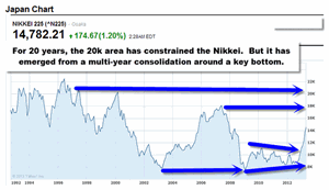
Zooming in just a bit (if you consider 20 years of chart to be zoomed in), you can see below that the 20k area marked tops in the Nikkei many times in the 1990s and into the year 2000. The 18000 area marked another top in 2007 before the worldwide crash that sent it to lows in 2009. The Nikkei bottomed out at lows in 2009 all the way down below 8000, similar to the bottom in 2003. From 2009 until late last year, the Nikkei wasn't able to make headway, forming a narrowing consolidation pattern. This type of chart pattern often precedes a breakout or breakdown—in this case it's clearly been to the upside.
Click to Enlarge
Since November of 2012, the Nikkei has been on a sharp upward trend—that also is when a key bottom in the US markets was reached before we began this steady uptrend that continues today and has taken us to all-time highs. Since the week of November 5, 2012, the Nikkei is up an astounding 69%, according to the data above from Yahoo Finance.
Bottom Line: In my analysis, the Nikkei 225 Index looks likely to once again test the 18k highs reached a few years ago—that is about 21% higher from here. Remember, however, this is a long-term chart, so this move could take six months to three years from now—and the pace of the recent gains is likely unsustainable without a consolidation and/or pullback. Another test of 20k on the Nikkei is also possible, but that is 35% higher from here and could take one to five years to play out. But there does appear to be a long-term bull trend in place on Japan, if history is any guide.
Moby Waller, Co-Portfolio Manager, ETF Tradr Program, BigTrends.com


