

Yields will climb in the next year, but there will be a selloff in the near term because the net positioning shows a near record short position. We may have seen that start on Friday as the 10- year yield fell 3.5 basis points, says Don Kaufman, co-founder of TheoTrade.
It seemed as though the March meeting was going to be predictable in that the Fed would raise rates 25 basis points and continue on its QE unwind plan. The exciting part is supposed to be the differences in the Powell-led Fed statement and press conference compared to Yellen.
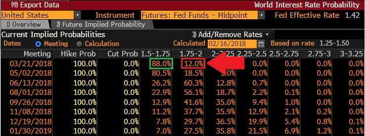
There appears to be an added uncertainty approaching as the market sees inflation picking up. The Bloomberg table below shows there is a 12% chance the Fed raises rates 50 basis points. There have previously been futures pointing to an outside shot at two hikes at one meeting, but they didn’t lead to anything.
I think this meeting has the best chance of two hikes in years. As I mentioned, the Fed will hike in March no matter what the data over the next month says, unless there’s some sort of unforeseen disaster. The reports will determine if the Fed hikes twice or once.
The Fed is deciding if it wants to leave rates relatively low to boost the economy and inflation, so that it can raise rates quickly at the end of the cycle, giving it more room to cut them prior to and during the next recession.
If the Fed stays the course, it probably won’t end the cycle with high rates. However, the Fed might be less concerned with the amount of room it has to cut rates because the entire term structure is increasing. If the growth and inflation accelerate, two hikes would be fine. It would bring a recession closer but would reduce the risk of inflation getting out of control. That risk is muted, so it would squash it even further in the next year.
Forecasting rates
The 10-year bond yield finally declined about 3.5 basis points to 2.87% on Friday. This is after it has increased about 86 basis points in a powerful uptrend. It’s easy to see why rates will go up: there is momentum in inflation and growth.
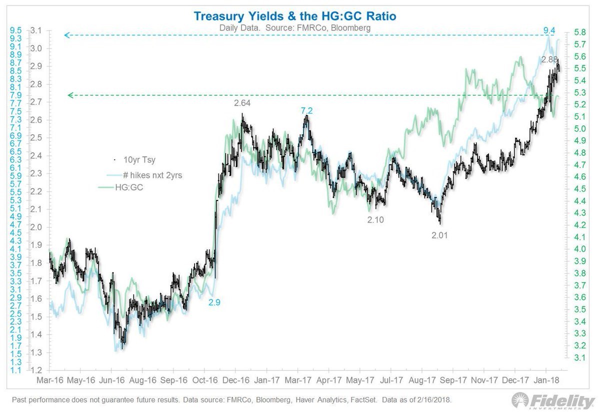
The chart below attempts to fundamentally determine where rates should be. According to the chart, the 10-year bond yield should be between 2.7% and 3.1% because there will be 9.4 rate hikes in the next two years and because the copper to gold ratio is at 5.2.
I disagree with this chart because the price of gold isn’t consistent enough for me to use it as an indicator. You can tell this indicator is a stretch because the y axis doesn’t start at zero. Secondly, I’m not sure why the chart shows nine rate hikes in the next two years when I’m expecting about five hikes. This chart is an example of trend fitting. It’s convenient that the chart has yields currently at the perfect mid-point and that it has worked in the past 23 months, but that’s not enough to use it as a forecasting tool.
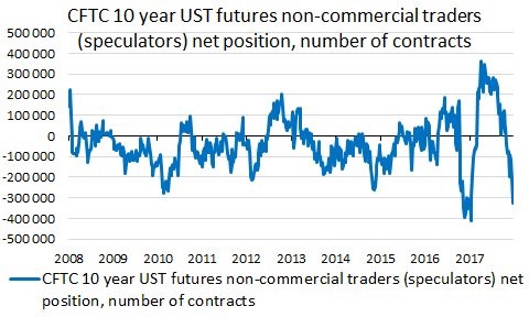
While that chart wasn’t helpful, the chart below is valuable. It shows the CFTC positioning in the 10-year bond futures. This positioning has helped me predict the recent correction in oil among other trades.
I think the best way to forecast where yields are going is to look at inflation, growth, monetary policy, the futures positioning, the projected deficit, global transactions and the Merrill Lynch fund manager survey. As you can see, there are many aspects to this trade. The 10-year bond is the most important asset in the world right now, so it’s not going to be easy to forecast. The best short-term indicator of the bunch is seen in the chart below.
The net position of speculators is near the lowest point since 2008. Only in early 2017 were traders more short. This is why I’ve said the most crowded trade is short Treasuries. This overcrowded short position caused yields to eventually fall from 2.59% to 2.05%. This was an especially big decline because the trade went from a record short position to a record long position. I don’t foresee a 54 basis point decline based on the overcrowded position, but a decline is likely in the next month.
Another chart to ignore
I like to show why popular charts which are shared on the internet aren’t valuable because it is an interesting discussion and keeps readers smart.
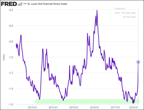
Part of being a good investor is simply ignoring bad arguments. The chart below shows the financial stress index. By looking at the chart alone, you would be convinced the next recession is coming soon because it shows conditions are stressed. However, there are two problems with this. The first is that the chart only looks at the past few years. If you take a step back and look at the 10-year chart, this only looks like a blip on the radar.
Even though the 2016 economy was stressed, this indicator didn’t come close to forecasting a recession, so using the 2016 stress as a reference point is dubious. The second reason why this chart is terrible is because even though the watermark is for February 16, the data is only updated as of February 9. The stock market bottomed on February 9, so that was likely peak stress in the financial conditions index.
The conventional wisdom that stocks don’t bottom on a Friday was proven incorrect. The theory is that investors don’t want to go into the weekend with risky exposure. Secondly, new money usually comes in on Monday.
Conclusion
Don’t get scared about the financial conditions index moving up modestly during the stock market correction last week. There’s nothing to worry about. The concept that the 10-year yield is perfectly priced is wrong because the chart manipulates the y axis to prove a point. I think yields will move higher in the next year based on fundamentals, but I think there will be a selloff in the near term because the net positioning shows a near record short position. We may have seen that trend start on Friday as the 10- year yield fell 3.5 basis points.


