

Although the IWM has greater upside potential than high yield bonds, the additional risk does not justify the 0.5% per year outperformance, says Joon Choi.
Despite recent equity weakness the S&P 500 SPDR (SPY) has advanced more than 12% since Christmas, recouping approximately half of the exchange traded fund’s losses since its record high on Sept. 20th, 2018. However, the iShares Russell 2000 Index small cap ETF (IWM) has only recovered about 40% of its 27% loss from Aug. 31 to Dec. 24. This may be an indication that stocks may be under pressure in the short-term since IWM tends to lead SPY during a healthy rally. Given that, high yield bonds may present a better opportunity than either they IWM or SPY.
The Russell 2000 Index (IWM) tends to be more volatile than the S&P 500 Index as companies in the former index are not as financially stable as the ones in the latter; thus, small companies are more sensitive to changes in economic conditions. Similarly, high yield bonds are sensitive to the overall health of the economy because those bond issuers are in relatively precarious financial standing.
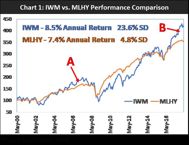
In the April 19, 2018 newsletter, I compared the performances of IWM and Merrill Lynch High Yield Index (MLHY), a popular high yield bond benchmark. Since IWM’s inception on May 26, 2000, the ETF managed to outperform MLHY by only 1.1% per year with despite five times the volatility (see chart). While the two ETFs have been correlated, IWM pulled away from MLHY in 2018 similar to a move in 2007, which led me to recommend high yield bonds over IWM for the rest of the year on a reversion play.
Since this recommendation, there have been wild swings in its relative performance (see chart below).
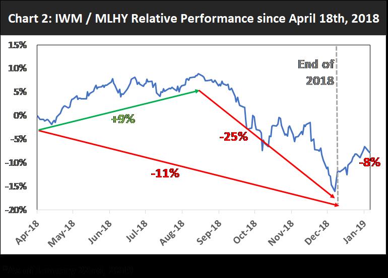
IWM has continued to outgain MLHY by 9% until the end of August; however, the ETF promptly underperformed the high yield index by 25%. Hence, IWM trailed MLHY by approximately 11% by year end. It would have been profitable, albeit with great volatility, if you had replaced the small cap ETF with a high yield fund. Even with the recent rally, IWM is still behind by 8%.
The gap between the IWM and MLHY equity curves almost closed completely by the end of the year (see chart).
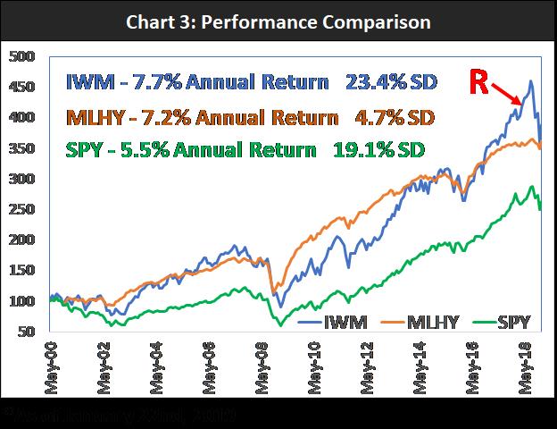
As of Jan. 22, IWM’s annualized return since inception is only 0.5% better than that of MLHY but with much greater volatility. Point R indicates my recommendation of high yield bonds over small cap stocks.
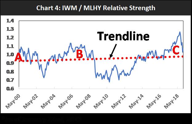
IWM/MLHY relative strength (see chart below) shows that IWM was very overvalued vs. high yield bonds last August; as the ratio was stretched from the mean (trendline) which led to an abrupt reversion to the mean (point C). It’s interesting to note that relative strength sharply pulled back during both bear markets in 2001 (point A) and 2008 (point B). Further deterioration of small cap stocks vs. high yield bonds may be a bad omen for equities.
Although IWM has a greater upside potential than high yield bonds due to its higher volatility, the additional risk does not justify the 0.5% per year outperformance since inception. High yield bonds offer the best bang for the buck. These bonds have allowed us to capture equity-like returns with significantly less risk. Lastly, IWM significantly underperformed MLHY last quarter; suggesting that investors are shunning risk. Further relative weakness in small cap stocks (vs. high yield bonds) may spell trouble for the equity market.


