

I just got back from our 2025 MoneyShow Toronto – and let me tell you, it was a BLAST! We had an enormous crowd join us downtown to learn about opportunities in Canadian (and US) markets…and I had the privilege of sharing my market thoughts from the keynote stage. That includes ONE chart that REALLY tells the market’s story!
Let me share it here as the MoneyShow Chart of the Day. It shows the performance of the “Big Six” banks in Canada over the past five years.
As Long as We Have the Banks, It's Tough to Be Bearish
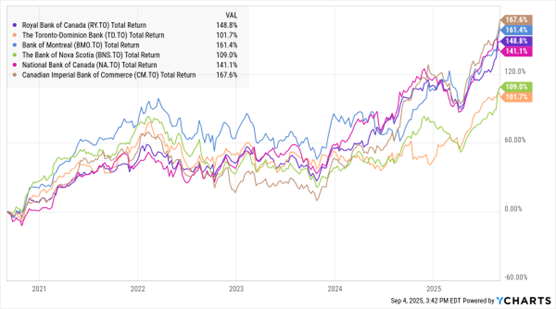
Data by YCharts
You can see that for the longest time, shares of banks like Royal Bank of Canada and Bank of Montreal essentially marked time. Endless months of sideways chop is not what you want to see if you’re a bull. But you can ALSO see that the banks caught fire in mid-2024, then broke out above prior highs across the board this year.
You can observe a similar, albeit less amplified, pattern in US funds like the Financial Select Sector SPDR Fund (XLF) and SPDR S&P Regional Banking ETF (KRE). They’re picking up steam, rising 10.8% and 14.5% in the last six months – and as I wrote on Sept. 5, they COULD end up replacing technology as a key sector driver for the S&P 500 Index (^SPX).
If you’re bullish on the market, you love to have the banks on your side. They’re among the most credit-sensitive and growth-sensitive groups around.
Yes, this IS “Fed Week.” Anything could happen considering how sensitive these stocks are to interest rates, too. But like I said in Toronto, things have been breaking the bulls’ way. Swimming against that tide as a trader doesn’t make much sense to me here.


