

Technician Corey Rosenbloom, of AfraidToTrade.com, points out exactly what insights charts can show traders historically, since the 1980s, about the long-term performance of stocks, oil, gold, the US dollar, and US Treasury Yields.
We’re accustomed to seeing stocks at all time highs, but what about other markets?
And what do long-term charts—specifically back to the early 1980s—show about stocks, the dollar, gold, oil, and US Treasury Yields?
There’s only one way to find out these insights from the long-term frame: Let’s see them.
Click to
Enlarge
We’ll highlight the main trends and put our current market action in context of the higher perspective.
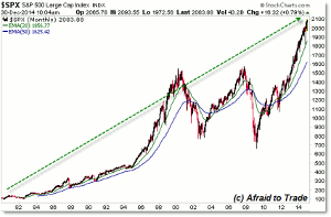
Stocks continue in a primary bull market with two interruptions; the early and late 2000’s temporary bear markets.
It’s amazing how small these bear markets look on this time frame.
The current multi-year bull market rally is in some ways similar to the 1996 to 2000 rally as the S&P 500 (SPX) tripled in price from the 500 level to 1,600.
We’ve seen the current bull market run from 666 to the current 2,100 level, also tripling in index value.
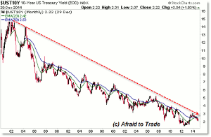
If you’re focusing on low interest rates—Treasury Yields—then take a look at this chart:
Click to
Enlarge
Treasury Yields peaked near 16.0% at the start of the 1980s and then as inflation was tamed, yields continued a long-term downtrend that continues to this day.
The 10-Year US Treasury Yield (so far) bottomed in 2012 near the 1.0% Yield level, aided in part by the Federal Reserve buying trillions of dollars worth of bonds and mortgage-backed securities as part of their three intervention (Quantitative Easing) programs.
Yet even the intervention is a small blip on this time frame that continues to reveal a triple-decade bear market for Treasury Yields.
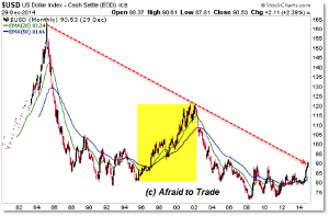
At the same time yields have been falling and stocks have been rising, the dollar has been declining:
Click to
Enlarge
The Dollar Index measures the value of the US dollar against a basket of currencies.
The major trend has been down, falling from the 165 index level in the mid-1980s to the 2008 low (the peak of the US equity market ahead of the recent recession) near the 70 index level.
The dollar—like the 1990s—has recently been trading sideways and may yet be breaking higher above the 90 index level for another possible bullish rally.
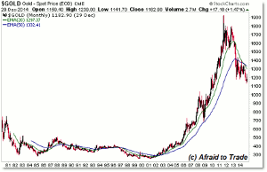
For those who monitor commodities, gold has enjoyed an interesting trend over the last three decades:
Click to
Enlarge
While gold peaked in the late 1970s and traded down (sideways) through the 1980s and 1990s, price bottomed and skyrocketed higher in parabolic movement from 2001 until the peak in 2011 near $1,900 per ounce.
Gold prices have retraced lower in a lower frame bear market ever since the 2011 high and now trade near the $1,150 per ounce level, a key reference point for current traders and investors.
What goes up must generally come down and we see another example of this concept in oil:
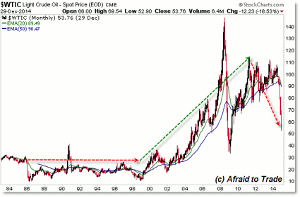
Click to
Enlarge
Like gold, oil remained relatively flat and tame during the 1980s and 1990s but broke into a strong bull market from the $15.00 per barrel level (imagine that) toward a peak ten times higher near $150 at the beginning of the 2008 recession.
Oil prices collapsed horrendously from the $150 peak all the way back to the $35.00 per barrel level to end the sudden bear market.
Like stocks, this horrific price collapse is yet a short period when measured against the last 30 years.
After a rally during the recently economic recovery, we’re seeing oil prices collapse rapidly down away from the $110 peak.
Even if you are a short-term trader, give yourself liberty to view the longer-term trends of your stocks and markets and put your current trading environment in context of much longer-term perspectives.
By Corey Rosenbloom, CMT, Trader and Blogger, AfraidToTrade.com


