
Although they are important, liquidity and expense ratios should not be the only determining factors when selecting ETFs; you must dig a little bit deeper, counsels MoneyShow's Tom Aspray as he demonstrates why this is just as important.
When choosing an ETF, many investors look for a sector that they think will outperform the overall stock market. Once they have obtained a list of ETFs, then they often just buy the one that is the most liquid. Trading volume should always be a consideration when selecting an ETF. In my opinion, you must do further research as the performance of your ETF could depend on other factors.
All of the information you need can be found on many popular Web sites, but once you locate the details, like the expense ratio, don't stop there. Many of the most liquid sector ETFs are run by State Street Global Advisors, and they have been the ones that I have recommended for many years. In last week's 4 of the Year's Best Sector ETFs, I reviewed the technical outlook on the four top performing Select Sector ETFs.
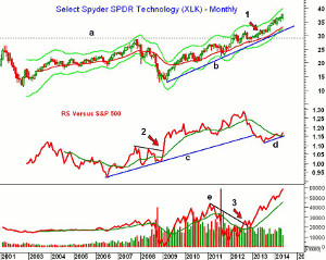
The Select Sector SPDR Technology ETF (XLK) on a YTD basis is currently not one of the best gainers but is one that I often recommended in the Charts in Play portfolio. The most recent position was stopped out in April for an 11.7% profit.
Click to Enlarge
The monthly chart of XLK shows that it broke through major resistance, line a, in February 2012 (point 1). It stayed in a 13-week trading range until April 2013 (point 1) when it completed its flag formation. XLK has been in a steady monthly uptrend every since.
It has held above its 20-month EMA (now at $33.18) with the long-term uptrend, line b, at $31.78.
This year, XLK has twice tested its 20-week EMA but never closed below it. With the solid gains of the past three weeks, it is up 9% from the April lows. There is monthly projected pivot resistance at $38.59 with quarterly projected pivot resistance at $39.25. The monthly starc+ band is at $39.89. In the past seven years, XLK has only come close to its monthly starc+ band in October 2007 and in March 2013.
The monthly, weekly, and daily relative performance analysis plays an important role in my selection of ETFs and stocks. The best signals come when all three are in agreement but I will often make recommendations when the daily and weekly have signaled that they are new market leaders.
The continued improvement in the monthly relative performance, line c, was one of the reasons that the technology sector was a favorite at the March 2009 lows. The RS line actually bottomed in 2006 and then formed higher lows in 2008 and 2009. It moved through its resistance (point 2) and at the end of January 2009, which was a positive sign.
The monthly RS line broke support in the fall of 2012 and declined until the end of 2013. The RS now appears to have formed a short-term bottom, line d.
The monthly OBV broke its downtrend in the latter part of 2012 9 (point 2) suggesting that the tech sector was being accumulated even though it was not currently a market leader. The OBV has stayed well above its WMA and made another new all-time high in May.
NEXT PAGE: A Different Picture Emerges If You Dig Deeper
|pagebreak|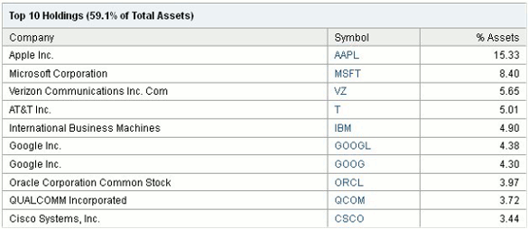
The Select Sector SPDR Technology ETF (XLK) has a fairly low expense ratio of 0.18% but any active investor or trader needs to look at a list of its holdings before buying. This table is from Yahoo.com but you can find the entire list on the State Street's Web site. In conversations with readers and those who attend our conferences, many are surprised to learn that Apple Inc. (AAPL) is a 15.3% holding in XLK.
In 2012, the percentage was closer to 20%, and when AAPL triggered an LCD sell signal in September 2012, it magnified the selling pressure in XLK. It is also important to note that 59.1% of the ETF is concentrated in just these top ten stocks. Therefore, if you are considering an ETF, you should also examine the charts of any stocks that make up 10% or more of the ETF.
Click to Enlarge
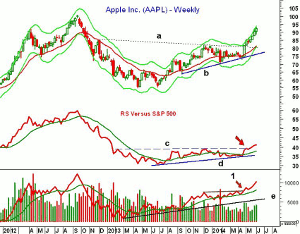
The weekly chart of Apple Inc. (AAPL) (reflecting the stock spilt) shows the strong surge in its stock on April 24 after it reported earnings, the stock split, and an increase in their dividends. The pullback in early May is barely noticeable on the weekly chart as it moved sideways for three weeks after reaching its weekly starc+ band.
This set the stage for the sharp rally as it has been hugging the weekly starc+ band for the past six weeks. The monthly projected pivot resistance is now at $97.57 with the monthly starc+ band a bit higher at $98.31.
The relative performance shows a pattern of higher lows, line d, since last summer. The upside breakout in the RS line came on the date of the big announcement. The RS line is rising, consistent with a market leader.
The weekly OBV broke out to the upside in October and surged to a new high at the end of the year. Additional OBV resistance was overcome in April (point 1), and it has continued to surge in the past few weeks. The daily OBV (not shown) has also confirmed the new highs and shows no signs yet of a top.
So what does this mean? Given that XLK is in a high-risk buy area, basis both the starc and pivot resistance analysis, it turns the focus on Apple Inc. (AAPL), which is its largest holding. The starc band analysis of AAPL increases the chances that it will either correct or move sideways for a few weeks before it can go substantially higher.
For Select Sector SPDR Technology ETF (XLK), look for first good support now in the $36.44 to $37.16 area while Apple Inc. (AAPL) has first good support in the $88.50 area with the monthly projected pivot support at $84.88. So if you are interested in buying XLK, keep your eye on both its support zone and that for Apple Inc. (AAPL).
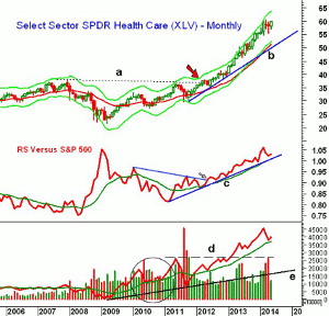
In my recent sector review, I took a look at the weekly chart of the Select Sector SPDR Health Care (XLV), but it was the monthly chart that helped me identify it as a winner in 2012.
Click to Enlarge
The monthly chart shows that XLV overcame major resistance, line a, in March 2012 (see arrow). For the next four months, XLV stayed in a fairly tight range as it came with 4.4% of its 20-month EMA before it broke out to further new highs.
The monthly relative performance confirmed the price action by overcoming its downtrend as the RS line was already in a solid uptrend, line c. This support has been holding, and it made a new high in February 2014.
The OBV started to act stronger than prices in early 2010 as it broke out to the upside and then held its rising 20-month WMA (see circle). The monthly OBV made further new highs in 2011 before pulling back sharply during the August 2011 debt ceiling crisis. By 2012, it was in a solid uptrend and moved well above the 2011 highs, line d, in early 2013.
The March 6 high of $60.50 is now being challenged with June's projected pivot resistance (courtesy of John Person's software) at $61.67 with the weekly starc+ band at $61.88.
There is initial monthly support at the May low of $57.03 with further at $55.39, which was the April low.
NEXT PAGE: Multiple Time Frame RS Analysis is Important
|pagebreak|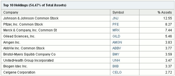
As the table indicates, the top ten holdings of XLV make up over 54% of the ETF with Johnson & Johnson (JNJ) the top holding at 12.55%. The ETF has a total of 54 holdings with an average trading volume of 5.47 million shares. It has a yield of 1.42% with an annualized five-year return of 20.90% and an expense ratio of 0.17%.
In the top ten stocks, you will also notice quite a few top biotechnology stocks including; Gilead Sciences Inc. (GILD), Amgen Inc. (AMGN), Biogen Idec Inc. (BIIB), and Celgene Corp. (CELG).
Click to Enlarge
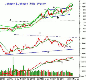
Clearly Johnson & Johnson (JNJ) plays an important role in the performance of XLV. The weekly chart of JNJ shows that it overcame the 2008 high, line c, in early March of 2013. It surged from $78.19 to a high of $94.42 in August as the weekly starc+ band was tested.
This was the start of an 18-month trading range, lines a and b. The weekly starc- band was tested with the late August low of $85.85. JNJ made a marginal new high of $95.99 late in the year before it again reversed to the downside.
The starc- band was also exceeded in February 2014 but JNJ's low was $86.09, which was above the August 2013 low. The quarterly projected pivot resistance is at $106.49. The width of the trading range, lines a and b, has upside targets in the $108-$110 area.
The weekly relative performance analysis did make a new high in August 2013 but it soon dropped below its WMA. The RS line moved above its WMA in March of this year (point 1). This was confirmed by bottoming action in the daily RS analysis and that is another reason why multiple time frame RS analysis is important.
The weekly OBV has been leading prices higher since early in 2013 as it has made a series of higher highs. It broke out in early 2014 so prices were also likely to also break out to the upside. The monthly OBV (not shown) has made new highs each of the past three months and is well above its rising WMA.
June's monthly projected pivot resistance at $103.74 was exceeded this week with the weekly starc+ band now at $106.40. The 20-day EMA is at $101.81 with the monthly pivot at $100.40.
In conclusion, though we are holding on to longs in the Select Sector SPDR Health Care (XLV), I would not buy it at current levels. The ETF is likely to look more attractive if JNJ pulls back to stronger support in the $100-$101.50 area.
Click to Enlarge
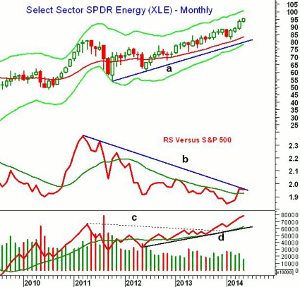
The Select Sector SPDR Energy ETF (XLE) has had a rollercoaster ride in 2014 as it just recently emerged as one of the top-performing sector ETFs. At the February low of $81.38, it was down 7.6% for the year and was one of the worst performers. With its move above the $97 level this week, it is now up close to 10% for the year.
The monthly chart (up through May) shows the solid rally of the past four months as the quarterly projected pivot resistance at $94.89 has been exceeded as has the monthly pivot resistance at $97.06. The monthly starc+ band is at $100.61.
The monthly relative performance peaked in May 2011 when the weekly negative divergences in the OBV confirmed that a top was in place. The downtrend from these highs, line b, is now being tested as the monthly RS line is above its WMA. The weekly RS line moved above its WMA in mid-March when XLE was trading in the $87.50 area.
The monthly OBV broke through its resistance, line c, at the end of October 2013. It moved to new highs at the end of February and has since been leading prices higher. It is well above its rising WMA and support at line d. The weekly OBV (not shown) moved above its WMA at the end of April and is still acting strong.
The monthly pivot at $94.56 now represents first good support with monthly projected support at $93.68. The lows over the past six weeks are in the $92.60 area with the rising 20-week EMA a bit lower at $90.98.
NEXT PAGE: Always Do Your Homework
|pagebreak|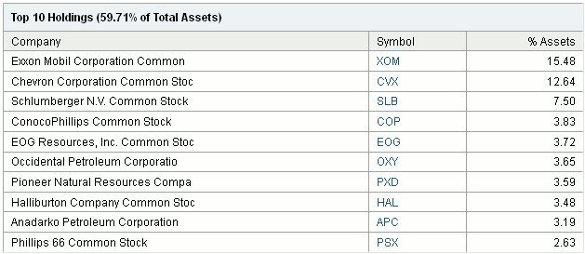
The ETF has two large holdings, 15.48% in Exxon Mobil (XOM) and 12.64% in Chevron Corporation (CVX). The top 10 holdings make up 59.71% of the ETF with a total of 44 holdings. The yield is 1.68% with an expense ratio of 0.16%.
In comparison, the SPDR S&P Oil & Gas Exploration & Product (XOP) has a total of 83 holdings but a higher expense ratio of 0.35%. It largest holding is Goodrich Petroleum Corp. (GDP), which makes up just 2.2% of the portfolio. The largest 10 holdings make up 15.7% of the ETF. It has just 1.25% in XOM and CVX and is the energy ETF that I generally favor.
Click to Enlarge
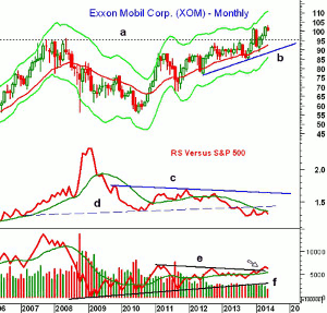
The monthly chart of Exxon Mobil Corp. (XOM) shows that in April, it made a new high of $102.57, which was just above the December 2013 high of $101.74. The monthly projected pivot resistance is at $103.64 with the quarterly resistance at $106.67. The monthly starc+ band in June is at $110.83.
The monthly relative performance for XOM has been acting poorly for most of the bull market. It broke to the downside from its trading range, lines c and d, in early 2013. The RS line has just turned down from its declining WMA. The weekly RS analysis (not shown) does look not look any stronger as it has been diverging from prices since early in the year.
The monthly OBV finally was able to overcome its resistance, line e, at the end of March. The OBV is holding above its WMA but is lagging the price action. The weekly OBV (not shown) is not looking much stronger as it is diverging from the early January highs.
Click to Enlarge
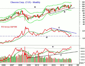
Chevron Corp. (CVX), unlike XOM, has not made new highs this year as it is still below the July 2013 high of $127.83. The monthly projected pivot resistance is at $127.44 with the monthly starc+ band at $136.80. The quarterly pivot resistance at $124.92 is currently being tested.
The monthly relative performance formed a negative divergence in July 2012, line c, and has been in a solid downtrend since October of 2012. The RS line dropped to new lows in February. The weekly RS analysis (not shown) is trying to bottom but needs a move above the May highs to turn positive.
The monthly OBV moved above both the 2007 and 2011 highs at the end of 2013. It made impressive new highs in April and is well above its rising WMA. The weekly OBV (not shown) broke its downtrend in the middle of April and is also acting stronger than prices. The daily OBV and RS analysis are currently both negative.
CVX has just moved above the monthly pivot at $123.38 and is still fairly close to the 20-week EMA at $120.94. The monthly pivot support is at $116.15.
Given the poor relative performance of XOM, I would not be buying XLE at current levels even though oil prices are getting a nice boost due to the turmoil in Iraq. If we get daily buy signals in Chevron Corp. (CVX), it will look more interesting, and so will XOP, if it gets back into the $77.50-$78 area.
In conclusion, before you buy a sector ETF, you need to do your homework. Find out the top ten holdings and what % of the ETF is concentrated in the top ten. Any stocks that make up 10% or more should also be analyzed.
Once you have bought one of these ETFs, monitor the top ten holdings on a regular basis by setting up an online portfolio containing these ten stocks. If any shows a down day of 1% or more, take a look at their charts for signs of trouble.
Often, weakness in a few of the top holdings will warn of a sharper correction in the ETF. For example, negative signals in Duke Energy (DUK) and other key utilities in early May warned of a drop in the Select Sector SPDR Utilities (XLU), which has DUK as a top holding.


