According to legendary Dow theorist, Richard Russell, volume tends to expand in the main direction of the trend, and since it’s always helpful to know the direction and strength of a trend, MoneyShow’s Tom Aspray details the nuts and bolts of a leading indicator he has relied on over the years.
Volume is one of the best tools that an investor or trader can use to tell whether money is moving into or out of a stock or ETF. Regular readers know that my favorite volume indicator is the on-balance volume (OBV) that was introduced in 1963 by Joe Granville in his book Granville’s New Key to Stock Market Profits.
As I have been using it for about 30 years, it is not surprising that I have my own way of interpreting it. It can be looked at in a very simplistic manner or it can also be analyzed in depth using trend lines and moving averages. As I discussed in an earlier trading lesson OBV: Perfect Indicator for All Markets, it can often be a very good leading indicator.
In the early 1980’s before it was a popular approach I always advocated looking at multiple time frames, initially concentrating on weekly, daily, and intra-day data. After a few years, I added in monthly data, which can be very useful for determining the major trend and can be especially helpful for longer-term investors.
In this article, I would like to explain how I apply the OBV on monthly, weekly daily and even hourly data. In addition, I want to review some of the specific OBV formations that I have found to be quite reliable in both up or down markets.
The most basic level of OBV analysis is to determine whether it is following the price behavior. In other words, in an uptrend the OBV should be keeping pace with prices or leading prices higher. In a downtrend, both the OBV and price should be making a series of lower highs and lower lows.
In some instances, you will also see the formation of bullish or bearish divergences between the OBV and prices that can alert you to important changes in trend. Of course, the longer the time frame the more important and reliable the signal will be.
In a recent Charts in Play column, I reviewed the monthly OBV analysis on the gold futures contract as it has been making new highs with prices since 2002. This is the most basic level of OBV analysis but as the gold example illustrates it can be a powerful tool.
Click to Enlarge
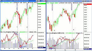
The first market I would like to cover is the very popular Spyder Trust (SPY), which tracks the S&P 500. The monthly chart of the Spyder Trust (SPY) above covers the period from 2009 until the present. The monthly OBV had moved above its WMA at the end of August 2009 ( not shown) and made convincing new highs with price in April 2010.
Over the next four months, the OBV tested its rising WMA before completing its bottom formation at the end of September 2010. When the OBV drops down to test its rising WMA, it identifies a good buying opportunity no matter what time frame you are using. Conversely, when the OBV rallies back to its declining WMA, it provides a good selling opportunity.
The OBV made a new high in February 2011 but as prices were making another new high in April, the OBV formed a negative divergence, line a. This made a correction likely but not an end to the major uptrend. The SPY made further new highs in May but the OBV did not and by the end of June (line 1), the OBV had dropped below its WMA.
The extent of the volatility over the next four months is evident by the wide ranges on the monthly chart. The low for SPY in October was lower than the August low but the OBV did not make a new low, forming a positive divergence, line b.
By the end of March 2012, the OBV had made it back to its declining OBV but it turned lower the following month. It was not until the end of July 2012 (line 2) that the OBV moved above its flat WMA. Though the monthly OBV is rising and above its WMA, it has not yet surpassed the highs from 2011. This will need to be watched in 2013.
NEXT PAGE: Bullish on Large-Caps |pagebreak|
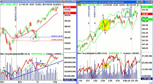
The weekly chart covers from the end of April 2012 up to the present. The weekly OBV dropped below its WMA in early May but when SPY made lower lows, the OBV formed a positive or bullish divergence, line c. By the week ending June 16 (line 3), the OBV was back above its WMA and by early July was in a clear uptrend.
The weekly OBV did make new highs with prices in mid-September but broke its uptrend, line d, in early October. The OBV then formed a series of lower highs as indicated by the downtrend, line e. By the first week of December the OBV had moved above both its WMA and the downtrend (line e) which was a good reason to be bullish on stocks.
Click to Enlarge
The weekly OBV pulled back the following week but by the time prices were dropping at the end of the December, the OBV was rising and holding above its WMA. The weekly OBV has made decisive new highs in 2013 but shows a wide gap with its rising WMA that may be warning of a February pullback.
Click to Enlarge
Now let’s look at the daily and hourly analysis of the Spyder Trust (SPY). Though the weekly OBV did form a positive divergence at the November 2012 lows, the daily OBV did not. The daily chart shows that the day after the lows, the downtrend in the OBV, line a, was broken, and by November 21, the OBV was back above its WMA.
A couple of days later, the OBV pulled back to its rising WMA (line 1), which is one of my favorite bullish setups as SPY was also testing its 20-day EMA. Seven days later, there was a similar formation as SPY again tested its rising 20-day EMA and the OBV pulled back towards its rising WMA. The daily OBV did make new highs in December before SPY corrected.
The five-day fear-of-the-cliff selloff dropped slightly below the 50% Fibonacci retracement support but then SPY closed the year back above the 20-day EMA. Though the monthly and weekly OBV were positive, the daily OBV did not break out of its trending range, line b, until the middle of January. The OBV did make new highs and is above its WMA and support at line c.
On the hourly chart I have also added the starc bands as it provides a multitude of good examples of how these bands work in any time frame. Using hourly OBV requires a consistently good level of volume as large surges once or twice a day can make it less useful as the “noise level” is definitely higher.
The hourly OBV was above its WMA on 1/15, and early on 1/17, SPY started bumping into the starc+ bands for several consecutive bars until 2:30 pm (line 3) and SPY closed lower the next hour. This was a sign of weakness and with prices near the starc+ band, it was a high-risk level to buy, but a low risk area to sell.
Over the next five hours, the SPY declined to its hourly starc- band and the OBV dropped well below its WMA. Early on January 22 (line 4), the OBV dropped back to test its WMA. On this rally, the SPY went from $148 to just above $150, point 5, and reached its starc+ band.
This was indeed a high-risk time to buy as SPY dropped for the next three hours back to the starc- band while the OBV dropped back below its rising WMA for a couple of hours (see circle) before turning higher. SPY and the OBV rallied for the next several days as both made new highs.
On February 1, SPY gapped higher and tested its starc+ band for the next five hours as noted by the area identified by point 7. The following day, prices gapped lower so holding a trade overnight was not a good idea. In a few hours, SPY was below the starc- band. By the daily close, however, the hourly OBV had formed another bullish zigzag (line 8) as the uptrend had resumed. As of mid-day on February 6, the hourly OBV had not confirmed the highs.
NEXT PAGE: Bullish on Small-Caps, Too |pagebreak|
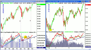
The Russell 2000 is one of the averages that has moved to new all-time highs in 2013, so I wanted to look at the monthly and weekly analysis of the iShares Russell 2000 (IWM). At the end of May 2009, the monthly OBV (line 1) had moved back above its WMA, which was the start of an 11-month rally. The OBV did confirm the April 2010 highs and then turned lower.
Over the next four months, the OBV dropped back to test its rising WMA (point a), which was a bullish setup. By the end of September, the OBV had turned higher, signaling that the uptrend had resumed. From the August low, IWM rallied for another eight months with only one lower monthly close.
Click to Enlarge
The OBV made a new high in April 2011, but IWM made a marginal new high in May before closing lower. The OBV broke its uptrend, line b, in June and dropped below its WMA in July 2011 (line 2). The OBV made lower lows for the next three months. The OBV was weaker than prices on the decline as it dropped below the 2010 lows while IWM did not. At the end of November 2011, the OBV formed a positive divergence, line d.
Though IWM rallied, the volume was not impressive as the OBV just briefly made it above its WMA in March (see yellow circle) before reversing. It did hold its uptrend, line d, and by the end of September 2012, the OBV was back above its WMA.
The OBV tested the WMA in October (another zigzag) and then broke through resistance, line c, at the end of November (line 3). This indicated that the January effect, where small caps outperform, was going to be followed in 2012-2013.
The weekly OBV moved above its WMA on July 30, 2010 (see vertical line), and then as IWM dropped back to test the lows, the OBV was stronger (circle e) as it stayed above its WMA. At this time, the monthly OBV was positive from May 2009. The OBV shows a bullish uptrend into the middle of February 2011 when it peaked.
IWM continued higher until early May, but the OBV dropped below its WMA and formed a trading range. The OBV surged to marginal new highs in July but IWM was lower and the monthly OBV dropped below its WMA at the end of July. This would have allowed for an exit before the debt ceiling selling reached its full panic mode.
The weekly OBV dropped below its WMA and support (line f) as IWM was breaking its corresponding support. The OBV made lower lows in November, but IWM did not, and by the second week of January, the OBV was back above its WMA. This coincided with the rally into the late March highs. On the ensuing eight-week correction, IWM held its support just below $74 but the OBV formed higher lows.
Two weeks after the lows, the OBV moved back above its WMA and then soon moved above the previous highs (line g) at the end of June. IWM rallied to a new high of $86.96 in the middle of September 2012, but by early October, the OBV was back below its WMA.
As the monthly OBV moved back above its WMA at the end of November, the weekly OBV was below its WMA but above its uptrend, line h. By December 14, the weekly OBV was above its WMA, confirming the January effect. By early January, the weekly OBV had moved above its resistance at line i.
Click to Enlarge
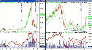
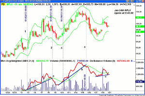
This method also works for commodities, as well as individual stocks. One of the most volatile stocks in the past few years has been Netflix Inc. (NFLX). The monthly chart shows the trading range that developed from 2004 through early 2009, line a.
The OBV surged in 2005 but then peaked in 2006 and formed a downtrend (line b) over the next three years. This downtrend was broken in February 2009, line 1. The next month, NFLX closed above its monthly resistance at $41.79, line a, and began its dramatic rally.
By the middle of 2010, one was able to draw a clear uptrend in the OBV, line c. At the end of August 2011, the monthly OBV dropped below its WMA as NFLX closed at $235. The next month, the uptrend in the OBV was also violated.
NEXT PAGE: The Power Of Divergences |pagebreak|
In August and September of 2012, NFLX made lower lows, but the OBV made a higher low, line d. This monthly positive divergence took 11-months to develop. At the end of November, the monthly OBV moved back above its WMA and the following month confirmed the divergence
The weekly OBV shows a pattern of higher highs from 2010 up through its peak on April 23, 2011. NFLX made another new high the week of July 16 but the OBV formed a lower high, line e. This negative divergence was then confirmed when the OBV dropped below support (line f) the following week, line 4. The July high at $304.79 was very close to the weekly starc+ band at $305.48.
Click to Enlarge
The weekly OBV stayed below its WMA until January 14, 2012, when there was a strong surge in volume. By the end of April, it was back below its WMA as the OBV formed a downtrend, line i. The OBV formed higher lows in September 2012, line j, while prices formed lower lows (line h). This bullish divergence was also noted in the monthly data, which is a powerful but rare bullish indication.
In October, the OBV moved back above its WMA and broke through its downtrend the next week, line 5. Two weeks later, NFLX also broke through its downtrend, line g, as the OBV was again leading prices. By the end of the November, the monthly OBV had also turned positive.
Click to Enlarge
The liquidity in NFLX allows for clear hourly OBV patterns in NFLX but as I noted before, this is not always the case. On January 2 (line 1), the OBV moved above its WMA. It stayed positive until the afternoon of January 8, line 2, as its WMA and the uptrend (line a) were both broken. NFLX had stayed above its starc+ band for three hours the previous day.
By the morning of January 10, the OBV was back above its WMA (line 3), and it soon was in a clear uptrend, line b. This OBV support was broken on January 15, and two hours later, the OBV dropped below its WMA. The following day, NFLX had dropped below the starc- band.
In the first hour of trading on January 18, the volume was heavy, which moved the OBV back above its WMA. By the end of the day, the OBV appeared to be forming a short-term bottom as it had again moved back above its WMA. This was three days before it reported very strong earnings as the stock opened at $143.99. The hourly OBV (not shown) was in a clear uptrend before lunch on the day prior to the earnings report.
So how should you incorporate the OBV into your investing or trading? For investors, I think the use of the monthly and weekly OBV data will be one of the best technical tools, in addition to chart analysis, that you can use with or without fundamental analysis. I would use both to find likely buy candidates but use the weekly as the trigger in most instances.
For most traders, I would use the combination of the weekly and daily analysis, along with the starc bands to help keep you from buying at the wrong time. The hourly charts can help with this as when prices are at the hourly starc+ bands, you will often be able to get a better price by waiting a few hours. Of course, Fibonacci and pivot point analysis can be used to help determine your entry points
Also, keep an eye out for the zigzag formations as they can often provide low-risk entry points. Though I provided only bullish examples in this article, at market tops you will often see the OBV rally back to its flat or declining WMA before the selling gets heavy.
Disciplined short-term traders can use a combination of the daily and hourly data on many markets but one should only take hourly signals that are in agreement with the daily trend. Be careful about holding positions overnight if the starc bands have been tested for several periods.
As I discussed in 5 Rules for Success in 2013, pay particular attention to your entries, the risk of every trade, and learn to scale out of your profitable positions.
Editor’s Note: If you’d like to learn more about technical analysis, attend Tom Aspray’s workshop at The Trader’s Expo New York, February 17-19. You can sign up here, it’s free.