
Proven technical tools like moving averages and Fibonacci levels can be used to determine whether it’s truly safe to “buy the dips” in a strongly trending market.
Most investors have heard the phrase “Buy the dips” from the financial pundits when the stock market has been in a well-established uptrend.
But to most, a “dip” is quite a vague term and it means something different to a fundamental analyst than it does to a technical analyst. This was illustrated in a recent column in The Wall Street Journal by Jason Zweig titled “Why Buying on the Dips Isn’t All It’s Cracked Up to Be.”
In a nutshell, Zweig looks at how buying on a 2% or a 5% market correction impacted the performance when compared a single purchase over a ten-year period. I think his conclusion misses the point, however, as to most traders or technical analysts, buying the dips generally refers to a specific issue, and not the market as a whole.
Secondly, the “dip level” is rarely a percentage, but is more likely a support level that has been observed from past price behavior.
Let’s look at some simple ways to determine the dip level and whether you should be buying or not.
Click to Enlarge
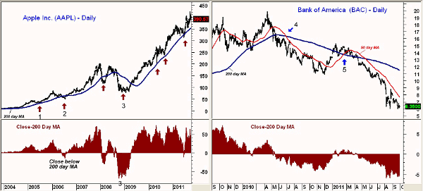
Chart Analysis: If there is one stock that we all would have liked to be buying on the dips for many years, it is Apple, Inc. (AAPL). This daily chart goes back to 2004, and the blue line on the chart is a simple 200-day moving average (MA). Below the bar chart is a plot of the difference between the close and the 200-day MA. At its extremes, the close was almost $70 above and $70 below the 200-day MA.
- In early 2005, APPL hit a high of $45.10 before dropping back to a low of $33.11 (point 1). AAPL went from over $18 above its 200-day MA to just $4 above it
- In 2006, AAPL went from $34 above its 200-day MA to $12 under it, point 2
- During the bear market of 2008-2009, it was a much different story, as AAPL dropped $27 under the MA, and in 2009, point 3, it was $67 below it
- A major flag formation, lines a and b, was formed during the bear market before AAPL’s uptrend resumed in 2009
- During 2010 and 2011, there have been several times when AAPL has dropped back to its MA (see arrows). All were good buying opportunities
Bank of America (BAC) has been in the news quite a bit over the past few years, but generally for all the wrong reasons. The daily chart shows a well-established downtrend for the past two years, and clearly, buying the dips in BAC has not been a good strategy.
- One simple way to determine whether to buy on the dips or not is to look at the relationship of the 50- and 200-day MAs
- In June 2010, the 50-day MA (in red) dropped below the 200-day MA when BAC dropped from over $15 to under $11
- Moving average crossovers can give false signals, as the 50-day MA moved back above the 200-day MA in February 2011 (point 5)
- By the next month, the technical studies were clearly negative, as discussed in “Big Banks Flunk Smell Test”
- As the chart indicates, BAC has stayed well below its 200-day MA
NEXT: Another Useful Tool for Buying the Dips
|pagebreak|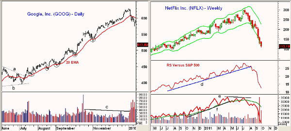
Click to Enlarge
Another popular tool used by many traders is the 20-day exponential moving average (EMA). This chart of Google, Inc. (GOOG) covers from June 2009 through early 2010.
- In July 2009, GOOG broke its downtrend, line a, and completed a flag formation, which started a new uptrend
- On the first pullback after the breakout, GOOG pulled back to its rising 20 EMA before turning higher
- GOOG rallied from a low in the $423 area to over $464 before dropping back below the rising 20 EMA in August (see circle)
- This happened several times over the next few months, as dips to the 20 EMA were good buying opportunities
- In early 2010, GOOG surged to a high of $629.51 before reversing sharply
- The volume on the new high was low, line b, but picked up sharply on the decline, suggesting that the trend may have changed
In The Wall Street Journal article, it was pointed out that “Buying low doesn’t do you much good unless you also can sell high.” NetFlix, Inc. (NFLX) hit a high of $304.79 during the week ending June 16 and came very close to its weekly Starc+ band before it collapsed.
- Several weeks after the highs, the long-term uptrend in the relative performance, or RS analysis, turned negative when it broke its uptrend, line d
- The weekly on-balance volume (OBV) broke its uptrend, line f, in May
- In July, the OBV formed a negative divergence at the highs, line e, and then dropped below its weighted moving average (WMA)
- The weekly Starc- band was tested a few weeks later and prices stabilized before dropping sharply
What It Means: As I have discussed frequently, it is very important to have a plan for all investments so you do not react to sudden turns in the market.
This is essential if you are buying on dips. If you have identified a strongly trending market, then you need to determine a good level of support from the 200-day MA, Fibonacci retracement level, or the Starc- band. Then you can place an order to buy at that level, but be sure to put a protective stop order in at the same time.
One should also use weekly Starc+ bands or Fibonacci targets to take profits on long positions when they reach a high-risk buy level.
How to Profit: Overall, the market is still range-bound and we need to see a strong day of Advance/Decline (A/D) numbers to turn the analysis of the A/D line positive. Until then, expect more choppy trading.


