
Learning to read option risk graphs is important as it will help you visualize the possible outcomes of a strategy that you are contemplating, notes Russ Allenof Online Trading Academy.
In my last article, which you can read here, I began a discussion of option position charts. These charts graph the profit or loss of an option position versus the price of the underlying asset. Being able to think of an option position in those terms lets you picture the effect of any change. This is vital to making options work profitably for you. And it’s easy and fun, once you get the knack.
To come up to speed on the example we’re using, below is a price chart for GLD, the gold exchange-traded fund, as of October 10, 2013.
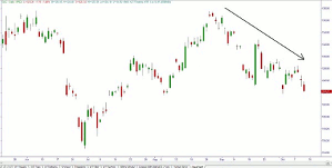
Figure 1 – GLD as of October 10, 2013
Click to Enlarge
For our example, we assumed that we believed that the long downtrend in GLD would continue, at least for the next few weeks. To make some money if we were right about that, we considered a bear call spread. Using prices for this example that were at the midpoint between the bid and ask prices for the options, we could have sold the November 130 call for $1.36; and simultaneously purchased the November 135 calls at $.555, for a net credit of $.805 per share, or $80.50 for the contract.
Below is the payoff graph for this trade, reproduced from the original article.
Figure 2 – GLD Bear Call Spread, with Selected Dates’ P/L Curves
Click to Enlarge
On the chart above, note the three curved colored lines. They show the P/L for this spread position at any GLD price, as of selected dates between now and expiration.
The blue line shows what our P/L would be at any GLD price when there were 36 days to go. The green line is where P/L it would be at any price when there are 24 days to go; and the purple line at 12 days to go. Usually we only draw one of the curved plots—the one for today. The straight-lined plot is the P/L as it will be on expiration day. Each day the curved “today’s P/L” line gets redrawn, and moves a little closer to the black straight lines.
Last week, we discussed what the diagram shows us about delta. In short, delta is represented by the slope of the P/L curve. The steeper it is, the more rapidly our P/L changes with a change in the underlying. Where the P/L curve is flat (horizontal), a change in underlying price does not change the options’ value, and hence the position’s P/L, at all. The steeper the slope is, the more effect a change in the underlying price has. Upward slope indicates a bullish trade; downward slope (like this diagram), a bearish trade.
Now let’s look at delta’s cousin, gamma.
Where delta measures how the underlying effects an option’s value, gamma measures how the underlying affects the delta. You could say that gamma is “the delta of the delta.”
The relationship between delta and gamma is similar to the relationship between speed and acceleration.
NEXT PAGE: Delta & Gamma’s Relationship
|pagebreak|Imagine that you are sitting in your stopped vehicle. Your speed is zero miles per hour. The light changes and you step on the accelerator. In one second you are going four miles per hour. A second later, you are going eight miles per hour; and another second later you are going another four mph faster, at 12 miles per hour (you have a very light foot on the pedal).
At this point, 12 miles per hour is your velocity, or speed—distance traveled (miles) per unit of time (hours). Meanwhile, four miles per hour per second is your rate of acceleration (0 to 4 to 8 to 12).
In a sort of similar way, with options, the position’s dollar value changes when the underlying price changes. This rate of change, or velocity, is measured by delta. At a given moment, if the underlying changes by one dollar, the delta measures the resulting change in the position’s value. “Miles per hour” is replaced by “option dollars per stock dollar.” If delta is zero point four, then a $1.00 change in the underlying will result in a change of $.40 in the value of the option position.
After a $1.00 underlying move, the value of an option that started at a delta value of .40 will have changed by 40 cents (that’s per share, or $40 for a standard 100-share contract). If the option was a call, its value will have gone up after an underlying price increase, or down after a decrease. For a put option, it’s the other way around.
After that first $1.00 change in the stock price has happened, all of the stock’s options’ values will have changed. Each option’s delta is no longer the same value that it was. A move up in a stock’s price will have improved the chances of all its call options finishing in the money, and diminished the probabilities for all of its puts. A down move will have had the opposite effect. Since the probability for every option is now different, its delta is different as well.
A call that started off with a $2.00 value and a delta of .40, would be worth $2.00 + $.40 = $2.40 after the underlying increased by one dollar. At that point, that call will have a new, higher delta. That delta might have changed, for example, from .40 to .58. That .18 change in delta (.58 minus .40) could have been predicted before the underlying moved. Just as the delta of .40 told us that the option value would change by forty cents, the option’s gamma would have predicted what the new delta would then be. In this case the option’s original gamma value would have been .18.
A delta of .40, together with a gamma of .18, would say “For the next one dollar increase in the stock price, this option will increase in value by forty cents, and its delta will increase by .18.”
So gamma is the rate of change of delta, while delta itself is the rate of change of option value.
Whew. So, do we want high gamma or low gamma? Positive or negative? Is it a good thing or bad? And how does the diagram show us any of that?
For the answers to those questions, and yet more thrills and chills, tune in again next time.
By Russ Allen, Instructor, Online Trading Academy


