
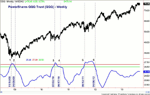
Developed by Donald Dorsey, the Mass Index is an indicator that identifies trend reversals, and here, MoneyShow’s Tom Aspray explains how it helps him in his analysis.
The majority of technical tools that I use in my analysis and discuss in my trading lessons are ones that I have used for decades or are strategies that have evolved over the years. I was fortunate in the early 1980s to have access to CompuTrac, which included the majority of today’s most frequently used technical indicators.
I do continue to do additional research and came across a technical tool that, I think, investors as well as traders should consider adding to their arsenal of market-timing indicators.
It is called the Mass Index, which first appeared in the June ‘92 Technical Analysis of Stocks & Commodities article The Mass Index, by Donald Dorsey. As he said in the article "Range oscillation, not often covered by students of technical analysis, delves into repetitive market patterns during which the daily trading range narrows and widens. Examining this pattern, Donald Dorsey explains, allows the technician to forecast market reversals that other indicators may miss.” Dorsey proposes the use of range oscillators in his Mass index.
Essentially, it measures the narrowing and widening of the range between the high and low prices. The signals do not tell you the direction of the trend change but that is when I rely on other tools such as the NYSE Advance/Decline and the on balance volume.
To calculate the Mass Index:
- Calculate a nine-day exponential moving average (EMA) of the difference between the high and low prices.
- Calculate a nine-day exponential moving average of the moving average calculated in Step 1.
- Divide the moving average calculated in Step 1 by the moving average calculated in Step 2.
- Total the values in Step 3 for the number of periods in the Mass Index (e.g., 25 days).
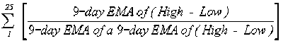
In my research I found the Mass Index to be most useful on the weekly data. On the weekly chart of the S&P 500, the Mass Index is in blue and there are two horizontal lines, one at 27 (in red) and the other at 26.5 (in green).The chart covers the period from the early part of 2006 until early in 2010.
Click
to Enlarge
Mr. Dorsey looked for what he called “bulges” which was when the Mass Index moves above the 27 level. The first example occurred on August 7, 2007, (line 1), which was two weeks after the July stock market high as the first hints of the mortgage crisis resulted in a wave of selling. Two weeks later, the S&P 500 formed a panic low on August 16.
The Mass Index dropped back below the 27 level at the end of September but did not drop below the 26.50 level, which would have signaled a change in trend. A second bulge occurred the week ending November 16 (line 2) as the Mass Index stayed above 27 until the middle of December.
NEXT PAGE: Examples of the Mass Index in Action
|pagebreak|Then on February 1, 2008, the Mass Index dropped to 26.46 (line 3), which was below the key level of 26.50 (green line) and signaled a trend change. As I discussed in detail in an earlier article, the NYSE Advance/Decline line (see chart) had formed a series of negative divergence since June of the prior year and was already in a well-established downtrend. This indicated that the trend change was to the downside.
The Mass index started to turn up in the fall of 2008, and on November 7, another bulge was formed (line 4). The Mass Index continued higher and peaked at 28.04 in early December. The Index then declined dropping to 26.33 on February 27 and a new trend change was signaled.
Click
to Enlarge
The S&P 500 made its bear-market low the following week, and by the end of March, the A/D line had broken its long-term downtrend and had turned positive.
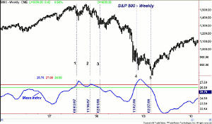
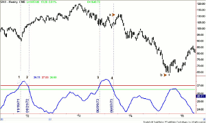
So what has happened since? In this example we are looking at, the Spyder Trust (SPY), which gave identical signals in 2007 as the cash S&P 500. The next bulge occurred on July 7, 2010, (line 1), which was almost a month before the debt ceiling vote, the downgrade of US debt, and plunge in the stock prices.
Click
to Enlarge
On August 27, 2010, the Mass Index dropped to 26.36 (line 2) indicating that a trend change was at hand. At the time, the AAII survey of individual investors revealed that only 20.7% were bullish. This was an historically low level that was consistent with a stock-market bottom. In the September 8, 2010, report I noted that the NYSE A/D line had made a new high, which was a bullish sign for stocks.
The Mass Index stayed below the zero line until the following August as it moved back above 27 (line 3) on August 27, 2011. This came during a period of much concern over the Eurozone debt, and by the later part of September, many analysts thought we were already in a recession.
The selling reached a fever pitch on October 4 as most stocks dropped sharply before reversing back to the upside and closing the day higher. The high-to-low ranges were quite extreme as the Spyder Trust (SPY) had a high of $112.98 and a low of $107.43. Just seven days after the lows, the A/D lines on the S&P 500 and Dow Industrials completed their bottom formations.
Click
to Enlarge
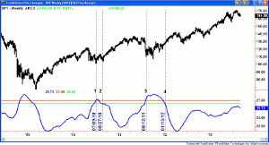
This analysis can then be compared with that of the PowerShares QQQ Trust (QQQ) as the weekly chart covers the period from late 2008 until early September of 2013. The Mass Index moved above 27 on November 11, 2008 (line 1). This alerted the investor to be looking for a change in trend.
The Mass Index dropped below 26.50 on January 9, 2009, signaling a trend change (line 2). In early March, the QQQ dropped back towards the November 21 low of $25.05 but only hit a low of $25.63 suggesting a double bottom could be forming. The relative performance analysis at the time indicated that the QQQ was acting stronger than the S&P 500.
The Mass Index stayed below 27 until July 7, 2010, (line 3), which was a month before the previously mentioned debt ceiling fight and stock market plunge. The new uptrend was in place on the chart when the Mass Index dropped below 26.50, line 4, on September 17, 2010.
NEXT PAGE: Mass Index Predicted Major Market Turns
|pagebreak|It was almost a year before the Mass Index again moved above the 27 level (line 5) on August 12, 2011. It was almost five months later when the Mass Index dropped to 26.35 confirming a new trend change. As is the case for the Spyder Trust (SPY), the Mass Index has stayed well below the 27 level, which is consistent with no change in the major uptrend for stocks.
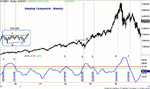
What about other major market turns? This chart covers the Nasdaq Composite from the middle of 1995 until the latter part of 2000. On August 4, 1995, the Mass Index moved above the 27 level and stayed above it until the end of the year.
Click
to Enlarge
The inset on the chart (1995-1996) shows that four weeks after the Mass Index signaled a trend change, the continuation pattern, lines a and b, was completed. This was an indication that the prior uptrend had resumed.
The Mass Index did not come close to the 27 level until January 16, 1998, (line 3), when it hit a high of 26.99. A month later, it dropped below the 26.50 level, but because it had not moved above the 27 level, a trend change was not generated.
Of course, these levels could be adjusted or optimized, but in my initial review, I wanted to start with the guidelines of the creator. Modifications may be included in a future article.
The next “bulge” or what I would call an early warning signal was on September 25, 1998, (line 4), when it came close to the 28 level. The prior high, line c, was overcome in the middle of December. The Nasdaq Composite gained about 12.8% before the Mass Index dropped below the 26.50 level, line 5, on February 26, 1999.
The Nasdaq Composite closed at 2288 and then rose 85% until February 4, 2000, (line 6), when the Mass Index next moved above the 27 level (line 6). Of course, the Nasdaq Composite peaked at 5132 in March of 2000, but the Mass Index did not drop back below the 26.50 level until July 28 (line 7).
Click
to Enlarge
When I research an indicator or methodology, I also like to look at some of the key historical periods, so I can gain further insight on how it might have performed. This chart covers the S&P 500 from late 1971 through the latter part of 1975, which includes one of the worst bear markets.
The warning signal came on November 19, 1971, as the Mass Index crossed above the 27 level one week before the S&P made its low. Two months later, the Mass Index dropped to 26.40 and signaled a change in trend.
The S&P 500 rallied until early 1973, and by the middle of February 1973, one of my favorite market timing indicators, the weekly NYSE Advance/Decline line had turned negative.
The signal or bulge in the Mass Index did not occur until June 1, 1973, (line 3), as it rose to a high of 27.81 by the middle of July. By September 7, 1973, a trend change was identified as the Mass Index dropped to 26.39, line 4. The S&P 500 rallied for seven weeks before it was hit with heavy selling.
From the October 1973 high, point a, to the October 1974 low (point b) the S&P 500 lost 43.5%. I also looked at some periods from the 1960’s where the Mass Index also performed well. For example, it signaled a trend change near the S&P 500’s low in September 1962 and then another in early 1963 very close to the highs.
NEXT PAGE: Mass Index Also Works on Stocks
|pagebreak|In my initial research, I concentrated mainly in the major averages and market-tracking ETFs. It was designed apparently to also work on stocks, so I wanted to examine how it has worked on two widely followed stocks, Apple, Inc. (AAPL) and Netflix Inc. (NFLX).
On May 28, 2010, the Mass index on AAPL moved above the 27 level (line 1). In the latter part of September, the stock made a new high for the year overcoming the resistance at $283. On October 22, the Mass Index dropped to 26.33 signaling a trend change, line 2.

Click
to Enlarge
The next early warning signal (line 3) came on October 14, 2011, and at the end of the year (12/30/11) the Mass Index declined to 26.41 and below the key level of 26.50, line 4. A month later at the end of January, AAPL overcame the resistance at $431 which was bullish. In July 2012 the Mass Index rose to 26.86 but did not make it above the 27 level and the stock topped in the middle of September.
Neflix Inc. (NFLX) signaled a trend change on July 4, 2008, when the stock closed at $27.21, line 5. It was not until April of 2009 that NFLX surpassed the price high at $41.75 from early 2008.
The 27 level was next overcome on May 14, 2010 (line 6) as the Mass Index had surged from 26.80 to 27.38. This was followed by a trend change signal on December 3, 2010. The stock continued higher until June 2011 when it peaked at over $300 per share. The weekly OBV turned negative two weeks after the high.
The Mass Index rose above 26.50 in October of 2011 but never made it above the 27 level. The most recent signal from the Mass Index came on March 3, 2013, when it rose to 27.48. Eight weeks later, NFLX broke out above the resistance at $198. The trend change was signaled on August 9, 2013, and since then, NFLX has surged from $246 to a new high of $293.06. The weekly OBV on NFLX is currently positive and shows no signs yet of a top.
So, how will I incorporate the Mass Index into my analysis? I will be scanning the major averages and the index-tracking ETFs each weekend, looking for readings above the 27 level, as well as the overall trend of the Mass Index.
At this point, my research has convinced me that the Mass Index is a useful confirming tool for market timing. It will supplement my analysis of the Advance/Decline and the on-balance volume, which are still the most important.
These examples show how it has worked at major trend changes, as well as giving confirmation that an up or down trend has resumed. I have pointed out several examples where significant chart resistance was overcome after the Mass Index moved above 27 but before it dropped below 26.50. There were also cases where the Mass Index dropped below 26.50, and the trend change was subsequently confirmed a few weeks later by a breakout in prices.
The Mass Index is available on many free websites including StockCharts.com. I will be doing further work with this indicator, so look for updates in the future.


