
After 30+ years in the financial markets, technician Tom Aspray has seen just about every kind of indicator available, but there are two that he has found particularly effective, which he shares here.
There are a wide range of technical indicators that traders and investors can use to determine the market's trend and to pick stocks. I have found that the most effective combination of indicators use either different data or non-correlated data.
For example, if you were to use the MACD-His, RSI, and stochastics you are likely to get similar results from all three as all are based solely on price. In many of my columns I generally feature two key technical tools even though I do use others.
The first is the on-balance volume (which I discovered from Joe Granville's book before I even had my first computer), which is my favorite volume tool and one that I have used confidently since the 1980s. Looking at the monthly, weekly, and daily OBV analysis can give you a good idea whether a market is being accumulated or distributed.
In the past ten years or so, I have relied more heavily on the relative performance. It measures how a stock or an ETF is performing relative to a benchmark like the S&P 500. In an up market, those stocks that have positive RS trends in all time frames do better than the overall market. Also, when a market is correcting, these stocks will generally decline less than the overall market.
To determine support or resistance level, I like to combine my chart analysis with Fibonacci and the monthly/quarterly pivot levels. The pivot analysis was added after John Person was kind enough to share with me his unique methodology.
When the Fibonacci and pivot analysis highlight the same levels of support or resistance, it can identify high-confidence price levels of where you should be buying or selling.
In this week's lesson, I want to demonstrate how two non-related technical tools can help you determine changes in the market's trend. This first is the McClellan oscillator, which was developed by Sherman and Marian McClellan and is calculated from the A/D data. The second is a sentiment indicator, the Total Put/Call ratio (P/C), which measures the volume of puts traded divided by the volume in calls. It can be downloaded free from the CBOE.
On the bottom of the NYSE Composite chart, I have plotted the eight-period WMA of the Total Put/Call ratio in green and the three-day SMA in red. I added this so that it could be used by the TradeStation platform.
When the ratio is above 1.0, it means that more puts are being traded than calls. So a reading of, say 1.2, indicates that a majority are bearish. Conversely, a reading of 0.5 indicates that twice as many calls have traded than puts, which reflects a high level of bullish sentiment.
Click
to Enlarge
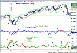
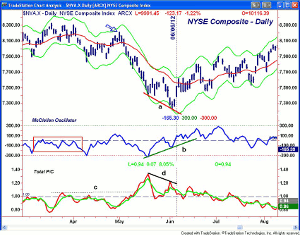
The first chart covers the period from February-August of 2007. At the end of February, the stock market had its biggest one-day drop in five years as it reacted to the selling in the Chinese market. The NYSE Composite traded below its starc- band for five days ending on March 5 (line 1) as the McClellan oscillator hit -307.
Stocks rebounded for five days before dropping once more as the NYSE made a lower low (line a) on March 14. The McClellan oscillator only dropped to -60 and therefore formed a positive divergence as indicated by line b.
NEXT PAGE: Examples of the McClellan Oscillator's Use
|pagebreak|The SMA of the P/C ratio broke above its prior high on February 23, which was two days before the plunge. It peaked at 1.46 on March 5 and then dropped back to 1.10. As the NYSE was making its low, the moving averages of the P/C were making lower highs, line c, indicating that fewer option traders were bearish.
The uptrend in the P/C, line d, was broken four days after the low. The P/C also spiked later in the month as prices pulled back to their 20-day EMA when the McClellan oscillator dropped briefly below the zero line.
Click
to Enlarge
During April and May both indicators were in a trading range but the NYSE Advance/Decline line was clearly positive as it was making higher highs with prices and staying above its WMA. In June, the bearishness picked up as the NYSE consolidated for a few weeks. The lower highs in the P/C, line e, preceded the next upside breakout.
The new highs in July were accompanied by low readings from the McClellan oscillator, which formed a negative divergence, line f, as the NYSE Composite was making another new high (line 2). The P/C ratio was very low but had started to edge higher. The ratio broke out to the upside on July 24 as the NYSE closed below the lows of the prior 13 days.
Click
to Enlarge
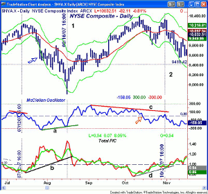
As stocks continued to plunge from the July highs, the NYSE closed below its starc- band for two consecutive days (see arrow) and the McClellan oscillator hit a low of -334. The P/C SMA turned down at the same time. The NYSE rally failed at its declining 20-day EMA as the McClellan oscillator rebounded to the zero line. The P/C SMA had dropped to 1.07 as the level of bearishness decreased.
As the market again turned lower, the P/C ratio turned up forming a new uptrend, line b. The NYSE Composite dropped well below the starc- band on August 16 but then closed on the day's highs. On that day, the McClellan oscillator only reached -251 therefore forming a bullish divergence, line a.
The SMA of the P/C ratio made a new high as the market was making its low. Three days later, the uptrend in the P/C, line b, was broken and the McClellan oscillator confirmed its positive divergence by moving above the prior high and the zero line.
By early September, the stock market was in a new uptrend as the McClellan oscillator peaked at +259 on September 4. The P/C ratio did not drop decisively below the zero line and the prior lows until September 21. By October 11, the NYSE made an intra-day high of 10,387, which has still not been exceeded.
At these highs, the P/C SMA dropped to a low of 0.77. The NYSE Composite quickly turned lower and had dropped below its starc- band on October 22. On this decline, the McClellan oscillator broke convincingly below the zero line (see arrow) and hit a low of -182. The P/C SMA edged slightly above the 1.00 line.
Just seven days later as the NYSE was making a new closing high at 10,308 (line 2), the McClellan oscillator was only able to rally to +47. The P/C SMA only dropped slightly below its WMA to 0.95 and held its uptrend, line d. Four days after the NYSE highs, the P/C was making new highs and was in a solid uptrend.
Click
to Enlarge
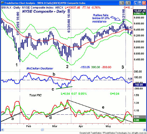
The next three months were pretty tough for the stock market as the NYSE had an intra-day low of 8343 on January 23 (line 1). The NYSE Composite was down 19% from the October high. As the NYSE was making its low, the McClellan oscillator was just below the zero line and the SMA of the P/C ratio had dropped below its WMA. Two days later, the uptrend in the P/C, line a, was also broken.
NEXT PAGE: More Examples of the McClellan Oscillator's Use
|pagebreak|Market sentiment was quite negative at this time, and as I interviewed a series of experts in February, majority thought that we were in a bear market. The NYSE shows a broad trading range over the next two months as the lows were tested again on March 17.
The McClellan oscillator formed a short-term positive divergence at these lows, line c, and overcame its resistance, line b, on March 20 (line 2). The P/C turned higher in the latter part of February and peaked as prices were making their lows. The uptrend in the P/C, line d, was broken on March 20, confirming the positive signal from the McClellan oscillator.
Click
to Enlarge
The rally from the March lows was a classic bear market rally as the NYSE rallied up to the 61.8% Fibonacci retracement resistance but did not close above it. During the two-month rally, the McClellan oscillator stayed in a range and as is sometimes the case failed to give any clear signals.
The P/C ratio was in a well-established downtrend, line e, during this period, which was broken as the NYSE was making its highs. The McClellan oscillator decisively dropped below the zero line on May 21 (line 3), and by then, the P/C also had moved above 1.00.
During sideway periods in the McClellan oscillator, the NYSE Advance/Decline is more useful. It was in a clear uptrend from early April and did not break its uptrend until May 23. This bear market rally lasted just long enough to change the opinion of the previously bearish advisors.
Click
to Enlarge
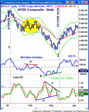
Since the 2008 financial collapse is hopefully an anomaly that will not be repeated, I will skip forward to the 2009 market low but will Tweet the 2008 chart out next week. The rally in early 2009 (line 1) tested the daily starc+ band before prices reversed. The NYSE then tried to consolidate above the November 2008 lows.
What followed is a classic example of how the McClellan oscillator acts during an interruption in the downtrend or continuation pattern (highlighted in yellow). The oscillator formed twin peaks, line a, before dropping below support. The P/C ratio was in a downtrend at the time indicating that puts were not being bought.
The NYSE tested the starc- band on February 23 as the McClellan oscillator was making its low at -359. It then made two higher lows forming the positive divergence, line b.
The P/C moving averages made their high a day before the low in the McClellan oscillator and then formed lower highs, line c, as the market was bottoming. This was a sign that the sentiment was less bearish in early March than it was in February, which was a positive sign.
By March 12 (line 2), the McClellan oscillator had moved well above the zero line and the uptrend in the P/C had been broken as the bottom formation had been completed.
Click
to Enlarge
In May and June of 2012, there was another example of a classic setup. The NYSE Advance/Decline (not shown) had topped out in March and violated support in early April. The McClellan oscillator stayed below the zero line as the NYSE was making its highs. This was a sign of weakness.
The Dow Industrials made new highs on May 1, but the NYSE (see arrow) and the other major averages did not make new highs. The Dow Industrials A/D line (not shown) also failed to confirm the May 1 highs.
Just five days later, the NYSE had dropped below its starc- band as the oscillator violated support and the P/C had moved above the resistance at line c. On May 18, the oscillator made its low at -329, which coincided with a peak in the P/C SMA at 1.34.
NEXT PAGE: Examples of the Use of the Put/Call Ratio
|pagebreak|The rally did not last long and the NYSE Composite made new lows on June 4. The McClellan oscillator just dropped to -123 and did not make new lows. Therefore, a bullish divergence, line b, was formed. The SMA of the P/C formed lower highs, line d, which confirmed the action in the McClellan oscillator. By June 6, a bottom had been confirmed as I noted at the time in Rally Potential That Bears Don't Expect.
I realize that many of you may not have the capability to plot the McClellan oscillator with the P/C ratio. As I mentioned in an earlier article, you can monitor the McClellan oscillator on StockCharts.com by following this link.
Click
to Enlarge
In a trading lesson from several years ago, A Treasure Trove of Technical Tools, I focused on the site www.indexindicators.com as they also have a wide range of Put/Call data. This includes the CBOE Total Put/Call, CBOE Index Put/Call, and CBOE Equity Put/Call.
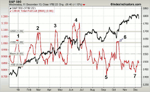
The chart above covers all of 2013 and below the chart of the S&P 500 is a chart of a five-day SMA of the Total Put/Call ratio. I use these signals to time the Spyder Trust (SPY).
In late December of 2012 as stocks dropped sharply in reaction to concerns about the fiscal cliff, the ratio spiked to one standard deviation above the mean (point 1). The technical reading at that time indicated this was a buying opportunity.
As the Spyder Trust (SPY) was making its low in February at $147.23, the five-day SMA of the P/C SMA came very close to the two standard deviation level at 1.09 (point 2) with a daily high in the P/C of 1.17.
A similar sharp increase in put volume, as measured by the SMA of the P/C, occurred in the middle of April, as noted by point 3. The decline from the May high to the June low was more severe as the Spyder Trust (SPY) dropped 6.4%. The MA of the P/C formed twin peaks (point 4) at 1.15, and on a single day, the P/C came very close to 1.40.
The lowest reading in 2013 came in the first week of September (point 5) as the P/C SMA had a low of 0.77 with a single day reading of 0.67. The Spyder Trust (SPY) had another correction from the September 20 high to the October 9 lows as it was down 5.2%. The SMA of the P/C reached the 1.00 level at the October low (point 6).
At the start of December of 2013, the P/C dropped below 0.80, and then tried to turn up as the stock market was correcting. It was well below levels normally associated with market bottoms and the McClellan oscillator had been quite weak since the middle of November.
I hope these past examples can still be applied to your chart analysis for the rest of 2015 and have demonstrated why combining these two quite different technical indicators can be a valuable tool. They are especially accurate in identifying short-term market bottoms but are not as good as the A/D line in identifying market peaks. Both are quite good in confirming market corrections. Veteran option expert Larry McMillan has developed several computer-generated trading systems from the Put/Call data, which you may find interesting.
In terms of a major trend in the stock market, in my opinion, the NYSE Advance/Decline is still the best tool and the readings from it should be combined with the McClellan oscillator and Put/Call ratio. The A/D line will also help tell you whether a market correction is just a pullback within a major trend or whether a more significant correction is likely.


