
Continuation patterns come in many shapes and sizes, but the one thing they all have in common is allow good trading or investing opportunities, says MoneyShow’s Tom Aspray.
Last summer’s rally in gold and the gold miners coincided with a strong seasonal period, and after the dismal performance in the first half of the year, a rally was overdue. The rally was impressive as the SPDR Gold Trust (GLD) rallied 20% from the late-June lows to the late-August highs.
In late July’s Is Gold's Rally a Bull Trap?, I shared the reasons why I thought the rally in gold and the SPDR Gold Trust (GLD) was a bull trap. GLD triggered a weekly low close doji sell signal in the early part of September suggesting that the rally might be over.
Click
to Enlarge
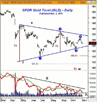
This chart I presented on November 5 subsequently got quite a bit of attention as the technical evidence suggested that the bull trap was ready to close. My high degree of confidence in this analysis came from the classic flag or continuation pattern (lines e and f) that had formed in GLD since April of 2013.
This type of formation can present some of the best trading or investing opportunities, and that is why they are my favorite chart formations. They allow one to clearly define both the risk, as well as the potential reward, and the market will give you clear signals when you are wrong.
The high in August 2013 (point 2) just reached the 38.2% Fibonacci retracement resistance from the high at $174.07. This, therefore, was a key level of resistance. As prices declined from the highs, the daily on-balance volume (OBV) began a new downtrend and by October the OBV was acting weaker than prices.
The rally in the OBV from the June lows had been weak, which was one of the main reasons I thought that this rally was a pause in the downtrend, not an important low.
After the decline from point 2 to point 3 and the weak OBV readings, the stage was set for a technical rebound that was expected to fail. The rally failed just below the minor 61.8% Fibonacci retracement resistance (point 4). The previous decline allowed one to calculate an equally downside target for GLD at $115.74. This was the first target as additional lower targets could also be calculated from this formation.
Click
to Enlarge
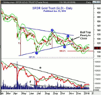
The updated chart from January 23’s Buy the Miners Not the Gold shows that the downside target was exceeded just before Christmas as GLD had a low of $114.46. As GLD was making its low, the daily OBV was above its WMA, which meant that only a fewer sellers were pushing prices lower. This was a positive sign.
Though this example was of a market in a downtrend, the same rules apply when a market is in a strong uptrend. In order to be successful, you do not need to buy at major bottoms or sell at major tops. Though this may happen periodically, most will make more money by identifying the pauses or corrections within the major trend.
Identifying major bottoms is not really that easy as a stock or ETF will not show up on one’s radar until they have already started to move higher. Momentum indicators like the RSI or stochastics will generally give positive signals at major lows but they frequently give false signals before the final low is in place.
I have found volume to be the most valuable tool in identifying a major bottom and the OBV generally does a good job of confirming that a stock is being accumulated. Positive relative performance is also important as you increase the odds of success when you are buying stocks or ETFs that are acting stronger than the S&P 500.
One of my favorite entry techniques is to buy setbacks in major trends as the monthly and weekly data can give you a reliable reading on the major trend. This confirmation can give you additional confidence that you are indeed buying a setback in a major uptrend.
Some of the major market-moving stocks of 2013 provide some excellent examples of what typically occurs during a stock or ETF’s major trend.
NEXT PAGE: The Flag Formation
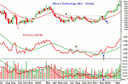
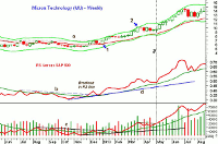
|pagebreak|Micron Technology (MU) was one of the best performers in 2013 as it was up 243%. It formed a bottom between May 2012 and December 2012 as the rallies failed below $7.00, line 1. MU made a low in June of $5.30 and this low was briefly broken for several days in October before it turned higher.
The technical studies bottomed ahead of prices at the end of November as the relative performance moved above its WMA and its resistance at line b. The RS line then surpassed the prior two peaks signaling that MU was a market leader. The strong action in the RS line favored buying the pullback from the weekly resistance.
Click
to Enlarge
The OBV was also bottoming as it moved above its WMA and then held above it as MU dropped back to test its 20-week EMA (point 1), which was typical of a correction.
The low volume evident on the weekly chart was a sign that there were not many sellers. The RS line also held well above its WMAs on the pullback (point 2) and then turned sharply higher.
Click
to Enlarge
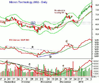
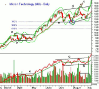
On the daily chart, the signs of a bottom and then a tradable correction are even more evident. As MU dropped back below its 20-day EMA and reached a low of $5.33, the daily relative performance was forming higher lows, line b. The RS line then moved above the zero line as MU closed well above its EMA.
The daily OBV had moved above its WMA before the end of November and broke its downtrend, line c, at the same time the RS line was overcoming its resistance. MU rallied steadily for the next three weeks rising from $5.77 to $6.89.
MU continued to edge higher for four days after the weekly RS line broke out to the upside but the RS line was forming a slight negative divergence, line d. The OBV also failed to make new highs and then volume spiked as MU gapped to the downside.
Over the next few days, MU dropped down into the zone of support between the 38.2% and 50% Fibonacci retracement support levels that were calculated from the October low of $5.16. The correction low at $6.07 was just above the 50% support at $6.03 as stops could have been used under the 61.8% support at $5.82.
On the correction, the daily RS line dropped well below its WMA but did hold above the breakout level. The OBV dropped below its WMA, but after the one day of high volume, it dropped to very low levels. Four days after the low, both the RS and OBV were able to move above their WMAs.
Click
to Enlarge
After the two-week correction, MU closed sharply higher at $6.96 and right on the weekly resistance at line a. For the next 11 weeks, MU continued to edge higher, eventually reaching a weekly closing high of $10.22 (point 2) at the end of March. MU had been trading above its weekly starc+ band for three weeks in a row and therefore was overbought.
On the weekly chart, prices moved sideways for six weeks. The weekly RS line had confirmed each new price highs and stayed above its WMA on the correction. The RS line had long-term support at line d.
The OBV had a very shallow correction as it also held well above its rising WMA and longer-term support. The OBV broke its short-term downtrend as MU was making its correction low on the week ending May 3 (line 3). The volume was heavy the following week as once again MU moved sharply higher.
Click
to Enlarge
This correction looks much different on the daily chart as it shows a clear-cut flag formation, lines a and b. The momentum had shifted by May 6 as the prior swing high was overcome and the breakout of the flag occurred two days later. It was confirmed by the OBV and the RS line (not shown) both moving through their resistance.
From the breakout close at $10.23, MU rallied to a high of $14.60 on July 1 before the rally stalled at the weekly starc+ bands. The correction lasted four weeks as the 38.2% Fibonacci retracement support from the early May lows did hold.
NEXT PAGE: The Flag Formation
|pagebreak|This correction was more complex because after completing the triangle formation and surging above the prior peak (point 1), MU again corrected back to support in the $13.00 area before it moved out of the broader trading range as identified by lines d and f.
The OBV confirmed the price action as it also broke out of its trading range, lines g and h, with the heavy volume in early September. The relative performance (not shown) also confirmed the price action as it moved well above its previous high. The major rally then resumed as MU hit a high of $23.66 before the end of the 2013.
Click
to Enlarge
Another market leader in 2013 was Celgene Corp. (CELG) from the red-hot biotech sector. The stock completed its bottom formation in early January 2013 as the resistance at $18 was overcome but the technical studies gave advance warning of the breakout.
The relative performance was in a clear uptrend by November 2013 (blue line). The OBV moved above its WMA in July, and by September, was leading prices higher. The OBV again tested its WMA in November (see arrow) before a strong year-end surge.
Click
to Enlarge
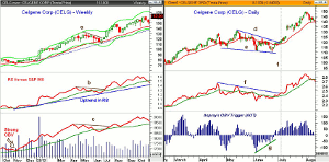
At the May 2013 high of $181.82, the relative performance formed a light negative divergence, line b. A similar negative divergence was evident in the OBV as it also formed lower highs, line c. This was consistent with a correction as their WMAs were both moving higher.
On the daily chart, one can see the formation of a flag, lines d and e, over the next six weeks. The daily RS line had also formed a divergence at the May 14 high, line f. The first half of the correction ended in early June as CELG hit a low of $111.50.
This was a drop of 15.4% from the high, but CELG held above the 38.2% support from the November 2012 low, which was at $108.45. After a two-week bounce, CELG made a new correction low at $110.53, which likely stopped out some of the early buyers. The chart support, line e, did hold.
This is pretty typical as those who bought near the initial low, likely raised their stops after CELG moved higher and then were stopped out near the final correction lows. The daily RS line moved back above its WMA two days after the lows and broke through resistance at line f, as prices were breaking the downtrend, line d. (line 1).
The Aspray's OBV Trigger (AOT) formed a positive divergence, line g, at the correction lows. It was well in positive territory a few days before prices broke out to the upside. Referring to the weekly chart, the short-term downtrends in both the RS and OBV, lines d and c, were also broken, providing further confirmation that the correction was over.
Click
to Enlarge
Caesars Entertainment (CZR) was up over 200% in 2013 but the rally really began in the latter part of 2012, when after making a low of $4.52, it rallied for the next four weeks, finally closing back above its 20-week EMA (line 1).
The strength of the rally pushed the relative performance above its WMA, suggesting that it was starting to become a market leader. The volume on the rally was the heaviest since March and the OBV also was able to move above its WMA.
As CZR hit a high of $8.25, it reached the weekly starc+ band. The stock consolidated for the next seven weeks (forming a triangle on the daily charts) before accelerating to the upside. During the sideways period, both the RS and OBV held above their WMAs.
The relative performance and OBV were strong in both February and March as CZR hit a high of $18.32 the week ending March 22 but then closed weak at $16.38. This reversal suggested the market was ready for a rest as CZR had closed well above its weekly starc+ band the prior week (see arrow).
NEXT PAGE: Another Flag Formation
|pagebreak|Both the weekly RS and OBV analysis had confirmed the highs so a correction was expected. Using the November 2012 low, the 38.2% Fibonacci retracement support was at $13.05 with the 50% support at $11.39. Four weeks after the highs, CZR hit a low of $11.84, which dropped prices right into the support zone.
Nine weeks later, CZR dropped to a low of $12, which retested the lows, line b. The upper boundary of the flag formation, line a, was well defined. The flag formation was completed in July (line 2) as the relative performance also completed a similar formation, lines c and d.
Click
to Enlarge
The OBV broke its downtrend, line e, two weeks ahead of the breakout and then moved back above its WMA as prices were breaking out. The triangle had measured upside targets in the $22-$23 area but CZR actually hit a high of $26.57 in September.
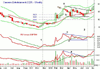
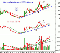
The current weekly chart of Caesars Entertainment (CZR) suggests that it may be in the process of completing another flag formation. The resistance from the September high at $26.57, line a, is now being tested as CZR has bounced several times after testing its 20-week EMA.
The correction from the September highs dropped CZR back to the support zone between the 38.2% and 50% retracement levels. This area also corresponds to the highs from early in 2013 as old resistance becomes new support. The quarterly pivot for CZR is at $20.10 with the weekly uptrend, line b, now at $19.51.
Click
to Enlarge
The weekly relative performance did confirm the recent highs and is now testing its resistance at line c. The RS line shows a strong long-term uptrend, line d. As long as the relative performance does not drop below the late 2013 lows, it will continue to indicate that CZR is a market leader.
The OBV has been much stronger as it broke out to the upside at the end of the year as it moved above the downtrend, line e. It is ready to make another new high this week and is clearly acting stronger than prices. It is well above its rising WMA and support at line f.
The daily chart shows fairly tight ranges and low volume so another pullback to the $20-$21 area is possible over the short term.
I hope these examples have stimulated your interest in trading continuation patterns. They come in many shapes and sizes but do have common features and characteristics that allow for good trading or investing opportunities.
One way to find such stocks is to keep a list of stocks that you notice have had dramatic rallies or those that are frequently on the new-highs list. Then check on them every few weeks and wait until they go into a corrective mode. Once they do, you can define a buying zone and develop a strategy.
Using technical tools like the OBV or relative performance will help you determine whether the major trend is positive or not. The daily technical studies will often give you advance warning of a price breakout, or alternatively, confirm the breakout which will give you more confidence in your decision.
There have been quite a few stocks and ETFs that have just recently completed continuation patterns. Oftentimes, you will get a retest of the breakout level, and I will be looking for opportunities like this in the weeks ahead to feature in my daily column.


