
Both long- and short-term chart patterns are used to identify the important price levels for the S&P 500, thus allowing traders to plan their strategies more effectively.
The S&P 500 is compressing between a shorter-term and broader consolidation pattern, so it could make for an interesting breakout resolution yet to come.
Let’s take a look at the bigger-picture market structure and then zoom in on the intraday charts to note key reference levels.
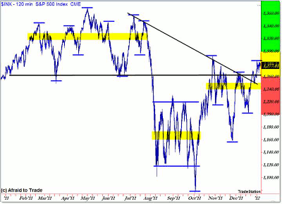
First, the broader picture starting with 2011:
Click to Enlarge
To recap, when we say “market structure,” we’re referring to the progression or sequence of price highs and lows.
See related: See Market Structure Like the Pros Do
In simplest terms, a series of higher highs and higher lows comprises an uptrend (vice versa for a downtrend), and a series of compressing highs and lows indicates a sideways consolidation structure.
Unfortunately, 2011 was more of a broad consolidation or sideways trend structure than anything else, which makes it very difficult to trade. Traders often do best in trending environments.
Anyway, I highlighted “value areas” or midpoints of known consolidation periods—rectangles—in the context of the bigger picture.
We see three distinct “value areas” to watch:
- 1,330 is the upper range for most of 2011
- 1,165 is the lower range from August to October 2011
- 1,250 is the current short-term value area from November to the present
|pagebreak|
Beyond the value areas, we have the price structure itself, which shows the swing highs and lows themselves.
The other thing to watch is the falling trend line (black) that connects the recent swing highs as labeled.
Price currently rests above the trend line as well as the long-term horizontal pivot point at 1,260.
In simplest terms, we need to reference price relative to 1,260.
The immediate levels to watch are 1,300 (upper resistance) and 1,260 (lower confluence support).
These would be levels to watch for any sort of breakout which could extend into a continuation/breakout move, targeting 1,375 if firmly above 1,300 or else 1,200 again if under 1,260.
That’s not much help at this exact moment, as price relaxes in the “Will it or won’t it break out” zone between these two levels.
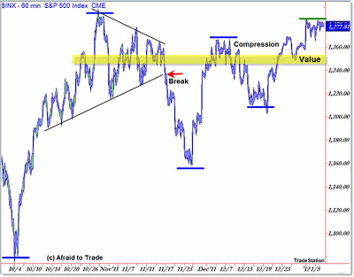
Let’s zoom in to the hourly structure for a tighter perspective:
Click to Enlarge
I mentioned the broader compression pattern, and we’re seeing a similar visual trend line and price-swing compression developing in an even narrower range, which just underscores the indecision—and tension—that’s building in the market at the moment.
Price tends to eject powerfully from compression patterns, which was the case in the short-term triangle compression in November (highlighted above with the “break” arrow).
Here’s what we can conclude in terms of supply/demand at the moment:
- Sellers are dominant near 1,280, rejecting price and forcing reversals there to create a resistance barrier
- Buyers are dominant at increasingly higher levels, forcing reversals off 1,100, 1,160, and recently 1,210
You could call this a type of ascending triangle and use that logic to plan strategies from there.
See related: How to Trade Triangle Patterns
Current short-term value exists near 1,250, which is the spot where we can draw the most price-bar overlap and was the midpoint of the November triangle pattern.
Hang in there, and don’t get frustrated in this tightly compressed price environment. Keep these levels objectively in focus as you trade the intraday or swing opportunities that you find.
By Corey Rosenbloom, CMT, trader and blogger, AfraidtoTrade.com


