

I just got back from our 2026 MoneyShow Masters Symposium Hollywood – and I’m still processing some of the incredible intelligence our speakers provided to attendees. Meanwhile, I shared a key credit market chart there...and what it “means” for investors and traders.
Take a look at the MoneyShow Chart of the Day, which is from my opening-day presentation. It shows the ICE BofA US High Yield Index Option Adjusted Spread – or in layman’s terms, how much extra yield higher-risk companies have to pay to borrow over and above what the US Treasury pays.
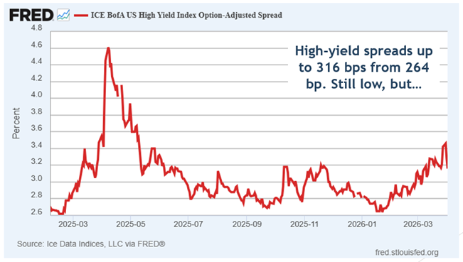
Source: FRED
Clearly, US companies are paying more to borrow money now – about 316 basis points over Treasuries versus 264 bps a couple months ago. But that’s nowhere near the levels we saw during the “Liberation Day” panic in 2025. Plus, the rise has been slow and steady this time around...rather than “spiky” as we saw back then.
That can be interpreted in two ways. The optimistic take is that things aren’t so bad (yet). Companies are paying a “war tax” – but it’s not catastrophic. The pessimistic view is that this looks like what you might see at the outset of a recession or bear market...versus a short-term crisis that has a better chance of fading quickly.
I’m still in the optimist camp – as I told our attendees at the Diplomat Beach Resort. But I’ll be watching credit. Closely.


