
Sometimes, it’s the out-of-the-box thinking that yields better results, rather than conventional wisdom, says Greg Harmon of Dragonfly Capital.
Technical analysts and traders use a broad array of tools to search the playground of securities for patterns, areas where consolidation and reversals occur and other measures, attempting to gain an edge to trade. Sometimes the data that we review can be so extreme that it distorts the analysis.
One way to deal with that is to ignore it, pretend it did not happen. I have done this in the 30-year chart of copper (HG, JJC) below. Just drew a big black spot over it like it was classified. Yeah, I hear you screaming blasphemy! And to appease those hard core technicians that feel the need to throw up now, or worse, stop reading, how about just considering it a false break down? When you take this approach to copper, it looks rather bullish. After the break out above the long channel of consolidation from 1988 to 2004 it has been building a new rising channel since early 2006. And more recently since 2010, this channel has been tilting higher.
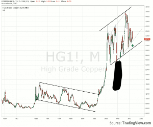
Click to Enlarge
Copper historically has been used as a barometer of economic activity, so as we look at this how do you resolve the dichotomy between this chart and what the economists are predicting? Actually it is not so hard to rectify the two. With the move lower throughout 2011 and no real bounce, this chart does reflect a lowered economic activity expectation. But the chart itself is also sitting near the rising trendline support just as the situation in the broad market and the forecast for the future are heading towards extreme negative sentiment.
Could it be that copper is ready to foretell or a reversal in both sentiment and the market soon? Watch the support line and make your own judgment.
By Greg Harmon of Dragonfly Capital


