
Most people, including traders, base their future action on their past experiences, and here Andrew Falde of SMB Training Blog demonstrates how a trader typically makes trading decisions using this framework.
Trade decisions are often based on what a trader observes on the chart. The thought process often starts with something like this:
“The last time this happened ABC moved 5%.”
“Last year at this time the market stayed in a 2% range.”
“If I had bought the last three breakouts, then I would be up $5k right now!”
“The MACD crossed over five times in the last month, and XYZ really had some big moves.”
“The last three breakouts in ZYX were false signals.”
With these pieces of information, traders believe they have found statistical evidence to justify a position when a similar set up occurs.
Let’s look at a hypothetical example in ProShares Ultra Silver (AGQ):
On this first chart is a simple back test of a breakout strategy. The strategy is buying new 20 bar highs and shorting 20 bar lows (on a 60-minute time frame). If you were observing this information on October 26, 2012, then this would seem like a viable strategy to follow. The blue dotted lines represent winning trades and the red lines represent losing trades.
It doesn’t take much observation to see that there are more winning trades than losing trades, and that the winning trades are bigger than the losing trades. A new “buy” signal has just appeared on this date and a trader may decide that this is a statistically valid signal based on the information provided:
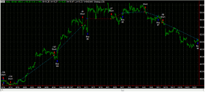
Click to Enlarge
Through the magic of historical back testing, we can see what the “disciplined” trader would have experienced by continuing to follow this strategy for the next 10 trades and 2± months. The white vertical line represents the beginning point of using the strategy:
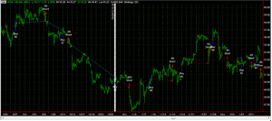
Click to Enlarge
Ouch! Ten losing trades in a row. OK, that wasn’t what we expected to see. So the next logical step is to take into account the new information and develop a new strategy. From now on we are going to do the opposite since 100% of the last 10 trades would have been profitable if we had done the opposite of this strategy. So in our next test, the blue lines are losses and the red lines are winners (because we are doing the opposite of the original strategy). The yellow line represents when we switch to do the opposite of the strategy. So let’s see what happens next:
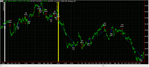
Click to Enlarge
Ouch again! The next trade moves 14% against the counter-trend trader. Then we see a mix of wins and losses, but more than anything we see giant rips in P&L. At this point, the frustrated trader may conclude that AGQ is an unpredictable instrument and breakouts should not be traded. This is a very expensive way to learn how AGQ trades. Tomorrow I’ll post an alternative way to make a statistically based decision on how to trade AGQ.
Andrew Falde, Contributor, SMB Training Blog


