
Volume patterns can confirm price action and uncover opportunities before they hit the mainstream, but if done improperly, traders can miss signals and be late to catch fast-moving equities.
As stocks have moved higher in 2012, some analysts have remained skeptical about the upside potential because of the light volume. With gains of over 13% in some sectors, however, this has been an opportunity many traders and investors do not want to miss.
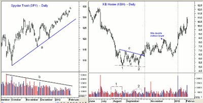
If you look at the below chart of the Spyder Trust (SPY), the reason for the analysts’ caution is clear. As SPY has moved higher from the October lows (line a), the volume has kept declining, line b.
If you look at the narrow range and the low volume so far in 2012, it is quite striking, but I believe it is a mistake to have based your strategy only on the volume of broadly based ETFs when so many individual stocks have exhibited bullish volume patterns.
Figure 1
Click to Enlarge
The chart of KB Home (KBH) is a case in point. KBH dropped over 50% from the late-June highs to the early-August lows. The heaviest selling (23 million shares) occurred on June 29, while at the August 5 lows, only 8.3 million shares traded.
In my volume analysis, I have found that it is often more useful to look at the volume pattern of the surrounding days whenever a high or low is being formed.
KBH made a lower low in mid-August at $5.09 which was accompanied by just under two million shares. This was a sign that fewer sellers were left. KBH rebounded into September before another wave of selling took the stock to an intraday low of $5.02 on October 4 before it eventually closed at $5.58. The cumulative volume in October (point 2) was significantly less it was in August, point 1.
The two almost equal lows and the volume pattern suggested that a double-bottom formation (points 1 and 2) might be forming. To complete the formation, KBH needed to close above resistance at line c, and this occurred on October 11.
Though the volume on the breakout was higher than it was at the low, it was not impressive. KBH then pulled back to retest the breakout level (line c) and then surged to the upside on heavy volume (line A). The volume that day (October 18) was the highest one-day total since early July.
KBH hit the upside target of $8.20 from the double-bottom formation on December 5 before correcting sharply into the end of the year. As KBH resumed its uptrend in January (line B), volume was strong once again, which was consistent with the positive price action.
If you take a look at many of the stocks that have done the best so far in 2012, I think you see that most had bullish volume patterns, unlike some of the broadly based ETFs.
The following are some additional examples of how I use volume patterns in my analysis. I think these will demonstrate why volume plays such an important role in my technical analysis process.
So why is volume analysis important? It allows us to get a reading on the level of buying or selling interest and can help to determine whether supply or demand is dominating a market. It should be noted that we cannot always expect to see the classic or ideal volume patterns that are often in the technical analysis books. There are some basics of volume analysis which can easily be explained, however.
When a market is in the process of bottoming, the volume will often be gradually declining because most of the sellers are out of the market and potential buyers have no reason to buy.
Once a trading range develops, then the volume is likely to ebb and flow. When prices break either up or down from the trading range, an increase in volume will validate or confirm the price behavior.
If the breakout is to the upside, then to the investor or trader, this reflects a pickup in interest in the market that is likely to be spotted by others over time. If it is a stock that is not widely held, then it may take several weeks or months before the increase in activity is picked up by the financial media.
NEXT: Volume Spike Precedes Impressive Stock Rally
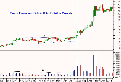
|pagebreak|Grupo Financiero Galicia S.A. (GGAL) is a stock I was watching in the summer of 2010 after it came up on my radar following a late-July volume spike. GGAL had been in a trading range between support at $5.00 (line a) and resistance at $6.50 (line b) for almost nine months.
In late-July 2010, volume was over two million shares for two consecutive weeks, which was the highest since the prior October. The trend of declining volume, line c, was broken, and the following week, volume increased again.
Figure 2
Click to Enlarge
Volume spiked to 7.6 million shares the week ending August 7, 2010, line 1, as GGAL closed at $6.98 and staged an impressive breakout above resistance at line a. This provided further evidence that the increasing volume over the prior three weeks was indeed accumulation.
For the next ten weeks, volume declined as GGAL moved to a high of $10.46. To some, this might have been a cause for concern, but in my experience, declining volume is not always negative. I have found that after you see such a significant breakout on heavy volume, it indicates that the stock is already in strong hands, and if a solid base has formed, a rally failure is much less likely.
In October, GGAL formed a weekly doji (a sign of indecision) before again accelerating to the upside on volume that was greater than what occurred on the original breakout. This was very bullish and coincided with GGAL being mentioned in the financial media.
When a major top is being formed, prices will often narrow and the volume will decline. This indicates that fewer and fewer buyers are working to keep the market near the highs. Eventually, with a lack of upward price action, the sellers start to dominate the market and a top is formed.
Often times, when a stock or ETF is in a protracted decline, you will see a very sharp drop on heavy volume that is often accompanied by a news event. This is noteworthy because it may indicate a selling climax. If so, then once these lows are again tested, the volume should be much lower because the majority already sold on the first drop.
Figure 3
Click to Enlarge
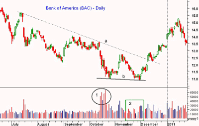
The action last fall in Bank of America (BAC) was a good example. The stock opened the week of October 11 a bit higher, but two days later, concerns over its foreclosure practices hit the stock hard and it dropped from the week’s high at $13.64 to a low on Friday of $11.74.
The volume on Friday spiked to over 500 million shares, which was well above the 170- million-share average. Volume was even higher the following weak, and in a five-day period (circle 1), over 2.7 trillion shares traded. This certainly fit the requirements of a selling climax.
BAC bottomed at $11.03 and just two weeks later had rallied 15.5% to a high of $12.74. By the middle of November, the sellers had again taken over, and by November 30, BAC had made a new low of $10.91, line b.
This low was accompanied by especially low volume (point 2), as volume averaged just over 100 million shares, and just a few days before the lows, volume was just 57 million shares.
This was consistent with a sold-out market, and two days after the lows, volume picked up nicely and the daily candle formation was bullish. The gap break through the downtrend, line a, occurred on volume of 327 million shares, which was the highest volume total in several weeks.
After the breakout, there was a three-day pullback on declining volume and a test of the breakout level, which also presented a good entry. This is a very typical pattern that provides a quiet period for establishing a position.
There was another low-volume pullback in late December before BAC gapped to the upside on over 350 million shares, line c.
The rationale for the volume patterns in head-and-shoulders (H&S) formations is probably the easiest to understand. In a classic H&S top formation, volume should be highest when the left shoulder is formed, then lower as both the head and right shoulder are being formed.
Since head-and-shoulders tops or bottoms are formed after a long trend, this pattern makes sense. The left shoulder is the strongest technically, as buyers or sellers have been pushing the price higher or lower for some time.
In an H&S top, the sharp correction after the left shoulder is formed causes some to sell and makes new buyers a bit more cautious. Therefore, as the head is being formed and the market makes new highs, fewer buyers are now participating.
On the correction following the formation of the head, more selling takes place and overall sentiment becomes less positive. Therefore, when the right shoulder is formed, there are even fewer buyers.
The inability of the market to move to new highs can put potential sellers on alert. The volume should then increase significantly when the neckline is broken, as those who failed to sell earlier all try to get out at the same time.
NEXT: Dow Industrials ETF Shows Important Volume Concepts
|pagebreak|The below weekly chart of the SPDR Dow Jones Industrial ETF (DIA), or Diamonds Trust, demonstrates several important volume concepts.
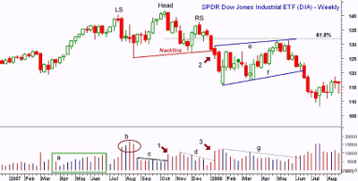
In late-February 2007, DIA had a sharp selloff over concerns about China, but that was short lived, as DIA bottomed at $119.50 and then began a steady rally. In a strong up or down trend, one would ideally like to see the volume increasing as prices move higher or lower, though in a downtrend, a persistent level of average volume can be equally bearish.
Figure 4
Click to Enlarge
In the spring of 2007, the volume in DIA expanded nicely, as highlighted by the green box (point a). In June, DIA began a four-week period of consolidation. If you look at this period on a daily chart, you will see that a flag formation, or continuation pattern, has formed.
The market again turned higher in early July but the volume was considerably less. The first hint of the mortgage crisis hit the market hard in late July, and the heavy volume, point b, was negative.
Stocks reversed from the panic lows of August 17 and DIA dropped to a low of $125.31, which was 10.8% below the July highs of $140.46. The volume the week of the lows was a bit less than the prior week. The rebound picked up steam in September and early October, but the volume stayed low, line c.
DIA made a new high at $141.95 the week ending October 13 but then reversed sharply to the downside the following week (point 1) on volume that was higher than the past eight weeks.
This action raised the possibility that a head-and-shoulders top was being formed with the left shoulder (LS) in July and the head (H) in October. The key level to watch was therefore the August lows.
The late-November low at $127.50 was well above the August lows, therefore, it allowed us to draw a neckline for a potential H&S top formation. The rally only lasted two weeks, as DIA just barely made it back to $137.90 before turning lower.
Volume on the rally was weak (line d), suggesting that the right shoulder (RS) might be forming. The break of the neckline (point 2) was accompanied by a significant increase in volume, point 3. Even though the right shoulder (RS) was formed during the holidays when volume is expected to be low, it should not have been discounted.
To determine the target from the H&S top, you would measure the distance from the head to the neckline, which was $13.70. This value is then subtracted from the level where the neckline was broken, which was $127.70. Therefore, the downside target was $127.70-$13.70, or $114.00.
In January 2008, DIA hit a low of $115.80 before prices stabilized. Over the next three months, DIA formed a flag formation, lines e and f. This period was discussed in a recent Trading Lesson, where I analyzed the Spyder Trust (SPY).
I won’t go into as much detail here, but did want to point out the typical volume pattern of a flag formation. Volume is normally the highest at the start of the formation and then declines as the flag is being formed.
It is also important to note that DIA peaked in December at $131.29, which was well below the 61.8% Fibonacci retractement resistance at $132.10 that was calculated from the October 2007 high to the January 2008 low.
NEXT: Using Volume to Confirm Apparent Chart Patterns
|pagebreak|Another commonly observed type of formation is the double-top or double-bottom formation. Typically, at the initial top or bottom, the volume should be the highest, and lower volume will be observed as the prior high or low is formed. The formation is completed when the intervening low or high is broken, and on the break, volume should increase.
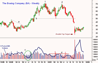
A classic example of this occurred in Boeing (BA) during 2000-2001, when it formed a double top that is especially clear on the weekly charts. During April 2000, BA hit a low of $32 before prices stabilized.
On the chart, I have also plotted an eight-week (two-month) simple moving average (SMA) of the volume. I find this to be a useful way to compare volumes over different time periods.
Click to Enlarge
The volume moving average declined into June (circle c) just as the downtrend, line a, was broken. When the breakout was confirmed by BA moving higher, volume expanded strongly. By the end of September, BA had rallied over 50% and reached a high of $66.94.
The volume weakened in October and the moving average (MA) was declining as BA finally reached a high of $70.93 in December 2000 (point 1). Over the next four months, BA eventually dropped back to a low of $49.70, line b, where it finally bottomed out. Volume was trending lower on the decline, as indicated by line d.
As BA again moved towards the previous highs, the support at $49.70 became more important. In May 2001, BA reached a high of $69.85 and closed the week strong.
The next week, however, BA reversed to close on its lows. The volume at this secondary high, point 2, was considerably lower, as the moving average of the volume was 25% lower than at point 1.
This action suggested that a double top might be forming. The first decline held well above the support at line b, but the chart was starting to look more negative. The failure of the rally in July 2001 was an additional sign of weakness.
If a double top was being formed, it was important to look at potential downside targets. To determine the price target from a double top, you measure the distance from the highest peak to the intervening low and then subtract this amount from the breakout point.
In this example for BA, this gives you $70.93-$49.70, or $21.23, and if you subtract this from $49.70, you get a target of $49.70-$21.23, or $28.47.
The actual low in September 2001 was $27.60.
Knowing the downside target could have helped traders make the decision on whether to establish short positions on the weak rally in July. This rally barely exceeded the 38.2% resistance level calculated from the May high, so the risk on the short side could have been well controlled.
Volume increased every week as BA declined and finally violated support (line b) in September. The selling then accelerated and over 78 million shares were traded the week that the downside target from the double-top formation was reached.
Conclusion
In conclusion, I would suggest keeping an eye on the volume of the stocks and/or ETFs that you invest or trade. Generally, I would not recommend placing too much emphasis on daily volume unless there is a dramatic price move.
The trend of the volume over five or ten periods is generally more important. Heavy volume at the start of a rally or decline is often more important than whether the volume is rising or falling within a trend.
Over the years, I have noticed that the common chart patterns go through cycles. There may be a several-year period where head-and-shoulders top formations are frequently observed, but then you may see very few in subsequent years.
As a result, try to keep an open mind; if you see double tops everywhere, don’t stop looking for other patterns. The volume will often tell you whether your chart analysis is on the right track, and we will review additional market examples in future articles.


