
Option traders use profit and loss diagrams to evaluate how a strategy may perform over a range of prices, so they can understand the potential outcomes. Russ Allen of Online Trading Academy details the steps of this analysis below.
Last week I wrote about backspreads as a strategy that could be used as an alternative to strangles and straddles. This week we’ll look a little deeper, and along the way we’ll take a good look at diagramming as a way to visually analyze a trade. The backspread is a particularly good example for that because of its unique characteristics.
We’ll continue with our example using XLF, the financial sector ETF. To review, when we picked it as an example on December 14, it was at exactly $16.00. It had a multi-year low IV reading of 17%. We thought it unlikely to stay at 16, and thought it could easily reach either $15.00 or $17.00 within a month. For our backspread, we looked at buying 3 March 16 puts at $.63, and simultaneously selling 2 March 17 puts at $1.27. The cost was 3 times $63 [out] for the long puts, minus 2 times $127 [in] for the short puts, for a net credit (money we were paid to do the trade) of $65.
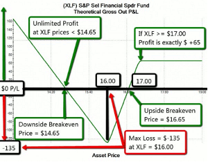
Last week I included a payoff diagram for that position, which is reproduced (with some enhancements) as Figure 1 below. Let’s take a closer look at that picture.
The green line that drops, rises, and then goes horizontal is the plot of the payoff graph. It shows the amount of profit or loss that the position would have, as of the moment of expiration, for varying underlying price levels. This is a bit different from the price charts we’re used to looking at.
First, notice the horizontal axis. It’s labeled Asset Price. The black horizontal line near the middle of the diagram has certain prices along the scale labeled ($14.20, $15.40, etc.) We’re putting price on the horizontal scale here, not on the vertical scale as we do on price charts
Next, the vertical axis. It measures Profit or Loss (not price). The black horizontal line with the price labels on it is at zero P/L (break-even). Whenever the green straight line is above that zero line that represents a profit; values below it, a loss.
Next, a very important point: Time is not an axis on this chart. The chart is not measuring price against time. The entire chart is as of a single moment in time. It answers the question “At the close of business on the expiration date, if XLF is at (pick a price), what will my profit be?” For example, note the point on the X axis labeled $17.00. Look upward from there to the green straight line. Now follow from there to the left to see where that is on the vertical scale. In this case it’s above 60 and below 80. To be exact, it’s at $65 (there is no mark on the vertical scale at 65, but that’s where it is). This indicates that if, at expiration, XLF is at $17.00, then this position will show a profit of $65. Now see at what level of P/L (left scale) the green V-shaped line is, when the Asset Price is at $16.00. The green line at that point is at $ -135. This is as low as that green line goes, meaning that this is the worst P/L that this position could have. No matter where XLF’s price ends up at expiration, this position could never lose more than $135. Note the red box labeled “Max Loss = $ -135 when XLF = $16.00.”
NEXT PAGE: Detailed Steps of the Analysis |pagebreak|
Also note at what asset price points along the zero P/L line the green lines cross. They’re labeled “Downside Breakeven” (at $14.65) and “Upside Breakeven” (at $16.65). Those are our breakeven prices. In this case we have both a downside and an upside breakeven. This is not always the case.
So far the graph shows us at a glance (once we have some practice glancing at it) that the worst-case price of XLF for us would be $16.00, at which price we’d lose $135.00. At XLF prices both above and below $16.00, the plotted line is higher, meaning that we’d do better.
Now that we see where the plots cross the zero P/L line, we also know that we would have a profit at any XLF price below $14.65 (Downside break-even), or at any XLF price above $16.65 (Upside break-even). Between those prices, the plot is below the zero P/L line, meaning that we would have a loss.
Click
to Enlarge
Now notice what happens outside of the break-even range. To the left (lower prices of XLF), the line continues upward without leveling off. If we had drawn the graph so that it extended to the left all the way to an XLF price of zero, the plotted line would keep on rising the whole way. So we say that our profit is unlimited to the downside.
On the right side though, the plotted line goes flat. This happens at a price of $17.00. At or above that price, no matter how high, we would have a $65 profit. So our profit is limited to the upside.
Putting all this together, we can say by looking at the graph:
Worst case is XLF at $16, which would be a $135 loss. The farther away from $16.00 the price ends up, the better, if it’s lower; if it’s higher and goes above $17.00 our profit tops out at $65.00. This position needs movement away from $16.00, and down is somewhat better than up.
In general we can say about payoff diagrams:
- In any range of prices where the line slopes upward to the right [ /], the position is bullish (higher prices lead to higher profits).
- In any range of prices where the lines slope upward to the left [ \ ], the position is bearish (lower prices lead to higher profits).
- In any range of prices where the line is horizontal [ --], the position is neutral (price change neither helps nor hurts us).
- The breakeven price(s) occur(s) at the point(s) where the plot cross(es) the zero P/L line.
- The highest point on the graph shows the maximum profit. (It can be unlimited—off the chart, as in our XLF example).
- The lowest point on the graph shows the maximum loss. (This also can be unlimited, although not in the case of our example).
- There is always an inflection point (a kink) in the line at each strike price (here, at $16 and at $17).
So, to wrap up for today, we can say that the diagram shows that our XLF put backspread is bearish at any price below $16.00; bullish in the price range between $16.00 and $17.00; and price-neutral at any price above $17.00.
Today, we only looked at a payoff graph as of the expiration. The lines and crossing points shown on today’s diagram are only going to be valid at that exact second. Until then, they will be different, and continuously changing.
By Russ Allen, Instructor, Online Trading Academy


