Since silver and gold topped in 2011, pundits have been speculating whether the bubble has finally popped, but Vin Maru of SafeHaven.com makes the case for why there never was a bubble to pop in the first place.
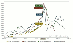
The current gold bull market that has been going on for well over 10 years has never entered a mania bubble phase, especially when you compare it to pervious bubbles of the past. If we compare today's gold price rise to that of the 1970s gold bull market, or the 1990s tech bubble and the 2000s oil run, we can clearly see that this gold bull market has underperformed on a percentage basis. The three other bubbles took about nine years to go from the start of the bubble before it hit the mania exponential rise in the last two years. It seems like starting in year seven after a small correction, the bubble making process starts to go exponential and can clearly gain several hundred percent in the final phase.
The current bull market for gold has risen steadily for about nine years, but on a percentage basis we still haven't seen the exponential rise in a one-two-year period that would clearly mark it as a bubble mania phase. In fact, after making solid gains and rising for nine years, the gold market has essentially gone sideways over the last 18 months. The good thing is that in the previous bubbles, after it burst the asset class had given back several hundred percent in the one-two years following the peak. Luckily we haven't seen that in this bull run for gold, not yet anyway, but we could see the cycle bottom later this year. The recent correction has given back about 20% from the peak of just over $1900 to just below $1550.
Can the correction continue and steepen to the downside? Sure, anything is possible, especially in a market that can easily be manipulated. But looking at the charts below, gold never went into a mania exponential rise and has been consolidating sideways for 18 months. This gold bull market run is definitely not like previous bubbles and the further this correction at these prices goes out in time, the more likely we will still see one more mania phase push higher with a several hundred percent rise before we can state that gold is truly in a bubble.
Graph courtesy of Macrotrends.org
Click to Enlarge
This chart tracks the performance of gold since July of 2002 against the three largest bubbles of the last 40 years. Past bubbles have shown strong but steady growth for the first seven-eight years before moving into a hyper-growth phase for the last 18-24 months. Each series is adjusted for inflation and is smoothed with a three-month moving average.
Dow vs. Gold Over the Last 100 Years and in the Current Bull Market
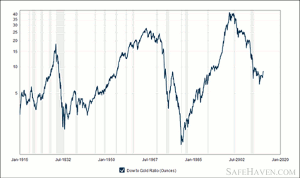
When we look at the Dow to Gold ratio for the last 100 years, we see that the Dow has traded between less than five times the price of gold on several different occasions. Most of this time was between 1915 and 1940s, with the exception of the roaring 20s when the stock markets outperformed gold significantly. The only other time we saw gold become over valued compared to the Dow was during the 60s and 70s, this was the last time when gold was in a bull market and it lasted less than 20 years.
From the early 1980s to about 2000, the Dow has clearly outperformed gold going from one extreme to another. In fact, at the peak of the Dow to gold ratio in 1999, you could buy the Dow 45 times over gold, but ever since then gold has been outperforming the Dow up until recently. What we haven't seen during this bull market for gold is a Dow to Gold ratio below 5, which could easily mark gold as way over valued compared to the Dow. In order for gold to be considered in a bubble territory, history has shown us that we need the ratio to be clearly below 5 to 1 on a spike low.
Graph courtesy of Macrotrends.org
Click to Enlarge
NEXT PAGE: Miners Underperformed Everything |pagebreak|
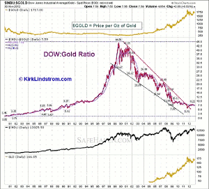
Now let's take a look at the recent chart for Dow to Gold over the last 12 years shown below. Starting in 1999, the Dow was priced 45 times gold and since then has given up a significant portion of that ratio. In 2011, the ratio did go as low as 5.7 to 1 when the gold price peaked at about $1900 and ever since then the Dow has been advancing while gold has still been correcting. Today, the Dow to Gold ratio is about 9 to 1 and the Dow just made all time highs at 14,286 while gold is sitting at about $1580.
Click to Enlarge
While the ratio is working in favor of the Dow for the moment, it would clearly need to break above 10 to 1 on a strong advance before we can say that gold is in trouble and that the bull market may be over. The 10 to 1 Dow to Gold ratio can be considered the line in the sand; this is where a period of great consolidation will take place before any judgment can be made. Assuming gold stays at about $1600, the Dow can easily move to all-time new highs and towards 16,000, it will probably do so by May. At that time, the Dow will most likely take a pause and possibly start a correction going into the summer.
The only question is what will gold do once we reach the 10 to 1? Does it enter a strong bear market and retreat further compared to the Dow as it goes on to make all-time highs from Fed-induced printing? Or does the bull market in gold reassert itself and the Dow starts a correction as we move back towards a 5 to 1 ratio?
Looking at the chart above, the Dow to Gold ratio is still in favor of gold but has started to move sideways. Maybe a new trading range of 5 to 1 and 10 to 1 between the Dow and Gold still holds for the remainder of the decade. If that is the case, we are much closer to the Dow being at a top and gold at a bottom if the 10 to 1 ratio holds. At some point in the next decade, we could see this ratio dip below 5 to 1, which would mean a strong rise in gold compared to the Dow at it enters bubble territory, but we are clearly not there yet.
One thing the charts above clearly show is that gold has never entered a strong parabolic rise into bubble territory. If that was the case, we would have seen a strong percentage gain of several hundred percent in gold within a very short period of time, of which it would be all given back in the same amount of time. Also, looking at the 100-year Dow to Gold ratio chart, the ratio never went below 5 to 1, which would mark that gold was way over valued compared to the Dow on a historical basis.
The Gold Miners Have Underperformed Everything
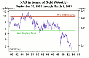
As for the gold miners, the XAU is a much broader index used to measure the performance of 30 mining companies. A chart courtesy of James Turk from Gold Money shows how the miners have done compared to gold since 1988. As we can clearly see, gold has outperformed the Dow and the miners during the current bull run we have been in.
Click to Enlarge
Following the meltdown that started in ‘08, the miners have seriously underperformed and have gone on to historical lows compared to gold. During the ‘90s when there was technically no bull market in gold, you could buy the mining companies in the XAU index between 6 to 10 grams of gold. The range between 6 to 8 grams of gold for the XAU held between 2001 and 2008 when the bull market started. Since 2008, the miners have seriously underperformed versus gold, and you can now buy the index for less than 3 grams of gold. The miners are extremely cheap compared to gold; in fact they probably have never been this cheap throughout history.
By Vin Maru, Contributor, SafeHaven.com